Life after the serial code

Let’s imagine you have a working code and now you are producing some results. What do you feel? You are very happy, of course, but you feel the urge to improve your code. It’s always a good idea to parallelize the code, and in the meantime you can think about the visualization, how to impress your colleagues and friends.
Parallelization
In my previous blog post I wrote about the already existing MPI parallelization of the code. Briefly, we have to solve the eigenvalue-equation of the Fock-matrix that has huge dimensions, but the matrix is -fortunately- block diagonal. The blocks are labelled with a k index, and each block is diagonalized by a different process. According to the original project plan, my task would have been the further development of the parallelization to make the code even faster. What have I done instead? I extended a code with a subroutine that performs a complicated computation for a lot of grid points. Yes, electron density computation made the program running longer. Well, it’s time for parallelization.
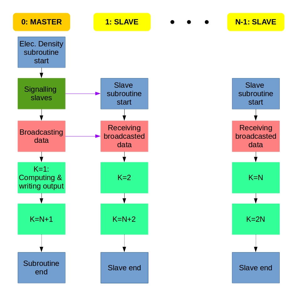
We get several electronic orbitals for each k value, and the electron density is computed for each orbital. I decided to implement the MPI parallelization of the electron density computation the same way as it was done for the Fock matrix diagonalization. We use the master-slave system: If we have N processes, the main program is carried out by the Master process (rank=0) that calls the Slave processes (rank=1,2,…,N-1) at the parallel regions and collects the data from the Slaves at the end.
Each process does the computation for a different k value. We distribute the work using a counter variable that is 0 at the beginning. A process does the upcoming k value if its rank is equal to the actual counter value. If a process accepts a k value, it increases the counter value with 1, or updates it to 0 if it was N-1. This way, process 0 does k=1, proc. 1 does k=2, proc. N-1 does k=N, then proc 0 does k=N+1, proc. 1 does k=N+2, and so on. The whole algorithm can be described something like this:
Master: Hey Slaves, wake up! We are computing electron density!
Slaves: Slaves are ready, Master, and waiting for instructions.
Master: Turn on your radios, I am broadcasting the data and variables.
Slaves: Broadcasted information received, entering k-loop.
From now, the Master and the Slaves do the same:
Everybody: Is my rank equal to the counter? If yes, I do the the actual k and update the counter; if not, then I will just wait.
At the end of the k-loop:
Slaves: Master, we finished the work. Slaves say goodbye and exit.
Master: Thank you Slaves, Master also leaves electron density computation.
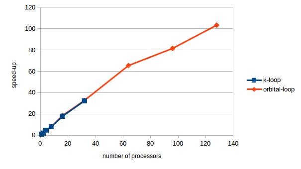
There is a problem with the current parallelization: you cannot utilize more processors than the number of k values. It is very effective for large nanotubes with lots of k values, but you cannot use the potentials of the supercomputer for small systems.
Next idea: Let’s put the parallelization in the inner loop, the loop over the orbitals with the same k. In this case we distribute the individual orbitals among the processes. If we have M orbitals in each block, the first M processes start working on the k=1 orbitals, the next process gets the first orbital for k=2. This way we can distribute the work more evenly and utilize more processors.

I tested the parallelization on a nanotube model that has 32 different k values. The speedup as a function of the number of the processors is shown in the figure below. The blue points stop at 32, because we cannot use more processors than the number of k values. The speedup is a linear function of the processor until about 64, but after that the speedup does not grow that much with the number of processors.
Visualization
Motto: 1 figure = 1 000 words = 1 000 000 data points
Before I started this project I thought that the visualization part will be the easiest one, but I was really wrong. It can be very difficult to produce an image that captures the essence of the scientific result and pretty as well. (I have even seen a Facebook page dedicated to particularly ugly plots. I cannot find it now, but it’s better that way.) I do not have a lot of experience with visualization, as it was only lab reports for me. For lab report all we had to do was to make a scatter plot, fit a function to the points, explain the outliers and -most importantly- have proper axes labels with physical quantities in italic and with proper units. The result? A correct, but boring plot and the best mark for the lab report.
Now I am trying to make figures that can show the results and capture the attention, too. If you have a good idea, any advice is greatly welcomed.
The first test system of the was the benzene molecule, and I computed the electron density only in the plane of the molecule. I plotted the results with Wolfram Mathematica using ListPlot3D and ListDensityPlot.
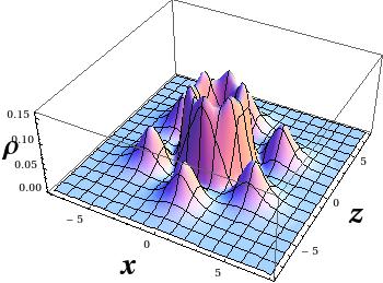

But electron density is a function is space! How can I plot the four-dimensional data? The answer is simple, let’s make cuts along the x-z plane, and make a plot for each cut. Here you can find 1231 cuts for the R=(6,0) nanotube. I apologize if you really tried to click on the “link”, it was a bad joke. I do not expect you to reconstruct the 3D data from plane cuts, because there are better ways of visualization.
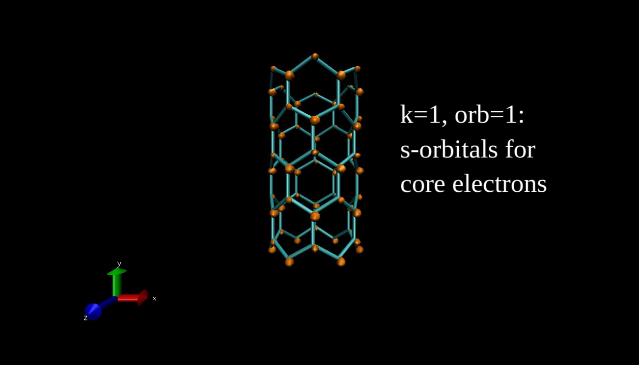
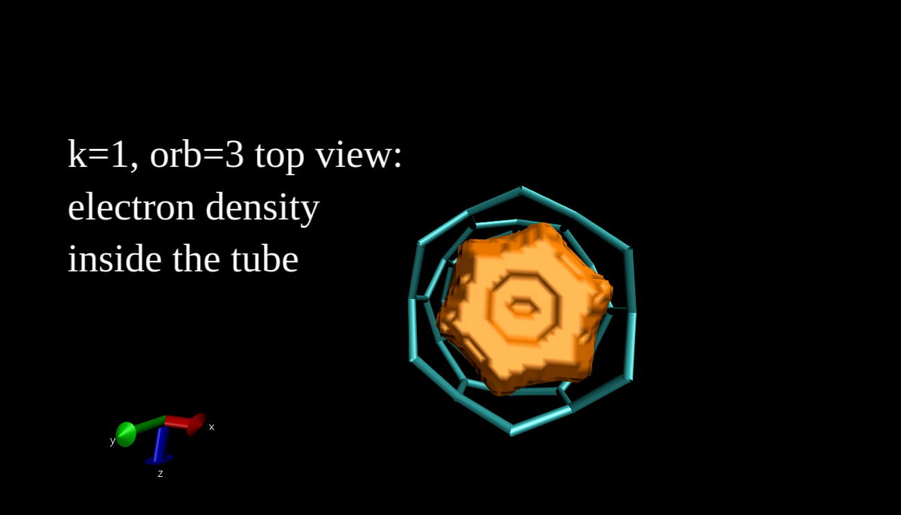
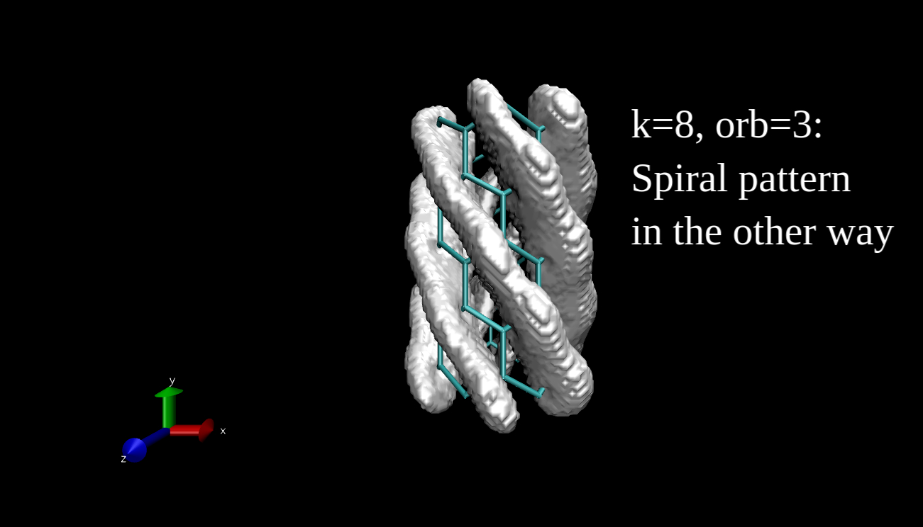
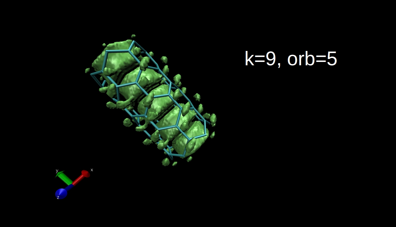
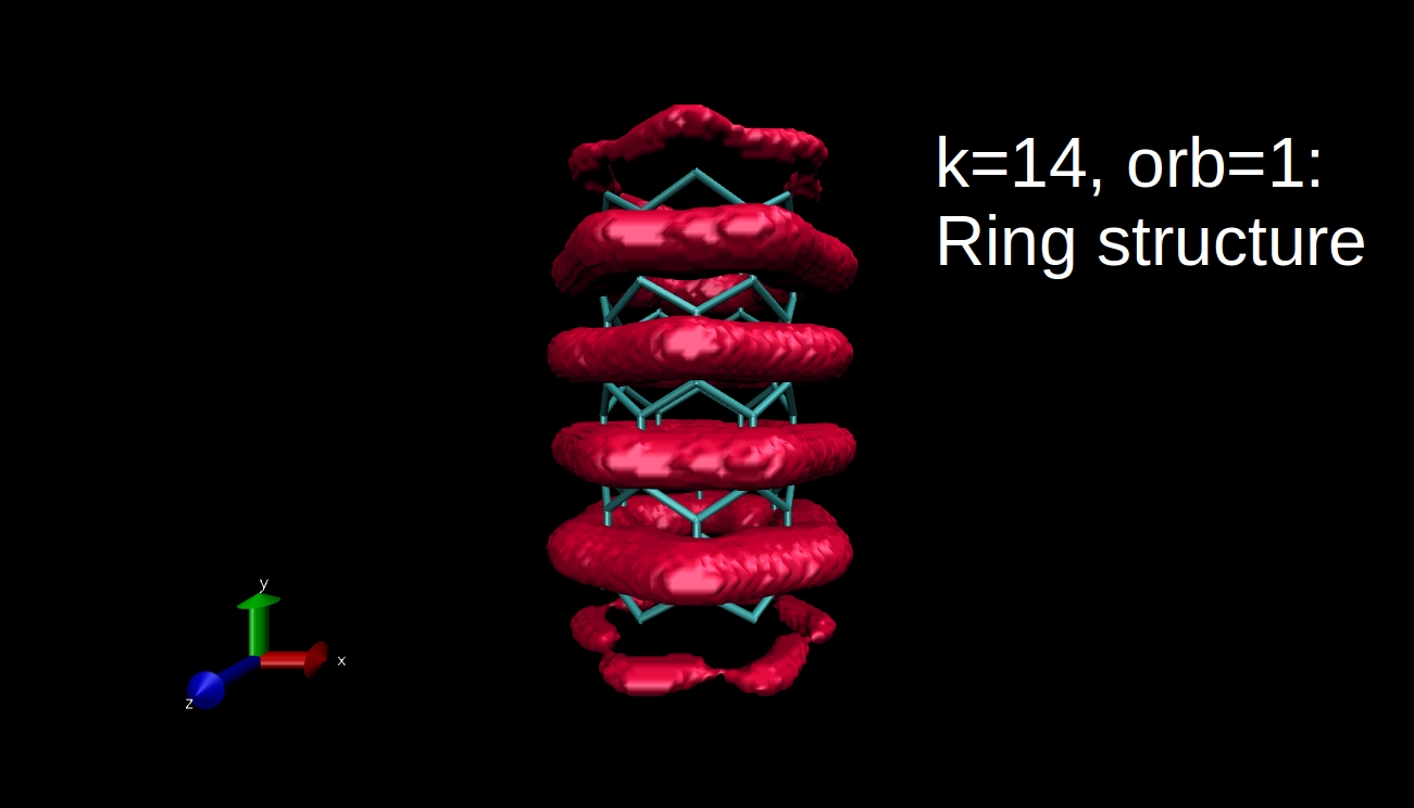
What we can plot is the electron density isosurface, a surface where the electron density is equal to a given value. Quantum chemical program packages can make such plots if we give them the input in the proper format. I have x-y-z coordinate values and the data, and I convert this to Gaussian cube file format, then I use the Visual Molecular Dynamics program to make the isosurface plots. Here you can see some examples for the R=(6,0) nanotube.

This is all for now, I hope I could tell you something interesting. I will come back with the final blog post next week.
Hello Everyone, my name is Irén and I am from Budapest. I have just completed my MSc in Chemistry at the Eötvös Loránd University, and now I am applying for the PhD School of Chemistry there. I have always been interested in mathematics and chemistry but I discovered programming only at the university (it was a love at first sight). This is why theoretical computational chemistry became my main topic of interest. This summer I will be staying in Bratislava where I will perform electronic structure computations of nanotubes and optimize the code. I have applied for the Summer of HPC program to study more about parallel programming, to peek into new fields of science and to meet new people.

Leave a Reply