Remember … first impressions last

Little bit of background
The data acquired for this project is from a biomass combustion simulation inside a furnace, this involves intricate physical phenomena and due to this complexity requires the use of High-Performance Computing (HPC) platforms.
In this simulation it is preferred to use a computational fluid dynamics(CFD) approach for gas simulation and a discrete element method(DEM) for the particles inside the combustion furnace, only CFD will not give individual or collective particle interaction and behaviour required to simulate chemical interactions and mass exchange with the surronding gas. CFD part is being carried by FOAM-extended (a variant of OPENFOAM for gases) and the DEM part by XDEM software as a numerical toolbox for the simulation of particulate material. Both software is coupled directly using C++ programmning language, that executes the respective parts of the simulation (CFD, DEM and coupling) allowing the two libraries to use the same memory and avoiding communication issues.
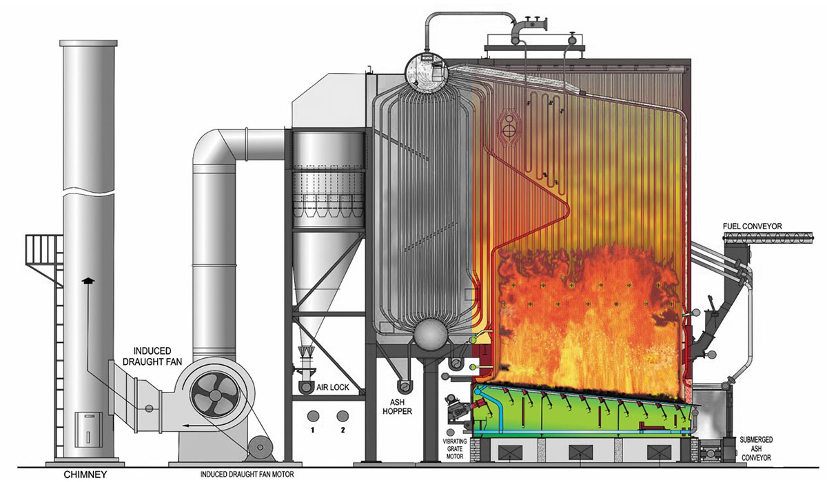
FOAM-extended is using a MPI-approach to parallelize the gas simulation and XDEM a OpenMP-approach, as particles usually lays on the fuel bed , it is mandatory that all those particle data belongs to only one MPI process so XDEM could only rely on multithreading. The way to decompose the CFD and DEM meshes is a crucial part to observe as it will determine a noticeable percentage of the total performance for the simulation. So for the next comparison we selected the simple decomposition which is a geometrical way to divide the furnace in geometrical blocks that communicate with each other and SCOTCH which is a OPENFOAM custom decomposition that detects and tries to spread the workload as balanced as possible.
Every plot should be an eye candy
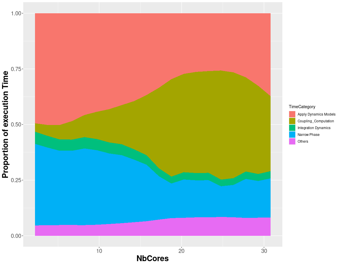
All we should agree that data visualization belongs to the edge where art and science instersects, and it is really important to point out crucial information in a direct and easy manner to the final user. So for example you can show a bar plot of the different categories in your data, but are you sure that this plot will convey the main purpose of the information to the viewers? What about if there is a trend on this data , a pattern that is visible with the correct arrangement or geometry, or in the most of the cases, is it really easy for the viewer to understand and compare data in the plot?.
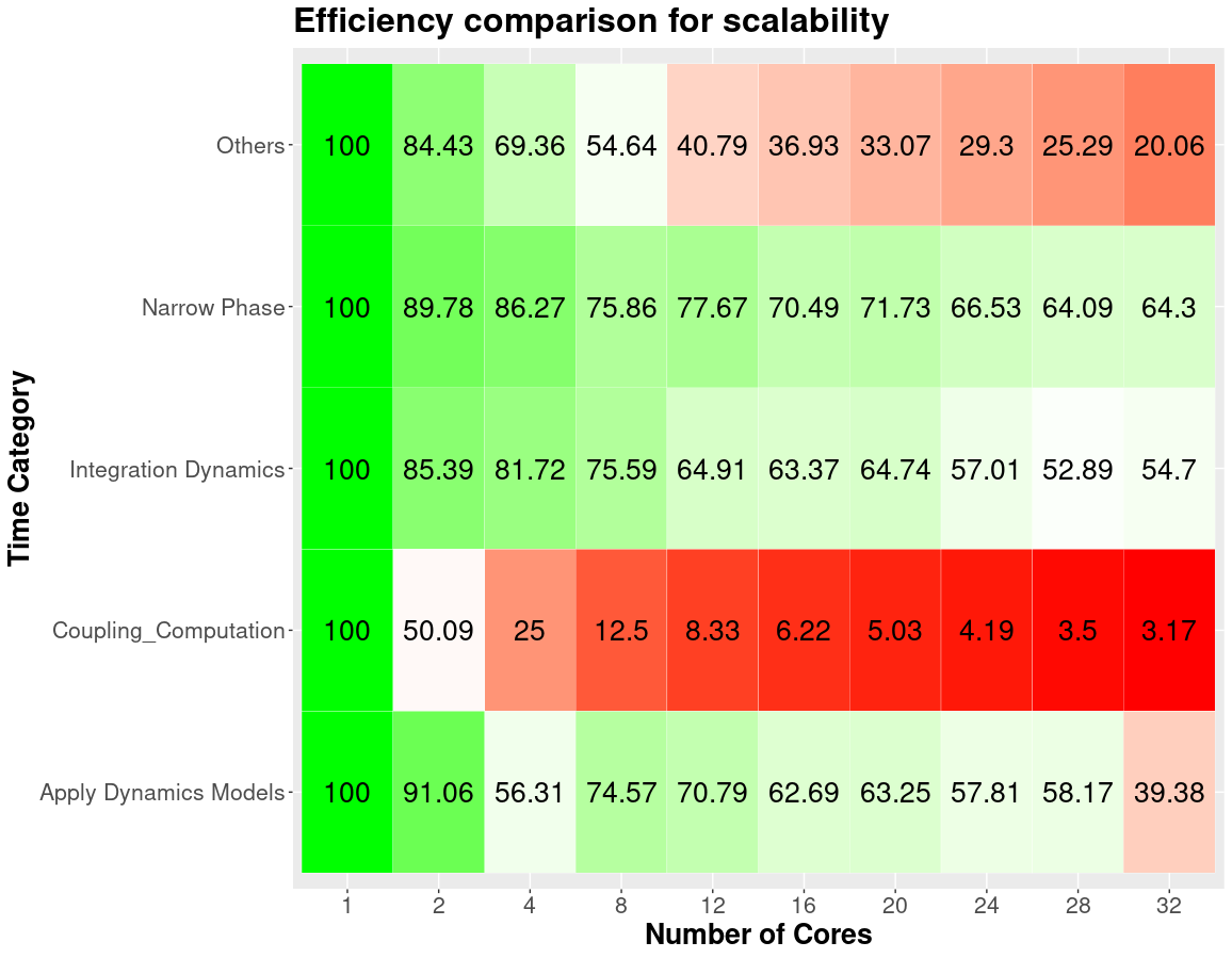
Let’s start with an example, a basic representation to show raw data directly would be a table, but let’s be honest, the brain is no trained to detect or do calculations with floating point numbers (if you can do this probably you would be very famous in a tv show), so it will be really hard for the viewers to compare changes in the data and even worse the magnitud of the change.
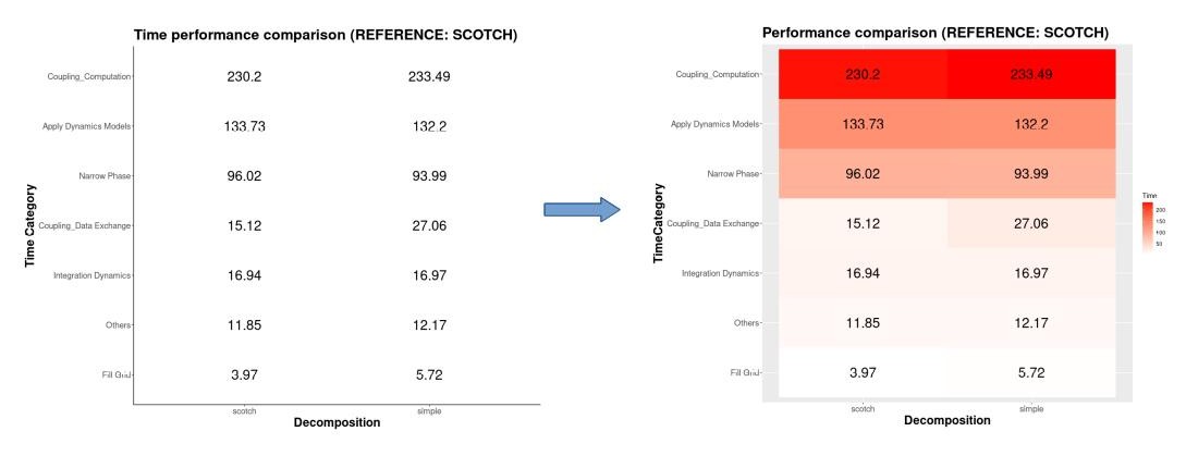
Taking in mind the figure above, we converted a boring table to a heatmap where it points the categories that takes the most of the time in the execution, but even with a heatmap would be really hard to compare between two different decompositions because we do not know which categories were impacted the most due to this new decomposition, so lets try to do a new heatmap but now we weight according on how much the time has changed in comparison with the previous one.
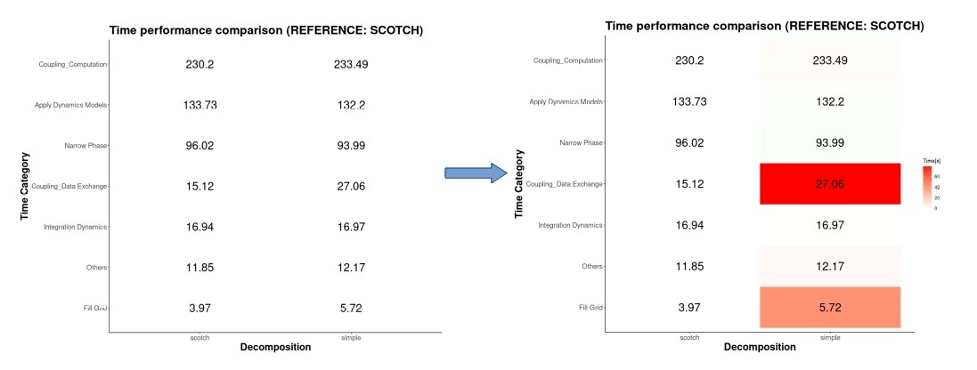
Now it is much better to see where the real changes occur, we can see that for the data exchange category occurs the biggest increment, and we can see that if the time decreases there is light green tone. But let’s make it more easy for the viewer, we are not human calculator so we will add the impact in terms of percentage.
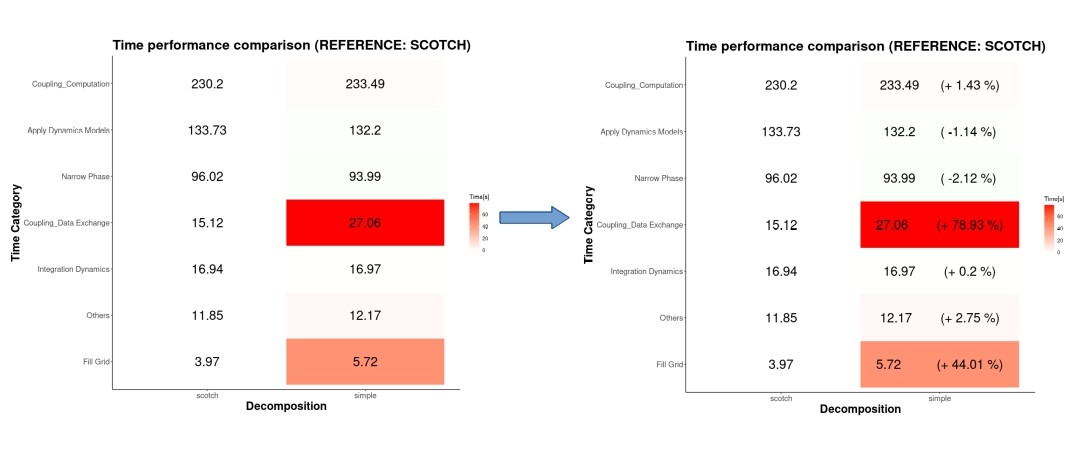
And now with a single glance we can say that the data exchange category is the worst performant with a decrement of 78% with respect to the scotch decomposition. Could you do this with the raw table at the beggining?.
A language made for this
All of these is possible thanks to R, which is a programming language mostly present on statistics analysis and graphics, R is very well mantained and contains thousand of libraries implemented by developers around the world that make your life easier. In our case we used “tidyverse” as the most important package library, it allow us to extract transform and load the data present on our simulations, as well as a intuitive set of commands to manipulate the data structure to be more suitable for different kind of plots. Also it contains ggplot2 which offers a great variety of plots and graphs implementations according to the need to convey the right information to the viewer, as one of the most reliable sources to select the kind of plot suitable for our project was https://www.data-to-viz.com/. All of this along with the “here” package library which makes easy the file referencing as our data could be stored in different paths on the local storage.


Leave a Reply