Bringing visualisation to the web with Python and Bokeh

These days the world seems to run on data; from Google, to the NSA/GCHQ, to CERN, everyone seems to want more data, and be willing to go to great lengths to get it. However, once we have all of this data, the natural question arises of what to do with it? Statistics, and other methods of analysis can do a great job of summarising data and extracting relevant information, but often pictures speak louder than numbers, so visualisation can be the key to turning all of this data into something which people can understand. Good visualisations should turn data into a compelling story, with colourful characters, depth, and a satisfying conclusion. But like a good story, much of the power of visualisation comes in the telling, and in spreading this story to all who will listen. Hence in this blog post I will focus on how to build your visualisations into compelling interactive websites to reach the largest audience possible.
Part 1: A hungry Panda and a crafty Python walk into a bar …
Of all of the creatures in the programming language zoo, none like to munch on data so much as the crafty Python. Python is in a unique position as one of the most popular languages for both data analysis and for building web applications. The secret to the Python’s data analysis skills is its ever hungry friend the Panda, or more specifically, the Pandas data analysis library. Panda provides efficient data types for handling tables of data – think of it like a spreadsheet inside your programming language. You can install your very own pet Panda as follows:
pip install pandas
It is then very easy to store your data as a data frame, for example, you can build a table of values for the sine and cosine functions as follows,
import numpy as np # Import the numpy numerical library
import pandas as pd # Import your pet panda

# Build the dataframe
df = pd.DataFrame({
 'x': 2*np.pi*i/100 ,
 'sin': np.sin(2*np.pi*i/100),
 'cos': np.cos(2*np.pi*i/100),
} for i in range(0,101))

Who wouldn’t trust these guys with their data? (image credit Kelvin Dooley (https://goo.gl/YAIDJU) and Jonathan Kriz (https://goo.gl/yaZ3Vc))
Part 2: Getting visual with Bokeh
Now you have got your data, it is time to make it visual. The key to this is Bokeh, a Python plotting library. You can install this with the following command,
pip install bokeh
Once you have this, plotting your data is very simple,
import bokeh.charts as bc
from bokeh.plotting import output_file show

output_file('myplot.html')

plot = bc.Line(title='Triganometric fun!', data=df, x='x', ylabel='y')
show(plot)
Hurrah, we have just recreated basic Excel in Python! However, there is a lot more to this, as you have the whole power of the Python programming language at your disposal to collect and analyse your data. Also, with this simple program, you can already generate your plot as a HTML web page. This means your plot is not just a static image, but rather, is plotted in your browser by Javascript, allowing you to zoom, pan, and interact with the plot.
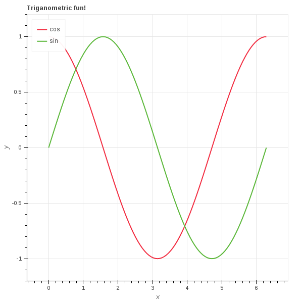
From dataframe to plot
Bokeh can produce a lot more exciting visualisations than just line graphs as shown above; you can get some ideas from the Bokeh website:
 |
 |
 |
 |
 |
 |
 |
 |
 |
 |
 |
 |
 |
 |
 |
 |
 |
 |
 |
 |
 |
Part 3: Taking your plots online with Flask

Clever cat knows the value of a good Flask (image credit: Sunfell (https://goo.gl/7pr8yy))
Congratulations, you have now managed to create something pretty. However, it is not doing much good sitting around on your harddrive. In order to share your plot with the world, you will need a webserver. You are in luck, as Python is well conversed in the ways of the web. An easy way to start building web applications is the Flask framework. You can install this using the command,
pip install Flask
Now it is really easy to build a webpage around your visualisation,
from flask import Flask
app = Flask(__name__)

import pandas as pd
import numpy as np
import bokeh.charts as bc
from bokeh.resources import CDN
from bokeh.embed import components

@app.route("/")
def visualisation():
 # Build the dataframe
 df = pd.DataFrame({
 'x': 2*np.pi*i/100,
 'sin': np.sin(2*np.pi*i/100),
 'cos': np.cos(2*np.pi*i/100),
 } for i in range(0,101))

 # Create the plot
 plot = bc.Line(title='Triganometric fun!',
 data=df, x='x', ylabel='y')

 # Generate the script and HTML for the plot
 script, div = components(plot)

 # Return the webpage
 return """


 My wonderful trigonometric webpage
 {bokeh_css}


 Everyone loves trig!
 {div}

 {bokeh_js}
 {script}

 """.format(script=script, div=div, bokeh_css=CDN.render_css(),
 bokeh_js=CDN.render_js())

if __name__ == "__main__":
 app.run(host='0.0.0.0', port=80)
You can now view your new webapp by visiting http://localhost/.
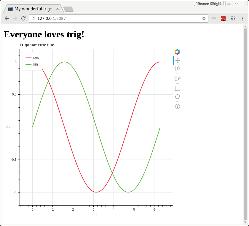
The beautiful result
Wow, that was fun. Now it is over to you to fill the web with new and existing visualisations using Flask, Python, and Bokeh.

Thanks for your great tutorial.
I have a personal website hosted on a server.How can I display this page on that website?
If I just include the .html page on my website and treat it a static web page, does it actually has the embedded python codes to run interactive visualizations, assuming I created a button using bokeh and it updates the plot?
Or should I install python and bokeh on the web server?
Thanks for your help.
Thanks for this post. Very useful. But as of Nov 2017, the bokeh package has changed and the import bokeh.charts throws an error. Here is the correct code:
from bokeh.plotting import figure, output_file, show
output_file(‘sine_cosine.html’)
plot = figure(plot_width=400, plot_height=400)
plot.multi_line([df.x, df.x], [df.sin, df.cos], color=[“firebrick”, “navy”])
show(plot)