Welcome to the Node Level PCA!

In my last update, I mentioned that I applied PCA for all datapoints and the results. But I have hidden an important detail for this post 😉 When we added the explained variance percentages as a result of PCA, we could only approach 40%. This means that we were only able to obtain 40% of the information about all datapoints.
Less Data, More Components
Then, in order to get more successful results, we decided to shrink the dataset we applied PCA and increase the number of components until the explained variance percentage increased. Thus, I started working on a dataset containing nearly 200 thousand datapoints containing information about 10 nodes. We chose these nodes according to their CPU usage rates. We tried to select the nodes with the most job submissions within the selected 6 days.
Afterwards, I increased the number of components one by one and made PCA analysis. As a result, we reached a 98% variance explained using 15 components.
Outlier Detection by PCA
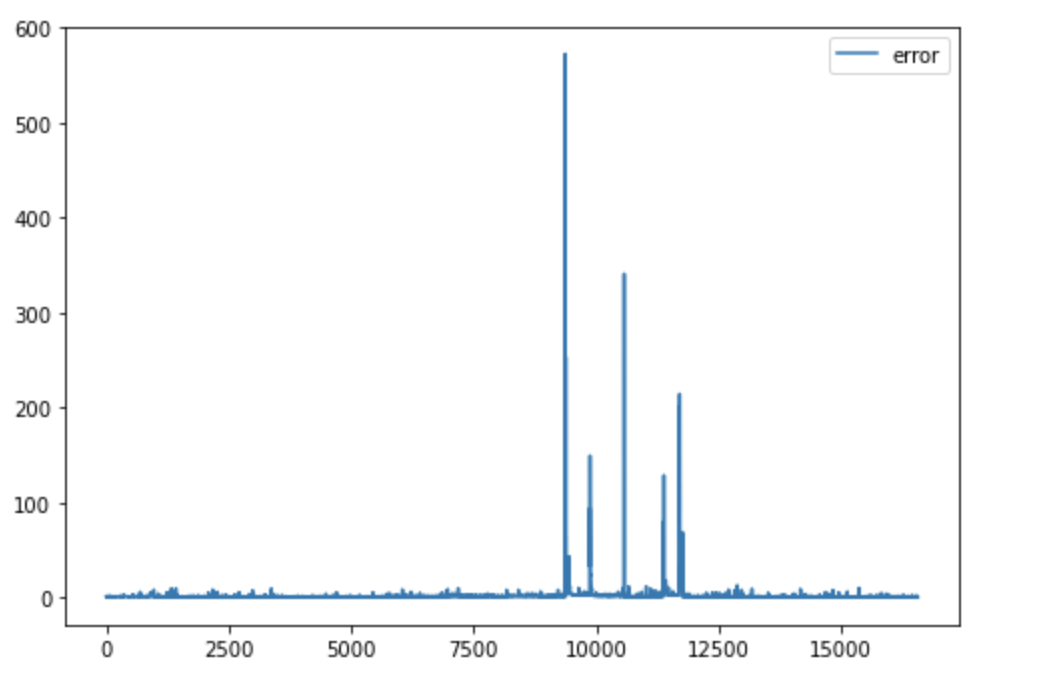
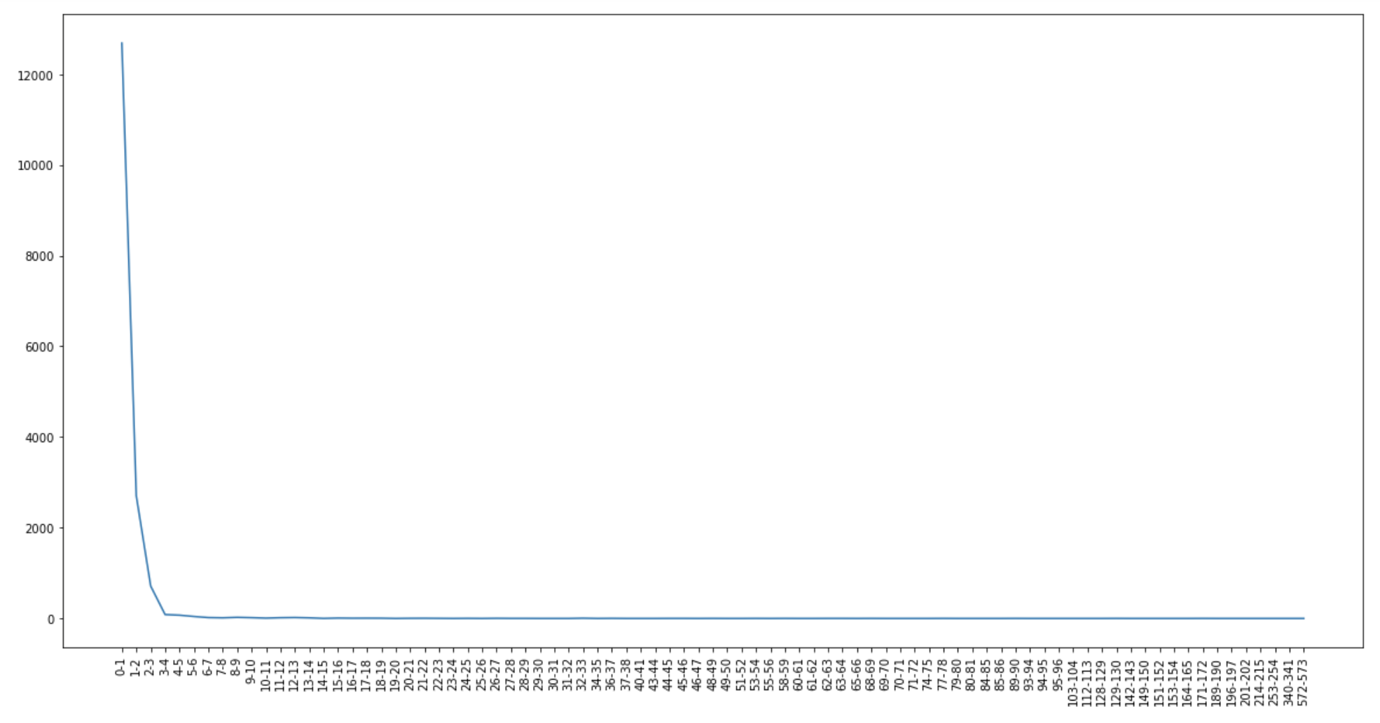
After that, we used 15 components in all PCA analyzes we did. We decided to clean up the dataset a bit with the help of PCA analysis. For this, we used the reverse transforms of the principal components, which we obtained as a result of the PCA analysis. Then, using the distance between these values and we removed some of the outliers from the dataset. While doing this, we set the maximum error rate as 5, in this way, we kept 95% of the data in the dataset and eliminated 5%.
Didn’t We Already Find the Outliers?
But of course, the question here is why did we clean this dataset? Wasn’t our goal to find outliers anyway? Yes, our goal is to find an outlier. But our plan for doing this is as follows: Let’s train a machine learning method on timeseries data and that model can predict the features in the next step. We will use this clean dataset to train this model. Next, we will find the anomaly using the model’s predictions.
Next Step
We’ve come to the coolest part of the project! Selecting a machine learning model and training it with this dataset that we cleaned. If you’re waiting for GPUs to mess with this, see you in the next post!

Leave a Reply