Compiling and thriving
Finally, our visualization project gets its final shape. Users experience navigating within my website and find all the tools embedded. Daily several corrections are being done in order to develop an even more versatile and user friendly tool. Furthermore weekends still offer evening walks in Barcelona discovering the new sights to be seen
I managed to visit Barcelona’s designed by Catalan architect Antoni Gaudí.
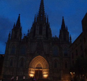
Cathedral of Barcelona
My next stop was in Barcelona’s Aquarium. It houses 35 aquariums, with 11,000 animals and over 450 different species. One of the highlights of the Aquarium is a 80 metre long underwater tunnel allowing us to walk and watch simultaneously all kind of underwater creatures swim.
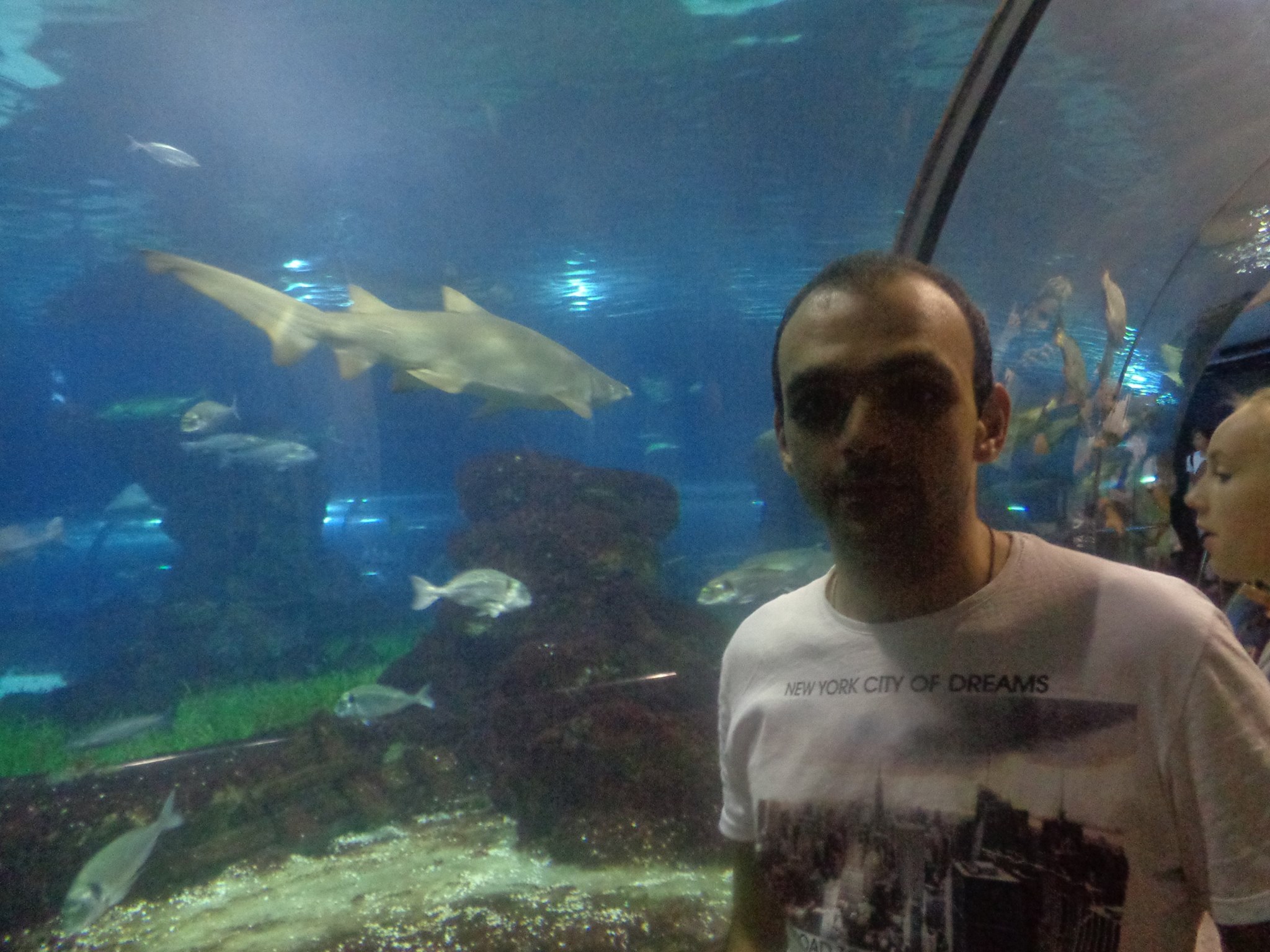
Aquarium in Barcelona
Next I visited the neighborhood of Vila de Gràcia. All streets were decorated and crowded by people. Each road was decorated differently and was celebrating a small festival with music, food, and drinks.
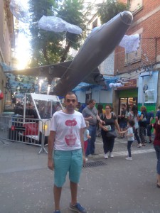
Vila de Gràcia
I last visited Montjuic, Barcelona’s Olympic Stadium, where the Olympic Games took place in 1992.
Montjuic’s view
Let’s sum up the project:
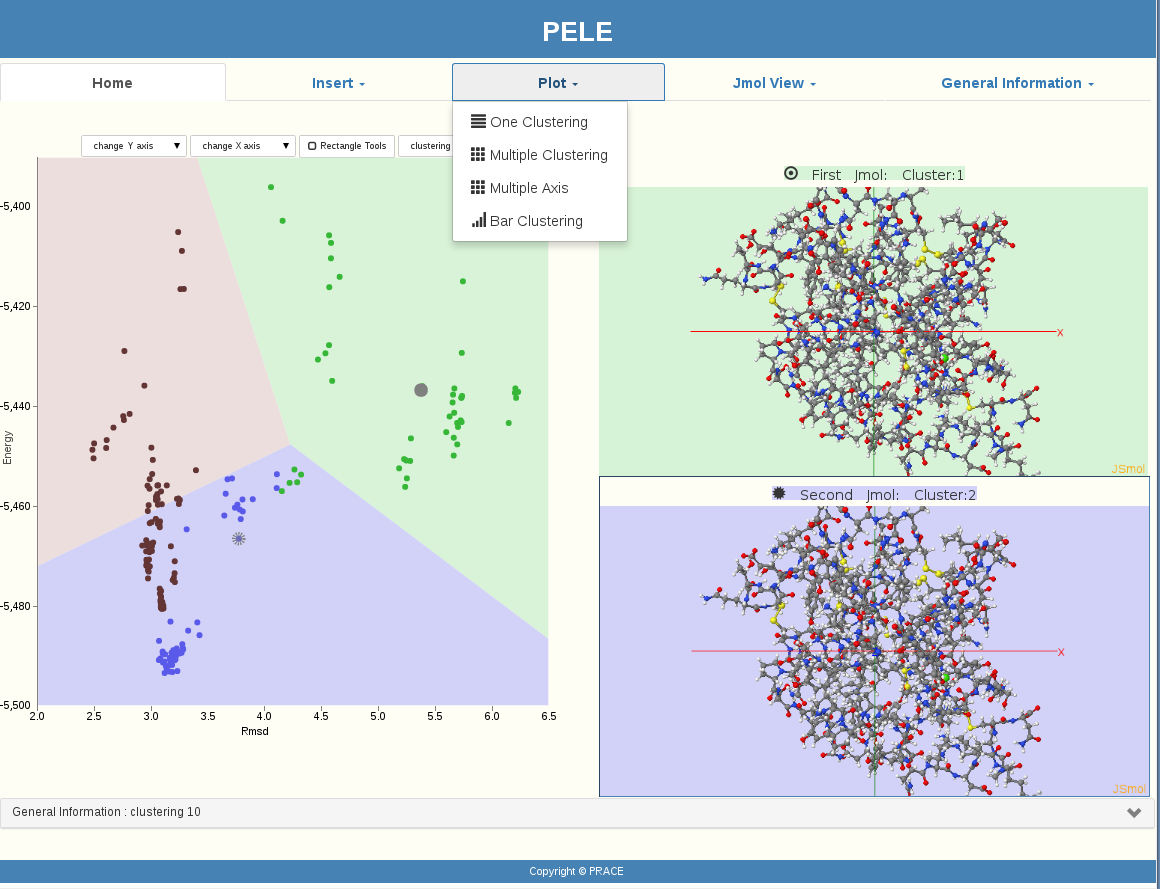
A user can upload his protein and ligand in the PELE software. PELE will then create spatial positions (moving and rotating the protein and the ligand) and get metrics’ results. At this point our visualization procedure is starting. At the beginning, protein and ligand conformations are being represented as black points. In our implementation, after the user presses the button of the parameters window, the clustering of PyProCT gives the results, and our GUI represents the clusters with different colors on a Voronoi diagram.
During the last weeks, having prepared a set of questions for our test users and by using the eyes tracker, interviews were accomplished to improve the GUI.
Using Eyes Tracker
PELE’s clustering results visualization is now ready to be used. The following icons are representing our GUI’s functionality:
Our visualization provided more than a graphical representation of the proteins’ structure by pointing to a specific “point” (protein) or by selecting a whole area of “points”(proteins) with the “Rectangle” choice. General information is given every time a user is interested in, such as Evaluation, Number of clusters, etc. JMol View is providing optional viewing of more than one protein simultaneously. Even the plotting options are enriched with many functions.
GUI for PELE, became a user friendly graphical interface which is easily managed even by users with little experience by using the tools and effects it provides, such as the Mouseover information triggering effect.
Pele’s Clustering Visualization
