Visualising how the World’s Centre for Supercomputing Shifted over the Last Decade
1. Introduction
In an age marked by data-driven knowledge, visualisation plays a major role for exploring and understanding datasets. Visualisations have an amazing ability to condense, analyse, and communicate data as if telling a story with numbers. In contrast to text-based means, the interpretation of visual information happens immediately in a pre-attentive manner. It is worth mentioning that the usefulness of data visualisation was introduced early in John Tukey’s landmark textbook Exploratory Data Analysis (Tukey, 1977).
In this post, I present an interactive visualisation that can help explore how the world’s centre for supercomputing has been changing since 2005. To put it in more detailed words, the visualisation answers which countries dominated the possession of supercomputers from 2005 to 2017. The visualisation can be accessed directly from the URL below:
The rest of the post gives an overview of the visualisation, how it was designed, and my personal reflections on the visualisation outcome.
2. Visualisation Pipeline
The visualisation is delivered as a web-based application. The visualisation was produced over the stages sketched in Figure 1. First, the data was collected from the Top500.org lists between the years of 2005 to 2017. The data was scrapped using a Python script that utilised the urllib and BeutifulSoup modules. Data included information on rankings and locations of the Top 500 supercomputers in each year. The location info (i.e. country) was utilised to get latitude and longitude coordinates using Google Maps API.
Subsequently, the data was transformed into the JSON format, again using Python. The JSON-structured data defined the markers to be plotted on the map. The JSON output is described as the “Data Layers” by Google Maps API. The map visualisation is rendered using Google Maps API along with the JSON data layers. Eventually, the visualisation is integrated within a simple web application that can provide interactivity features as well. All the code along with scrapped data are accessible from my GitHub below:
https://github.com/Mahmoud-Elbattah/Top500_Viz_2005-2017
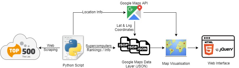
Figure 1: Overview of visualisation Pipeline.
3. Visual Design
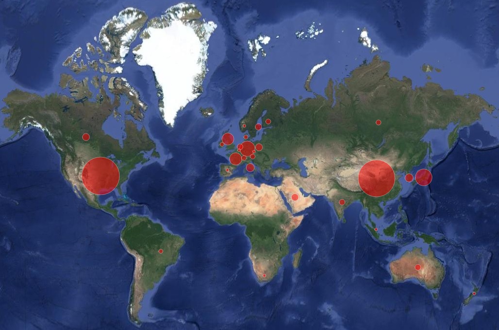
The visualisation is provided on top of Google Maps. Map markers are drawn on the map as circles (Figure 2). Particularly, every circle is placed on a country where at least one supercomputer was included in the Top500 list. The circle radius represents the percentage of possessed supercomputers with respect to the Top500 list in a specific year. For example, Figure 2 visualises the Top500 list in the year 2014. At glance, it can be learned that the USA was the largest incubator of supercomputers in that year.
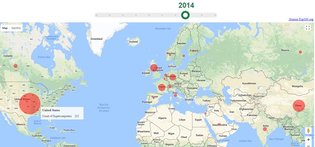
Figure 2: Visual design.
4. Interactivity
It was aimed to provide a flexible way that can portray how the world’s centre for supercomputing changed over the years 2005-2017. In this regard, a JQuery-based slider is used, which serves as a slide-able timeline. The visualisation is loaded automatically as the user slides the years forward or backward. In addition, the map markers show more info (e.g. number of supercomputers) as the mouse cursor moves over.
5. Reflections on Visualisation
It is quite interesting how the picture changed over the years. In 2005, China had only 19 supercomputers in the Top500 list, compared to 277 owned by USA. Today, China has 160 supercomputers, which makes it stand on equal footing with USA. This translates into how the world’s centre for supercomputing continues to shift eastwards.
The visualisation also shows what can be described as the rise and fall of some countries in the Top500 list. An adequate example is the case of Israel and Poland. On one hand, there were 8 supercomputers in Israel in 2005. That figure has been fluctuating till 2015, and since 2016 Israel had no supercomputers listed in the Top500 at all. On the other hand, Poland had no existence in the Top500 list before the year 2008. However, the number of supercomputers in Poland has been usually increasing since 2008, and has currently reached 6 in 2017. Those are just examples, and I am looking forward to hearing further interesting observations from the SoHPC community.
References
Tukey, J.(1977). Exploratory Data Analysis. New York: Addison Welsey.
