It’s Alive!
In my previous post it was all just dry theory and nothing to show (apart from a great food picture). Today the post will only be about presenting the “cool stuff”, and for that, just for you guys, my buddy Arnau filmed my horrendous face showing you what I have been working on.
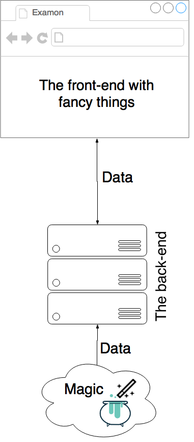
Scheme of the web application
I’ve been really busy the last couple of weeks developing the web application, and I am glad to say that most of the heavy lifting is done. The web app I developed somehow works (sometimes even I wonder how that is possible).
I used the modern approach to building it. This means that the front-end runs on your browser and it only requests data from the server via a REST API and WebSockets. This methods has its ups and downs but let’s say for this kind of webapp it is the best solution.
The figure on the right should help you get the general idea and show the big picture. I am not going to explain the architecture and boring stuff of the back-end but rather show the fancy things on the front-end that can be separated to 3 parts:
- charts (cool)
- one single number (fancy)
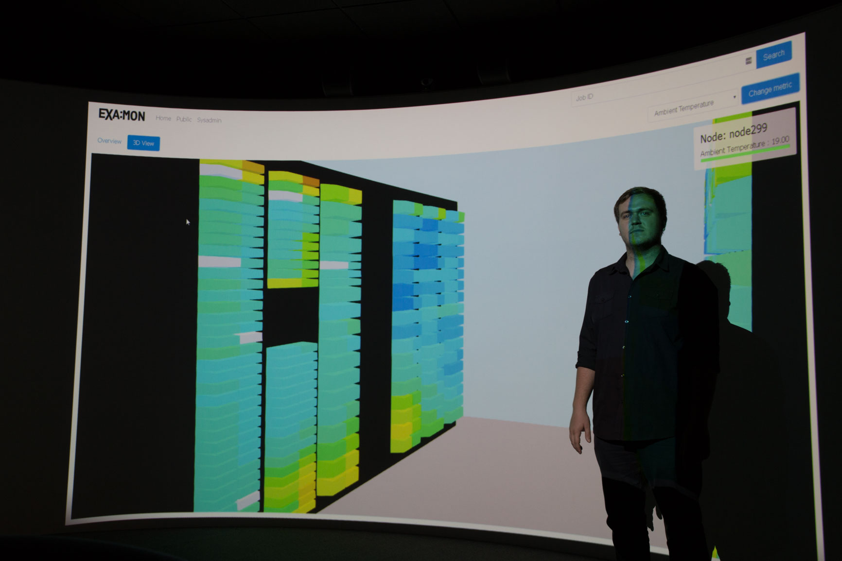
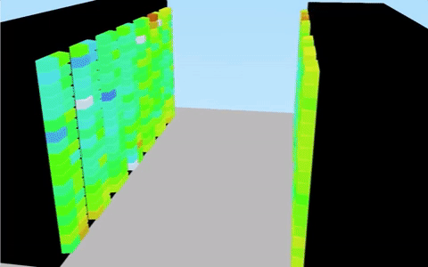
- interactive 3D model of the Galileo supercomputer (super mega awesome)
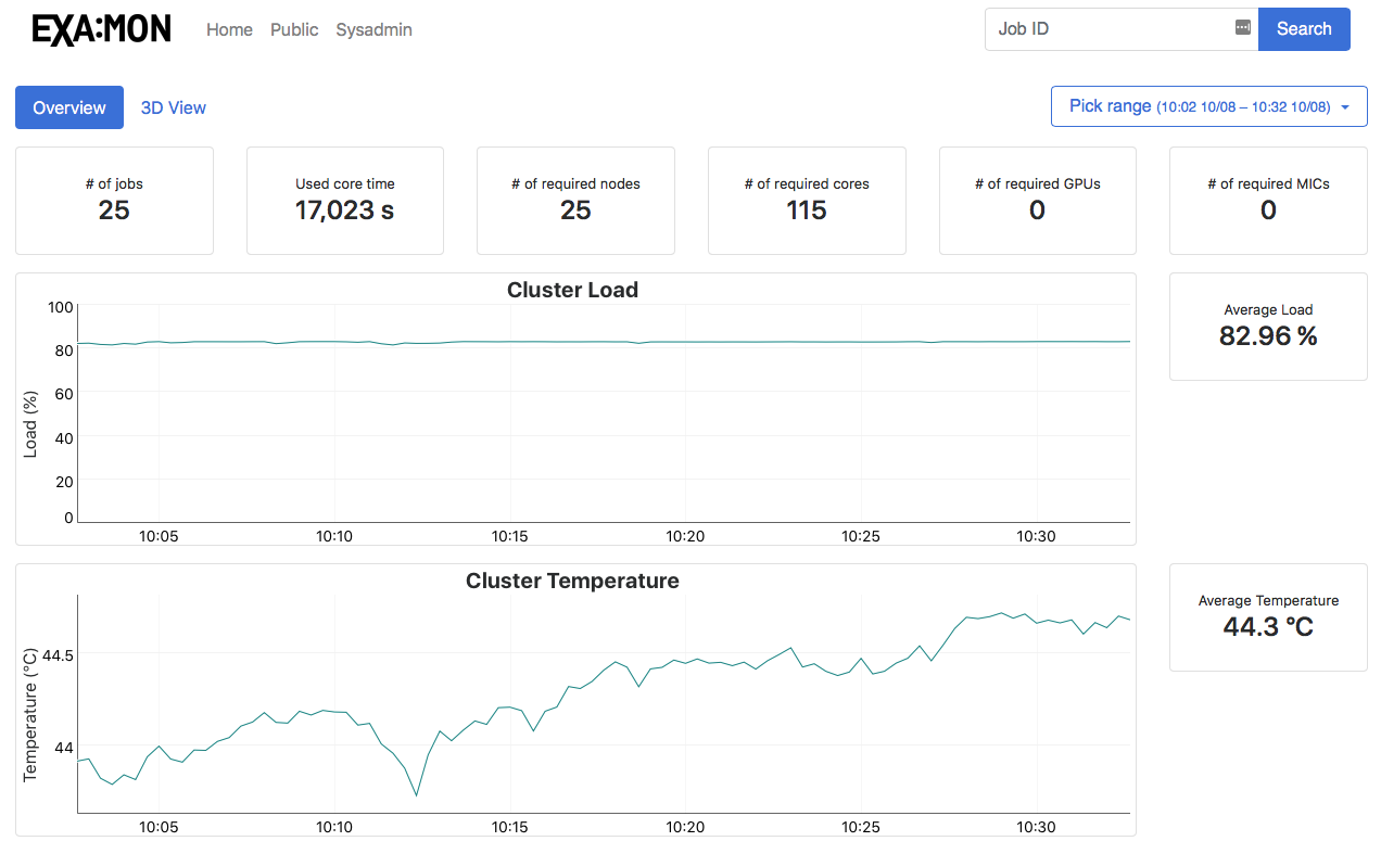
The Charts & Numbers
Charts are used for a viewing historical data in a timeline based fashion. This way you can see if the cluster behaves normally as it should or if there are some problems like huge raises in temperature. What you see below is a part of the public overview. These charts and big numbers use very aggregated dataset to show a meaningful information in a fast and easy way.
The 3D Model
And now comes the most super cool awesome part of all. The 3D model of the Galileo supercomputer. You can see it in action in the video on top (and if you didn’t see it, now is the right time to watch it). I took a Blender model which the good guys from CINECA prepared for me, did some small changes to it, converted it to a Blend4Web project, extracted the source files and integrated it into the webapp. Sounds easy, right? It uses WebSockets and MQTT to get the latest data and color-codes them so you can easily see what is happening with the cluster.
To sum it up, things are looking good and promising but there is still a lot of work to do. I didn’t even show another part of the job that displays the running jobs on Galileo and accompanying data to them.
So stay tuned!

[…] summer in Italy is not seeming to end but my stay here does. In my last post I showcased my work which was by that time almost done. From then, the looks didn’t change […]