Visualising the World Map of Supercomputers

“The greatest value of a picture is when it forces us to notice what we never expected to see.”, John Tukey.
Introduction
Data visualisation continues to change the way we see, interpret and understand the world around us. But it may be surprising to learn that visualisation techniques were actually embraced long before the age of computing. One example dates back to 1854, the John Snow’s visualisation that helped demystify the Cholera outbreak over the Soho district in London (Snow, 1855). John Snow, one of the fathers of modern epidemiology, made his famous map (Figure 1) of the Soho district, plotting the locations of death alongside street water pumps in the neighborhood. The visualisation provided the first clear evidence that linked cholera transmission to contaminated supply of water.
Here, I am introducing a visualisation that can help explore the world’s most powerful computers (i.e. supercomputers). The main purpose of the visualisation is to enable an interactive visual geo-exploration of the supercomputers worldwide. Thus, the visualisation can simply be considered as a pictorial representation of the Top500.org list. The rest of the post gives an overview of the visualisation, and how it was developed. The visualisation itself is accessible from the URL below:
https://goo.gl/sbapBc
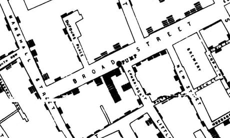
Figure 1: John Snow’s Cholera map.
Overview: Visualisation Pipeline
The visualisation is delivered through a web-based application. The visualisation was produced over the stages sketched in Figure 2. First, the data was collected from the Top500.org rankings according to the June 2017 list. It was aimed to get the top 100 supercomputers. The data was scraped using a Python script that mainly used the urllib and BeutifulSoup modules. In addition to rankings, the scraped data included location info (e.g. city, country), and specifications-related info (e.g. Rmax, Rpeak). The location info was utilised to get latitude and longitude coordinates using Google Maps API.
Subsequently, the data was transformed into the JSON format using Python as well. The JSON-structured data defined the markers to be plotted on the map. The JSON output is described as the “Data Layers” by Google Maps API. The map visualisation is rendered using Google Maps API along with the JSON data layers. Eventually, the visualisation is integrated within a simple web application that can provide interactivity features as well.
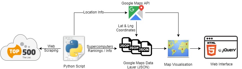
Figure 2: Overview of visualisation pipeline.
Visual Design
The visualisation is provided on top of Google Maps. The locations of supercomputers are plotted by markers as shown below in Figure 3. Three colours are used for the markers as follows: i) Green (i.e. rankings 1-10), ii) Yellow (i.e. rankings 11-50), iii) Orange (i.e. rankings 51-100).
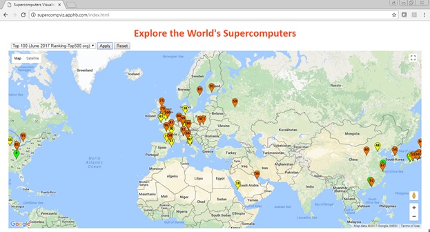
Figure 3: Visual design.
Interactivity
The user can easily apply filters (e.g. Top 10) using choices provided in a drop-down box. Moreover, the map markers are clickable, so that more detailed information on a particular supercomputer can be displayed on demand.
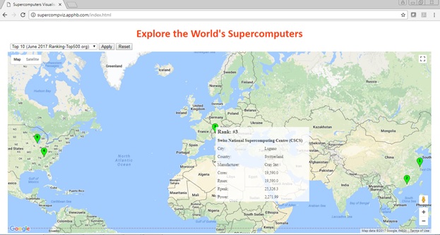
Figure 4: Viewing details on-demand.
References
Snow, J. (1855). On the Mode of Communication of Cholera. John Churchill.
The Guardian. (2013). Retrieved from: https://www.theguardian.com/news/datablog/2013/mar/15/john-snow-cholera-map

Very nice, but I think it would be helpful to have some form of spreading out around a center that has multiple computers. For example CSCS in Switzerland has multiple and with the Top 100 selected you can only see the 83rd, even though they have #3 as well (arguably more interesting).
What do you think of how they are spread geographically? Any insight?