An Interactive Visualisation to Explore the Top500 List
1. Introduction
Among many definitions of visualisation, I prefer when perhaps it was ideally described as the transformation of the symbolic into the geometric (McCormick, 1987). In this sense, visualisation methods are increasingly embraced to explore, communicate, and establish our understanding of data.
In this post, I present an interactive visualisation that can help explore the Top500 list of supercomputers. It was aimed to design the visualisation in an intuitive way that can synthesise and summarise the key statistics of the Top500 list. I believe that the produced visualisation can resonate with a larger audience whether within or outside of the HPC community. The rest of the post gives an overview of the visualisation, and how it was developed. Alternatively, the visualisation can be experimented directly from the URL below:
https://goo.gl/YywhU7
2. Overview: Visualisation Pipeline
The visualisation is delivered through a web-based application. The visualisation was produced over a set of stages as sketched in Figure 1. First, the data was collected from the Top500.org list according to the June 2017 list. The data was scraped using a Python script that mainly used the urllib and BeutifulSoup modules. Subsequently, another Python script was used to produce statistics out of the Top500 data such as the market share of vendors or operating systems. The statistics were stored into simple CSV-formatted files. The Python scripts are accessible from my GitHub below:
https://github.com/Mahmoud-Elbattah/Data_Scraping_Top500.org
The visualisation was created using the widely used D3 JavaScript library. Eventually, the visualisation was integrated within a simple web application that can provide some interactivity features as well.
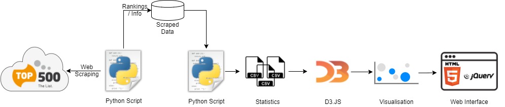
Figure1: Visualisation pipeline overview.
3. Visual Design
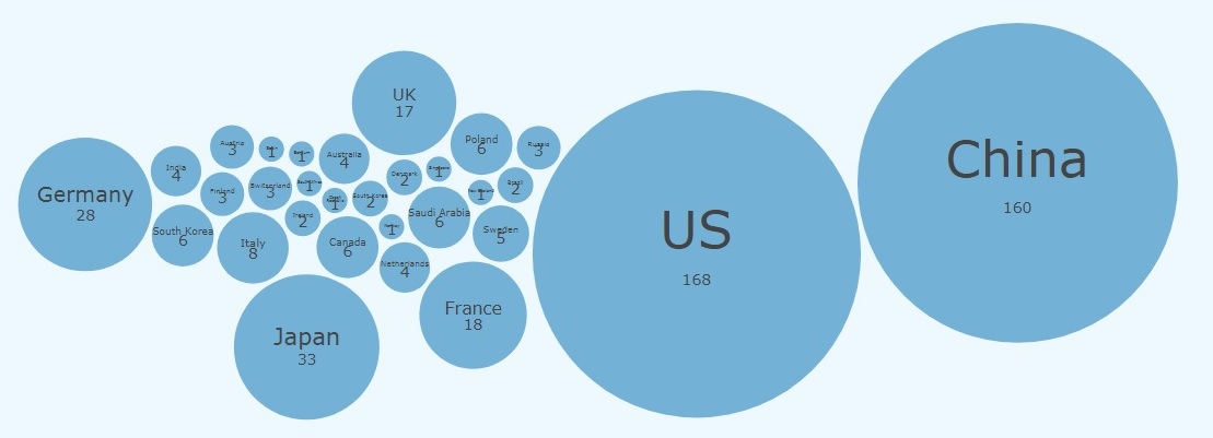
The visualisation mainly uses bubble charts for delivering the statistics about the Top500 list. Particularly, the size of a bubble represents the percentage with respect to the whole 500 supercomputers. For instance, Figure 2 shows a bubble chart that visualises the counts of supercomputers in countries based on the Top500 June 2017 list. Obviously, US and China have the highest number of supercomputers worldwide.
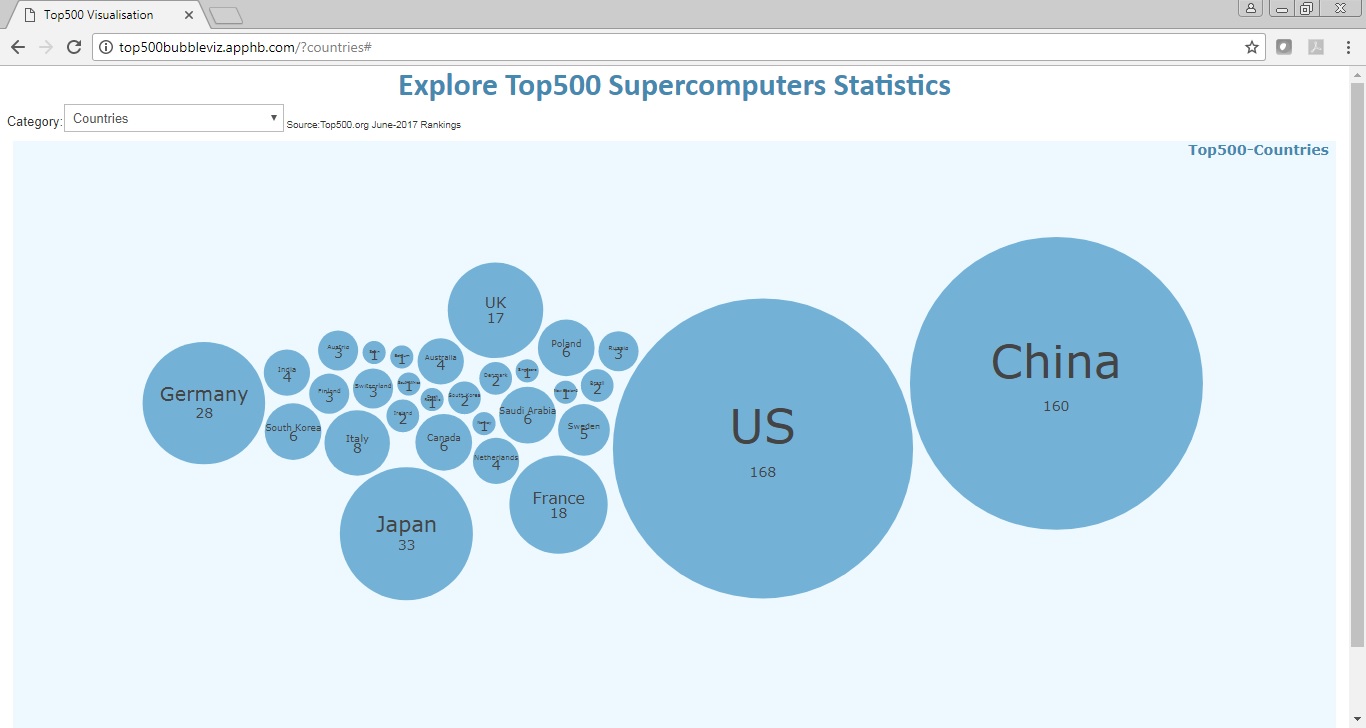
Figure 2: Visual design.
4. Interactivity
The user can choose a category provided in a dropdown box. The categories included: i) Countries , ii) Regions, iii) Segments, iv) Vendors, and v) Operating Systems.
Furthermore, a pop-up tooltip shows up when the cursor hovers a bubble. This can be very useful for viewing the information of small bubbles within the visualisation (e.g. Figure 3).
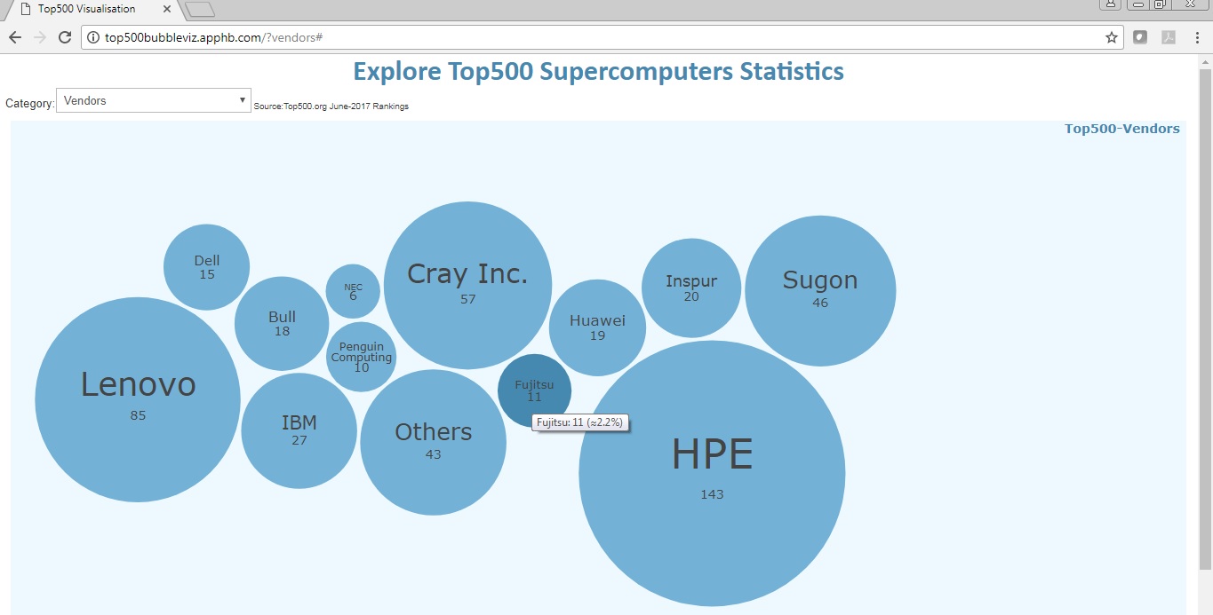
Figure 3: Visualisation interactivity.
5. Acknowledgments
The tutorial below provided by Jim Vallandingham helped a lot to produce the visualisation.
https://github.com/vlandham/bubble_cloud
References
McCormick, B. H. (1987). Visualization in Scientific Computing. Computer graphics, 21(6), 1-14

Leave a Reply