The Power of an Im-PECK-Able Viz

Bird pun, check. Now let’s move on to the next installation of Allison’s Summer of HPC blog!
A quick recap: my project is all about improving the accessibility of meteorological radar data for ornithologists at the University of Amsterdam. These data provide new insight into the migratory trends of different flocks, and the reason for changes to migration patterns. See the below posts for more info on my project and the SoHPC journey so far.
- SoHPC Orientation Week: a reflection
- Why give a flock about bird migration?
- Removing the data processing ‘bird’en with Spark
When I say ‘radar data’, I’m guessing that the first image that comes to your mind is a big ol’ circle with different blobs of blue and green on a retro screen in a submarine or airplane or some other militaristic vehicle. Maybe the screen is beeping and updating with every sweep, and the shapes are changing as the torpedo/alien starship is coming closer and closer to Air Force One (#hollywood). Am I right?
The important thing to recognise about this mental image is that: this may be the typical imagery associated with radar, but the data certainly isn’t readily accessible in this format. It’s all just numbers and figures with no discernible patterns. If I gave you a table (or worse still, a 1D array) of meteorological data like the below and told you to find the cloud, how do you think you would fare?
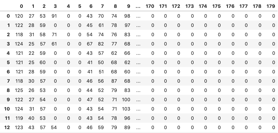
We need visualization to be able to make any use of this data! We need to turn this boring information into a visual that our brains can actually understand. Now what if I gave you this?
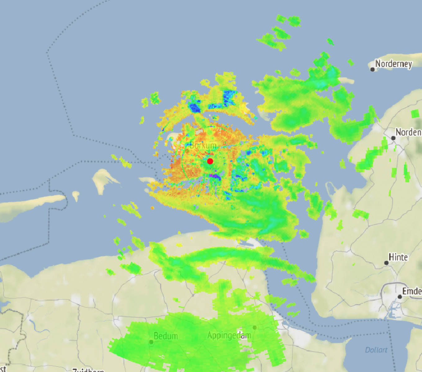
That’s more like it. Here we can clearly see the radar data represented in a way that is interpretable. Add in a time dimension (like in the gif at the top of this post) and Bob’s your uncle.
There’s a bit more complexity to visualizing radar data than you might first imagine. Image data is typically stored in 3D (height, width, and colour if a colour image), or 2D arrays (height and width if black and white). This is basically a matrix, or ‘gridded’ data, and it’s pretty easy to wrap your head around. Polar data, however, is not stored in this format. Instead of having x and y axes (width and height), a polar dataset basically collects data along different azimuths and radial distances. This data combines to form a circle with 360 data points at each range.
Azimuth: the horizontal angle or direction of a compass bearing. Ie. if you stand in a circle and do a twirl you’ll cover 360 azimuths.
Radial distance: the distance (in any metric) from measurement point to the fixed origin, being the radar.
The polar data structure can make it quite complicated to visualize this data. Most visualization tools require pixels to be stored in a tabular format, ie. all the horizontal pixels are stored in rows, and all the vertical pixels stored in columns. If you try to shove in polar data and tell the tool to start at the middle and go out in graduated circles: fail.
A crucial step in the data transformation pipeline that I am building is, therefore, ‘gridding’ the data. Conceptually, not too challenging: plotting out the circular data that we do have, and then filling in to the corners with null values. In practice, this was a lengthy process involving many documentation rabbit-holes.
def polar_to_grid(polar_array):
     # lots of code
     # more code

      return gridded_data
Et voila, we have a grid! The datapoint that was at the top left corner in the table above (ie. at azimuth 0 and radius 0) now becomes the datapoint at the very centre of our new grid.

With gridded data, things become much “easier”. Now we just have to generate longitude and latitude arrays that accurately reflect the geographical position of each datapoint, with consideration of the altitude of the radar, the elevation of the scan, and the curvature of the globe.
With a little help from some brilliant tools and libraries like Geoviews, Wradlib, Holoviews, Spark and Bokeh, we can create an interactive visualization tool that allows researchers to quickly access and visualize their data. They can stop wasting time on data structures, programming and stack trace errors, and focus on what’s more important for them: ornithology.
Hi all! I'm Allison, and I have the great pleasure of being one of the participants in the 2019 Summer of HPC Program. I am Canadian born, Australian raised, and I have just finished studying in Spain. My professional background is in analytics and research, and my recently completed Masters in Big Data Solutions led me to the PRACE summer program. Following this exciting orientation week in Bologna, I will be heading to Amsterdam. There, I will spend eight weeks working on a Data Architecture project with the e-Ecology team at SURFsara. The goal is to improve how ornithologists query and analyse bird migration radar data. My expertise is more in analytics and Data Science (rather than Data Engineering), so this summer is going to be an exciting new challenge! I can't wait to begin :)

Wow I had no idea how cool Radar is! Great Work!
I can see how this would be useful in a whole range of management activities.
Learning so much with every post Allison…thanks for enlightening me!
So it seems that birds of a feather DO flock together!
Interesting read. Hurt my head a bit, but in the good way.