Caves , Castles and CAD data extraction – these are the three key subjects of focus in this blog. Now, having spent more than a month in Ljubljana, I have been able to make some progress not only in my SoHPC project but also in exploring this beautiful place. So, let’s have a deeper look into the things.

Predjama Castle, Predjama, Slovenia

at the Predjama Castle

Over the past month, I got the chance to visit some of the magnificent sights in Slovenia including the Postojna Cave, the Predjama Castle and the Rakov Škocjan Valley. The feature picture is that of the Diamond which is the Symbol of the Postojna cave. It is around 5 meter high stalgamite formation and  is snow white – as if truly shining like diamonds.

What is CAD ?

CAD stands for Computer Aided Design, which is a technical discipline dealing with the application of computers or “Super Computers” to the design of products used in everyday life. The CAD model contains the geometric details of the product and is created using  a CAD modelling software such as SOLIDWORKS.  As mentioned in my previous post , the CAD model serves as the starting point for various computer based design validation techniques (numerical simulation) including Finite Element Analysis and Computational Fluid Dynamics. The terms “CAD data” or simply “CAD” are many a times used to refer to the CAD model, a convention followed in this post from now on.

Why is CAD so bad after all  ?

The CAD data as created by the designer, almost invariably contains many small details such as fillets, holes and small parts such as bolts and nuts which are not of much importance for the numerical simulation. An attempt to use this data directly for numerical simulation would result in much complex and sometimes even incorrect numerical models. Thus arises the need for CAD data extraction (also referred to as defeaturing or geometry cleanup) wherein, we extract the useful data from the CAD model. Usually, this is somehow handled manually within the pre-processor but is cumbersome and time consuming. As already mentioned in my previous post, this project aims at development of a utility for carrying out the defeaturing in a programmatic way and to automate the process.

How Do we correct it ? 

Before we go into the technical details of how this utility works, it is essential to know the hierarchy of the topological entities used for modelling in OpenCASCADE.

Solid -> Shell -> Face -> Wire -> Edge -> Vertex

The flow chart below describes the steps followed in this utility for geometry cleanup

  1. Import the CAD data as a .STEP file and sort all the solids present in the model according to their volumes.
  2. Remove all the solids with volumes below a threshold, as these are likely to form nuts, bolts ans other small parts not required for simulation.
  3. Removal of fillets : This step can be subdivided into sub-tasks as done below.
    1. Loop over each solid, recognize if it contains fillets and determine the type of fillet 
    2. Apply suitable algorithm for removing the fillet, depending on its type ( explained later in detail)

For the purpose of  debugging(removing “bugs” /errors present, so that the code does what it is expected to do), we use simple geometry as input. The input and the modified CAD model for such an example is presented below.

CAD Model of a Box with 4 isolated edge fillets

The modified model with the fillets removed


The next step in the process chain is the preparation of the CFD input files using the modified CAD data. A detailed description of this step along the different types of fillets handled in this utility will follow in the next post. So, stay tuned till then 🙂

Disclaimer: This post will not teach you how to build your own graphics engine. It may, however, delight and confuse you.

In my previous post (which you can find here) I introduced what radiosity is along with why and how we want to use it. In this post I’m going to get into a little bit more technical detail on the bits and pieces that go into computer graphics in general and are used to help in the final calculation of radiosity. To begin with, I’ll talk about how the z-buffer is used to sort out which polygons are visible in a scene. Just to remind you, polygons are the shapes (here I use triangles) that make up any and every object in a virtual scene.

Buffering… Please Wait

So you’ve got your virtual scene, perhaps a room filled with virtual doggos, and you’ve figured out how to put a little camera in it to view the scene (with a fancy perspective projection?) but how do you figure out which parts of the scene are visible to you? In the real world it’s easy, light from objects behind other objects simply doesn’t reach your eye, but when rendering a virtual scene the computer isn’t sending out billions of rays of light and checking what hits its virtual eye, that would be far too expensive. Instead we have to be clever about it and one way to do this is by using the z-buffer.

The basic idea is simple, for every polygon in your view, for every pixel inside that polygon, compare the depth of that pixel (typically the z-coordinate, hence z-buffer) with the value currently in the z-buffer to decide which pixel should be displayed. For two intersecting polygons the final z-buffer and rendered image look like this.

For a sample scene, a room with coloured walls and a white box inside, the z-buffer and final image looks like this.


Bro, Do You Even Clip?

During the projection step, but before we use the z-buffer, we choose a near plane, basically a kind of split in the scene separating polygons that are far from us from polygons that are too close to or behind the virtual camera. Any polygons in front of this plane should be rendered and any behind it should be discarded. However, there is the tricky situation of there being polygons that happen to have points on either side of the near plane. These polygons must be clipped, that is they are cut so that the bit that’s in front of the near plane remains and the bit behind it is discarded.

Below you can see the situations where no clipping is needed, where one point of the triangle is cut leaving two triangles, and lastly where two points are cut leaving just one smaller triangle.

Can You Make It Look Less… Tron?

So with the help of the techniques above I’ve actually managed to get a kind of first version completed of the rendering process. Check out the strange looking results below.

There’s a few things to notice that are wrong about the previous image. For one, it’s far too dark, radiosity must be being lost somewhere. Also, two neighbouring triangles should have similar shading values and it’s clearly seen in this image that the triangles seem to be forming a kind of stripy pattern. There’s also artifacts appearing between certain triangles because of the drawing method. The last problem I’m not too worried about but the first two are indicative of some kind of bug in the code. Maybe it’ll get fixed in time, maybe it won’t.

So it goes.

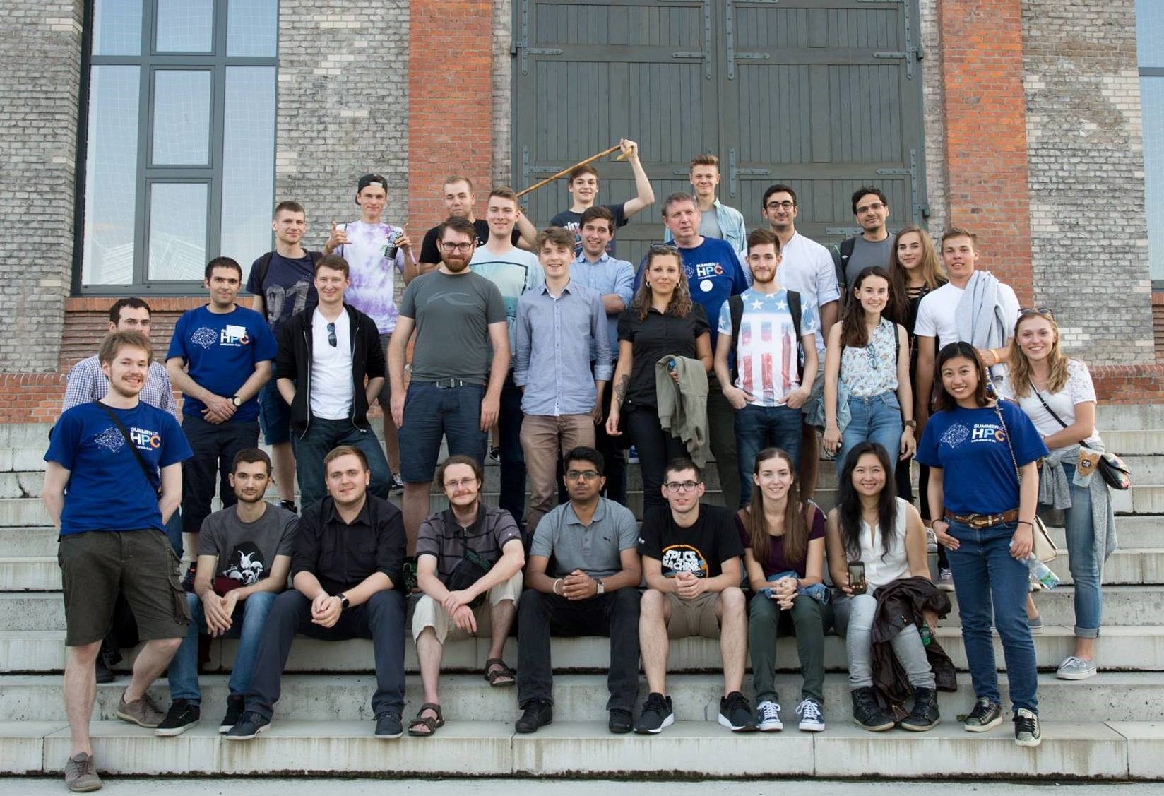
My first Monday morning in Copenhagen, Konstantinos and I met the guys working at the Niels Bohr Institute and we had a very delicious breakfast together. Seriously, Danish pastries are so good I can understand why the Danes named them after themselves!* Soon after that I was handed by my supervisor a paper with some notes about my project “Tracing in 4D data” (Check out my introduction blog post if you didn’t read it!).

By the afternoon on the same day I already completed 4 over 6 points of the notes’ list, getting familiar with my project, OpenCV and its implementation of various 2D object tracking algorithms, and having fun testing them with my laptop’s webcam. The next point was “Move to 3D”. That’s what I have been doing so far regarding my project and what I am going to talk about in this blog post.

In the next two sections you’ll find a description of the object tracking algorithms I implemented during my project. If you’re not interested in the math, you can skip directly to the last section where you can see some nice visualizations of the testing results of the algorithm!

*This statement is not true but made only for comical purposes. Use this joke at your own risk. Actually Danish pastries are called like this everywhere but in Denmark, where they are called Vienna Bread (wienerbrød), as they were first made in Denmark in 1840 by Viennese chefs! Click here to know more about this.


Median Flow

medianflow, object tracking

Forward-backward consistency assumption. [1]

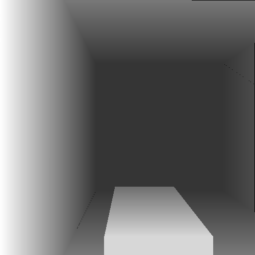
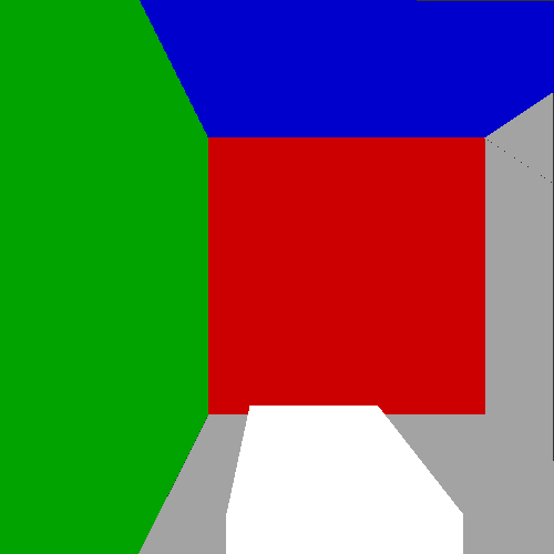
Median Flow is the algorithm I finally chose to generalise to 4D data among the ones from OpenCV after reading some academic papers. It [1] is mainly based on one idea: the algorithm should be able to track the object regardless of the direction of time-flow. This concept is well explained by the image on the right. Point 1 is visible in both images and the tracker is able to track it correctly: tracking this point forward and backward results in identical trajectories. On the other hand Point 2 is occluded in the second image and the tracker localizes a different point. Tracking this point backward the tracker finds a different location than the original one. In the algorithm the discrepancies between these forward and backward trajectories are measured and if they differ significantly, the forward trajectory is considered as incorrect. This Forward-Backward error penalizes these inconsistent trajectories and enables the algorithm to reliably detect tracking failures and select reliable trajectories in video sequences.

medianflow, block diagram

Block diagram of Median Flow. [1]

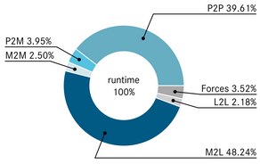
But how do you actually track the objects? Well, the algorithm’s block diagram is shown on the image on the left. The tracker accepts a pair of images (the current frame and the next consecutive frame of a video) and a bounding box that locates the object to track in the first frame, and it outputs a new bounding box that locates the object in the next frame. Initially, a set of points is initialized on a rectangular grid within the bounding box. These points identify the object and they are the actual elements tracked in the video. To track these points Median Flow relies on a sparse optical flow feature tracker called Lucas-Kanade [2]. You can read more about it on the next section. This is the ‘Flow’ part in ‘Median Flow’. The quality of the point predictions is then estimated and each point is assigned an error (a combination of Forward-Backward error and other measures). 50% of the worst predictions are filtered out and only the remaining predictions are used to estimate the displacement of the bounding box and scale change using median over each spatial dimension. This is the ‘Median’ part!

medianflow grid points

Median Flow at work. Red points are correctly tracked and the ones chosen to update the bounding box for the next frame.

To improve the accuracy of Median Flow we can use other error measuring approaches like normalized cross-correlation, which turns out it’s complementary to the forward-backward error! [1] The name sounds fancy but again the concept is very simple: we compare a small region around the tracked points in the current frame and the next one, and measure how similar they are. If the points are tracked correctly the regions should be identical. This is true under the assumption already made by optical flow based tracking.


Lucas-Kanade feature tracker

The Lucas-Kanade tracker is a widely used differential method for sparse optical flow estimation. The concept of optical flow is quite old and it extends outside the field of Computer Vision. In this blog you can think of optical flow as a vector that contains for every dimension the number of pixels a point has moved between one frame and the next. To compute optical flow firstly we have to make an important assumption: the brightness of the region we are tracking in the video doesn’t change between consecutive frames. Mathematically this translates to:

I(x,y,t)=I(x+\Delta x,y+\Delta y, t+\Delta t)

Then if the movement is small, we can develop the term I(x+\Delta x,y+\Delta y, t+\Delta t) using the first order from the Taylor series and we get:

I(x+\Delta x,y+\Delta y, t+\Delta t) = I(x,y,t) + \frac{\partial I}{\partial x} \Delta x+ \frac{\partial I}{\partial y} \Delta y+ \frac{\partial I}{\partial t} \Delta t

Now from the original equation it follows that:

\frac{\partial I}{\partial x} \Delta x+ \frac{\partial I}{\partial y} \Delta y+ \frac{\partial I}{\partial t} \Delta t = 0

Dividing by \Delta t we finally obtain the optical flow equation:

\frac{\partial I}{\partial x} V_{x}+ \frac{\partial I}{\partial y} V_{y}+ \frac{\partial I}{\partial t} = 0

where V_{x} and V_{y} are the velocities, or the components of the optical flow. We can also write this equation in such a way that it’s still valid for 3 dimensions in the following way:

\nabla I^{T} \cdot \vec{V} = - I_{t}

The problem now is that this is an equation in two (or three) unknowns and cannot be solved as such. This is known as the aperture problem of optical flow algorithms, which basically means that we can estimate optical flow only in the direction of the gradients and not in the direction perpendicular to it. To actually solve this equation we need some additional constraint and there are various approaches and algorithms for estimating the actual flow. The Lucas-Kanade tracker applies the least square principle to solve the equation. Making the same assumptions as before (brightness consistency constraint and small movement) for the neighborhood of the point to track we can apply the optical flow equation to all the pixels q_1, q_2, \dots, q_n in the window centered around the point. We obtain a system of equations that can be written in a matrix form Av = b where v is the optical flow and:


A = \begin{bmatrix} \nabla I(q_1) \\ \nabla I(q_2) \\ \vdots \\ \nabla I(q_n) \end{bmatrix}    and   b = \begin{bmatrix} - I_t (q_1) \\ - I_t (q_2) \\ \vdots \\ - I_t (q_n) \end{bmatrix}

And the solution is: v = (A^T A)^{-1} A^T b

Finally! Now we understand the classical Lucas-Kanade algorithm. But when we have to implement it we still have some ways to improve the accuracy and robustness of this original version of the algorithm, for example adding the words ‘iterative’ and ‘pyramidal’ to it [2].

Pyramidal implementation of Lucas-Kanade feature tracker

Pyramidal implementation of Lucas-Kanade feature tracker.

By ‘iterative’ I mean just iterate the classical Lucas-Kanade multiple times, using every time the solution found in the previous iteration and letting the algorithm converge. This is what we need to do in practice to obtain an accurate solution. The second trick is to build pyramidal representations of the images: this means to resize every image halving the size multiple times. So for example, for an image of size 640×480 and a pyramid of 3 levels we would also have images of size 320×240, 160×120 and 80×60. The reason behind this is to allow the algorithm to handle large pixel motion. The movement of a pixel is a lot smaller on the top level of the pyramid (divided by 2^L where L is the top level of the pyramid, exactly) . We apply the iterative algorithm to every level of the pyramid using the solution of the current level as initial guess of optical flow for the next one.

pyramidal iterative lucas kanade

Now the Lucas-Kanade feature tracker works quite well!


Reinventing the wheel to move forward

If you read the previous sections and you thought that there is nothing that cannot be extended to more dimensions, you are correct! Every step described up to now can be easily generalized to three dimensional volumes, Lucas-Kanade included The proof is left as an exercise for the reader . Everything I described is already well implemented by the OpenCV library for typical 2D videos. That’s why at first I started diving into the code of the implementations of OpenCV. But for me it was too much optimized to make something useful out of it. Let’s remember that the OpenCV project was started 18 years ago and the main contributors were a group Russian optimization experts who worked at Intel, and they also had 18 years to optimize it even more! As an epigraph written and highlighted just outside my office says: “Optimization hinders evolution”, and I guess I experienced this firsthand. To be fair to the OpenCV project, I don’t think it was ever the intention of the developers to implement 3D versions of the algorithms.

But enough ramblings! Long story short, I reinvented the wheel and did my implementation of these algorithms in Python using Numpy, then generalized them to work on 3D movies. To test the new Median Flow I generated my own 4D data to make the problem very easy for the algorithm, like for example a volume of a ball, and then applying small translations to the ball.

3D Median Flow test results.

3D Median Flow test results.

It works! Now we can try to make the problem a little more difficult and also have a bit of fun. For example, let’s add gravity to the ball! Or as my professor would say, let’s use a numerical integrator to solve the system of ordinary differential equations of the laws of kinematics for the ball subject to a gravitational field!

20 minutes to implement and about 5 hours of debugging, damn interpolation!

It took me way longer than I care to admit to make this.

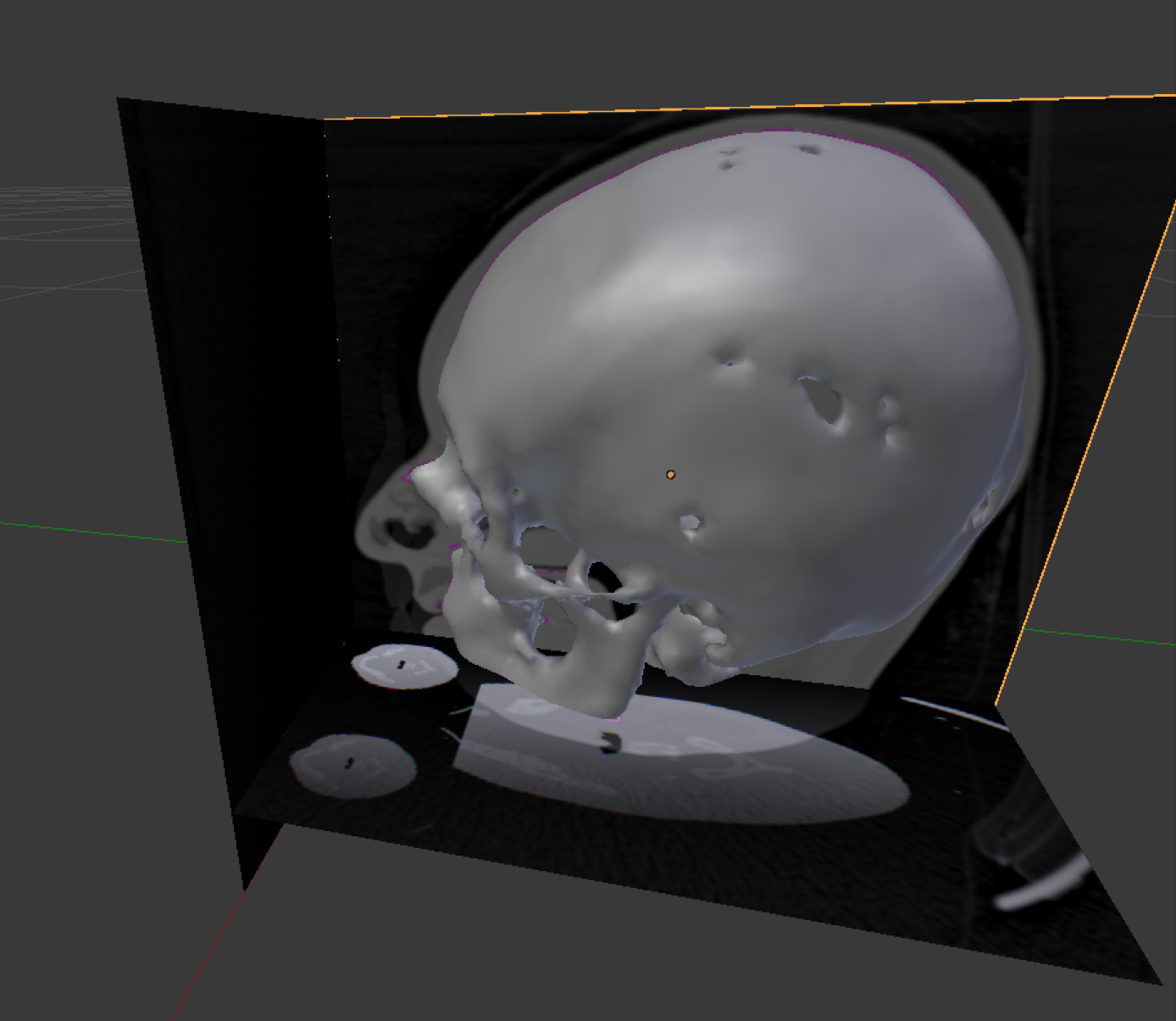
But it’s not just balls! The beautiful thing about the algorithm is that it doesn’t care about the object it is tracking, but we can apply it to any sort of data, for example 3D MRI data! Let’s generate some 3D movie applying again some translations to make the head move and then track something, like the nose!

Having fun with 3D Median Flow.

Having fun with 3D Median Flow. Database source: University of North Carolina

These toy problems are quite easy to handle for the algorithm because the object moves very slowly between one frame and the next one, and also they are quite easy to handle for my laptop since the sizes of the volumes is quite small. This is not the case for real world research data. Increasing the size of the data increases the computation required by the algorithm. Also when the object moves faster between frames we need to increase the total number of levels of the pyramidal representation and the size of the integration window for the Lucas-Kanade algorithm. This means even more computation, a lot more!

That’s why this is a problem for supercomputers and why I am moving onto the next point of my notes’ list: “High performance computing”. But this a topic for another blog post.


References

[1] Zdenek Kalal, Krystian Mikolajczyk, and Jiri Matas. Forward-backward error: Automatic detection of tracking failures. In Pattern Recognition (ICPR), 2010 20th International Conference on, pages 2756–2759. IEEE, 2010.

[2] Jean-Yves Bouguet. Pyramidal implementation of the Lucas Kanade feature tracker. Description of the algorithm. Intel Corporation, 5, 2001.

My project has reached a turning point! What I’ve now got is an Multipole2Local segment of the Fast Multipole Method written in C++ using HIP and thus it runs on both AMD and Nvidia GPUs. The next step is to start implementing neat memory hacks and data reuse schemes to optimize the running time.

Most of my time wasn’t spent writing new code, but instead debugging what I had previously written. And I’ve had quite a number of those bugs. At least this many, accompanied with the appropriate reaction of course. To visualize this work, I could’ve taken screen-shots of the error messages, but instead I’ll seize this opportunity to show you what sorts of neat bugs I’ve found around the office!

ladybug, c++, comment, bug

Epilachninae Syntaxerronia in its natural habitat, the source code. They mark their territory with compiler errors, which makes finding them quite easy. This particular individual has made it’s presence very clear with in-line comments in the hope of attracting mates, but that also makes it more susceptible to predators.

I know what you’re now thinking: “What’s this ‘Multipole2Local’ anyway?” and “Wait a minute, you’re slacking off! Halfway through the program and you’ve only got one part!”. Don’t worry, I’ll address these issues right away!

The Fast Multipole Method consists of five separate phases: Particle2Multipole, Multipole2Multipole, Multipole2Local, Local2Local and Particle2Particle. As I mentioned in my previous post, the area in which we want to compute the potential is divided into small elementary boxes. The box division is done by dividing the whole area into eight smaller boxes and each of those boxes is again divided into eight smaller boxes and so on, until desired coarseness of the division is reached. The smallest boxes are called elementary boxes. You can then describe the whole structure using an octree.

  • In Particle2Multipole phase, the spherical harmonics expansion of the potential function are calculated for each elementary box.
  • In Multipole2Multipole phase, the individual potential function expansions of elementary boxes are shifted up the octree and then added up as the potential function of each parent box.
  • In Multipole2Local phase, the far-field effects of several spherical harmonics expansions are converted into a local Taylor expansion of the potential function.
  • In Local2Local phase, the Taylor expansions are added up and shifted down the octree. Now the far-field potential are represented as an Taylor expansion in each elementary box.
  • Finally, in Particle2Particle phase, the near-field potentials are calculated classically pairwise.

The reason for working with just one segment of this algorithm becomes apparent from the following figure:

The runtime measurement of each segment of the algorithm [1].

Most of the runtime is spent in converting multipole expansions into local Taylor expansions, so there’s more speedup attained from optimizing the M2L segment than other parts. This project is an unusual one from the high-performance computing point of view, since usually you want to reduce the program runtime from several days to several minutes, but now we want to go from 2 milliseconds to 1 millisecond. In order to do that, one needs to utilize all sorts of non-trivial tricks close to the hardware.

moth, segfault, cuda, hip, c++, bug, white

A rare picture of Heterocera Segfaulticus. This nocturnal species is quite elusive, as they’re usually encountered during runtime, but its nutrition, liberal usage of memcpy and funky pointer arithmetic is found nearly everywhere. The large eyes are optimal for detecting tasty binaries in low-light environments.

The memory bandwidth acts as a bottleneck in this computation problem, which means that cutting down memory usage or speeding it up are the ways to increase the efficiency. There are now two ways to proceed: to look into the usage of constant (or texture) memory of GPU, which cannot be edited during computation kernel execution, but accesses to it are faster than in global memory. On the other hand, on the GPU we have FLOPSs in abundance so we wouldn’t need to store any data, if we could compute it on the fly. These are the approaches I will be looking into during the rest of my stay in Jülich Supercomputing Center.

In other news, I took a break from all of this bug-hunting and coffee-drinking and paid a weekend-long visit to Copenhagen, at another Summer of HPC site, where Alessandro and Konstantinos are working on their fascinating projects. Their workplace is the Niels Bohr Institute, which is the same exact building, where Niels Bohr, Werner Heisenberg and other legendary physicists developed the theory of quantum mechanics in the 1920s. And nowadays, the building is overrun with computer scientists; these truly are the end times.

The overall visit was a bit less about projects and a bit more about partying, though. In addition, we figured out how to run a Danish coffee machine and met a cool cat.

The Niels Bohr Institute in Copenhagen. Those vertical rails with some smaller sticks protruding out of them is a beautiful lighting setup which represents particle measurements at one of those enormous detectors at CERN.

References:

[1] I. Kabadshow, A. Beckmann, J. Pekkilä: Keep On Rolling. Pushing the Hardware Limits with a Rotation-based FMM, GPU Technology Conference posters, P7211, (2017).

August 7th 5:30 am, Copenhagen Central Station. I spent the weekend exploring the city along with my roommate Alessandro and my friend Antti, who traveled from Jülich to visit us. Among other activities, we walked the helical corridor to reach the top of the Rundetaarn or Round Tower and attended an outdoor chill-out music festival. Unfortunately, it was time for Antti to take his train so we said goodbye and promised to meet soon. Since the day was young, we decided to keep biking and enjoy the sunrise by the waterside. What better place for an excursion than the Langelinie promenade and the world famous statue of The Little Mermaid? Soon we were enjoying the view, clearing our minds while the city was slowly waking up.

10 am, Niels Bohr Institute. With a cup of coffee in my hand, I was ready to address the challenges of the day. But “what is the project you are working on”, you may ask. As I explained in a previous post, my summer mission is to improve the performance of the ocean modeling framework Versatile Ocean Simulation (Veros). Implemented in pure Python, it suffers from a heavy computational cost in the case of large models, requiring the assistance of Bohrium – an automatic parallelization framework that acts as a high performance alternative for the scientific computing library NumPy, targeting CPUs, GPUs and clusters. However, Bohrium can only do so much; even when it outperforms NumPy, simulations are still time consuming. It is clear that an investigation of the underlying issues behind the performance of Veros is essential.

Naturally, during the initial period, my time was mostly spent studying both the Veros documentation and the respective source code. I configured the environment for running existing model setups and experimented with the available settings. Running local tests and benchmarks of various models and backends, including NumPy and Bohrium, helped me familiarize myself with the basic internal components and the hands-on workflow of the ocean simulations.

The golden rule of optimization is: never optimize without profiling the code. Thus, I embarked on a quest to execute large scale simulations, from hundreds of thousands to millions of elements, in order to compare the performance with and without the use of Bohrium and analyze the running times of the core methods to identify possible bottlenecks. Such benchmarks are computationally intensive so I scheduled ocean models of different sizes to run on a university cluster for long periods of time. As expected, Bohrium becomes more efficient than NumPy if the setup contains at least a million elements. Among the most time-consuming methods in the core of Veros are isoneutral mixing and advection, even though they are straightforward number-crunching routines and Bohrium should theoretically accelerate them to a greater degree.

bohriumIn other words, Bohrium makes a difference when the number of elements exceeds a certain threshold but there is still much room for improvement. Towards this direction, there are two possible plans of action: replace certain slow parts with handmade optimized and parallelized code or modify the existing NumPy code in order to improve its acceleration by Bohrium. For the former scenario, I am working on porting methods to Cython by adding static types and compiler directives in order to diverge from the dynamic nature of the language and speed up these specific segments independently of Bohrium. I also intend to take advantage of Cython’s OpenMP support in order to enable parallel processing via threads. For the latter part, I need to study the internal details of Bohrium and examine the C code produced by it for these time intensive methods.

There are multiple possible paths to be considered and tested as solutions for the problem. In the next weeks I will attempt to implement and compare them, making sure that performance gains by Bohrium are not affected by these changes. On the contrary, Bohrium should benefit from the code restructure. Besides working on the project, I plan to visit more beautiful sights of Copenhagen and make a dedicated blog post about the city if there is enough time!

During this summer I’m trying to get a little better every day. As a hiking enthusiast, I really love to get on track during weekends. Scottish Highlands paths seem to be slightly worse maintained and much less congested than Tatra Mountains paths. It is great for someone who likes to get off the beaten track sometimes.

Land of Highlanders

View of Edinburgh from the Caerketton Hill

Last two weekends I walked almost 100km by foot. The tracks and peaks of Pentland Hills Regional Park, the nearby town, villages and various types of chapels had become my goal. Even 12 rainy days in a row could not stop me from seeing the moorlands. My feet have hurt afterwards but it was really worth it – the views were breathtaking.

I’ve also visited the National Museum of Scotland in Edinburgh. I would be lying if I said that I had been expecting it to be that large! The museum has 8 floors and a roof terrace. There was a huge number of exhibitions, half of them about Scottish history and achievements.

Let’s get back to business

Hiking wasn’t the only thing I did here in Edinburgh. I’ve been progressing with my project too. However, since my last post, some news emerged:

  • It will be hard to set up any new web services designed by me on the EPCC servers
  • My goal has changed to prepare the best front-end visualisation possible
  • This way if EPCC authorities like my front-end work, maybe they will pursue on setting up back-end services for it.


The best examples of data visualisation I’ve ever seen.

Andy, my mentor, has given me an inspirational book – “Information is Beautiful” by David McCandless. It’s easy to read and funny – an exceptional example of a data visualisation masterpiece. After finishing it by myself I can suggest it as a great idea for a gift for anyone, even someone not interested in data visualisation.

I’ve started learning and working with Angular. In my previous post, I’ve explained what it is. Now I feel obligated to talk a bit about my work with this framework. Its architecture is similar to an architecture of many other MVC (model-view-controller) or MVVM (model-view-view model) engines. Under the hood, Angular uses modern web browser capabilities to render highly optimized code that is previously compiled from TypeScript and template syntax. It introduces modularity, routing, testing, animations, accessibility and much more features that are desirable for fast and easy to develop Single Page Applications.

One of the most promising features seems to be its modularity. Each app consists of modules which combine components, directives and services. Templates are written in special Angular syntax and component’s code is written in TypeScript. The view is combined with the controller through one-way binding: either property or event binding.

Overview of Angular architecture.

Last time I’ve also mentioned something about D3.js. It’s the JavaScript library for HTML canvas and SVG manipulation. I’ve decided to use the Angular module called ngx-charts which combine Angular and D3 power. This module provides me with many customizable charts out of the box. It also allows for constructing custom charts by leveraging the various components that it exposes. It will be very useful to realize the data visualisation ideas that have arisen in my head since the beginning of the holidays and were even more boosted by the previously mentioned book.

1. The Problem
Sharing data among researchers is usually an afterthought. In our case, data is already shared publicly on a data repository, which is called DSpace. DSpace serves as an open-access repository for scholarly data published in various scientific fields. The main focus here is on the climate data.
Through DSpace, climate researchers and institutions can easily share their datasets. However, shared files can be considered as a “black box”, which needs to be opened first in order to know what is inside. In fact, climate simulation models generate vast amounts of data, stored in the standard NetCDf format. A typical NetCDF file contains a set of many dimensions and variables. With so many files, researchers can waste a lot of time trying to find the appropriate file (if any).
The goal of our project is to produce intelligible metadata about the NetCDF-based data. The metadata is to be stored and indexed in a query-able format, so that search and query tasks can be conducted effectively. In this manner, climate researchers can easily discover and use NetCDF data.

2. Data Source
As already mentioned, the DSpace repository is the main data source of NetCDF files. DSpace is a digital service that collects, preserves, and distributes digital material. Our particular focus is on climate datasets provided by Dr Eleni Katragkou from the Department of Meteorology and Climatology, Aristotle University of Thessaloniki. The datasets are available through the URL below:
https://goo.gl/3pkW9n

3. Background: NetCDF Files (Rew, & Davis, 1990) and (Unidata, 2017)
As the NetCDF format is usually used within particular scientific fields such as life sciences and climatology, it is expected that the reader may not be familiar with it. This section serves as a brief background to the NetCDF format, and its underlying structure.
NetCDF stands for “Network Common Data Form”. It emerged as an extension to NASA’s Common Data Format (CDF). The NetCDF is defined as a set of software libraries and self-describing, machine-independent data formats that support the creation, access, and sharing of array-oriented scientific data. NetCDF was developed and is maintained at Unidata.
Unidata is a diverse community of education and research institutions with the common goal of sharing geoscience data and the tools to access and visualise that data. Unidata aims to provide data, software tools, and support to enhance Earth-system education and research. Funded primarily by the National Science Foundation (NSF), Unidata is one of the University Corporation for Atmospheric Research (UCAR)’s Community Programs (UCP).
The NetCDF data abstraction models a scientific data set as a collection of named multidimensional variables along with their coordinate systems and some of their named auxiliary properties. The NetCDF abstraction is illustrated in Figure 1 with an example of the kinds of data that may be contained in a NetCDF file. Each NetCDF file has three components: dimensions, variables, and attributes.
A variable has a name, a data type, and a shape described by a list of dimensions. Scalar variables have an empty list of dimensions. The variables in the example in Figure 1 represent a 2D array of surface temperatures on a latitude/longitude grid and a 3D array of relative humidities defined on the same grid, but with a dimension representing atmospheric level. Any NetCDF variable may also have an associated list of attributes to represent information about the variable.

Figure 1. An example of the NetCDF abstraction.

4. Project Objectives
Basically, we are attempting to facilitate search and query of NetCDF files uploaded to the DSpace repository. A set of objectives were defined as below:

  1. Defining the relevant metadata structure to be extracted from NetCDF files.
  2. Extraction of metadata from the NetCDF files.
  3. Storage/indexing of extracted metadata.
  4. Supporting search/querying functionalities.

The project is developed in a collaboration between GrNet and the Aristotle University of Thessaloniki. GrNet provides us with access to the ARIS supercomputing facility in Greece, and they also manage the DSapce repository.

References
Rew, R., & Davis, G. (1990). NetCDF: An Interface for Scientific Data Access. IEEE Computer Graphics and Applications10(4), 76-82.
Unidata. (2017). Retrieved on 10/08/2017 from http://www.unidata.ucar.edu/about/tour/index.html

Hello everyone,

Greetings from Edinburgh’s sunny festival season 🙂

During the past few weeks I have been both exploring this vibrant city and cultivating my Python programming skills. I will give you more details about how my work has been going, but first let me introduce you to some of the adventures I’ve had. From Edinburgh castle to Museums of Modern art and street performances this city has it all. The local pubs have their own vivid rhythm and the traditional delicious fish and chips combination. We were even brave enough to try haggis and deep fried mars bars here. 🙂

But I think the most adventurous day I have had during this trip was hiking in the Pentland Hills Regional Park. The route was challenging and the weather unpredictable, but we managed to complete our mission and climb up and down the hills with the moor flowers.

Fringe Festival 2017

Let’s take a hot chocolate, a cup of tea now and take a closer look at my journey with Python and Geology!!! 🙂

The idea to use automated algorithms to facilitate the work done by geologists (as far as geological interpretation is concerned) is not new, but a recent increase in research conducted in the field of machine-learning and the implementation of neural network methods proves that it is time to revisit the topic. That was the motivation for my project for SoHPC project at EPCC in collaboration with the British Geological Survey(BGS).

Map of boreholes in the Netherlands and Dutch sea

During my summer internship, I have been familiarizing myself with methods concerning the simultaneous correlation of multiple well logs and have also been understanding their current challenges and limitations. This research field has been very new to me but still I find it very exciting. In general, I have focused on implementing Python tools and libraries to the preprocessing of well log data from the Netherlands and the Dutch sector of the North Sea continental shelf. Understanding which parameters and measurements will be of greater use to geologists has also been part of my work conducted through publication and literature search.

After the preprocessing is complete I will implement already existing well log correlation methods based on the preprocessed data. In this way, geologists will be able to evaluate the limitations of the existing methods and the quality of specific well log measurements. The next step would be to create a neural network based application for the automatic and simultaneous well log correlation. The preliminary design and concept on which I am currently working on has proven to be challenging as well.

So I am really looking forward to the final results of this effort in the future and I am more than excited to be participating in such an interesting project.

And just to give you a glimpse of well log correlation results, please see below 🙂

Left : Density distribution as a function of depth for various well logs. Right : After well log correlation the density of the well logs as a function of relative geologic time .


Since in the last entry I promised that I am going to talk about the comparison between the fixed point method and the projected gradient method I will dwell on this. But first of all, let me show you some of these magnificent places where we have been to during the last few weeks.

Besides probably the most famous cave in Slovenia (Postojna cave) we also visited a few smaller and less known caves, e.g. in Rak Skocjan, which were all very interesting. In fact, Rak Skocjan is the oldest landscape park in Slovenia and it is basically a valley which is enclosed on all sides by cliffs.

On our way to a cave

Inside a cave that belongs to Rak Skocjan

Another impressive place that we have inspected was Lake Cerknica which is an intermittent lake. During the winter it turns into the largest lake in Slovenia but during the summer it totally dries out. Luckily, we attended the lake early enough, so we could still find a part that even allowed us to swim.

The totally dried out Lake Cerknica with its sinks that make it look like from another planet

At this point I want to thank our supervisor Leon Kos who brought us to these hidden places with his car!


In my last blog entry I briefly introduced the topic of the project. After fixing some bugs of the fixed point method implementation, it is now possible to compare the results with the projected gradient method. In particular, one could have a look at the quality measure RSE again in order to observe a difference in the behaviour of convergency. For this purpose, I created a randomly chosen test case and ran 500 iterations for both methods. In the following figure you can see that the fixed point method converges much slower to the solution than the projected gradient method.

trend of quality measure RSE for both FPM and PGM

Nevertheless, for the PGM we measured a noticable larger execution time. This can be justified with the rather expensive computation of a step size in each iteration that leads to accurate results. How much faster the fixed point method compared to the projected gradient method is will be clarified in the next post where I will come up with some benchmarks.

What is a high-performance computer (HPC)? In simple terms, nowadays it is a cluster of innumerous ‘mini’ computers (nodes) interlinked by the same network. When a big calculation is submitted to the HPC, it will be fragmented into thousands of millions of mini tasks to be completed by individual nodes simultaneously. Hence the speed of the calculation is improved.

However, sometimes you have to wait for the results from one task in order to complete another task. Hence the mini tasks cannot be split as evenly as we want between all nodes. Therefore, there are always some nodes that are busier than  others. But how do we know this information and make sure the scheduling process is as fair as possible? Obviously, it is impossible to schedule millions of tasks manually to optimize the process as lots of computing time is wasted – which is neither fast or economical.

Yes! My group in IT4I has foreseen the problem and started solving it by developing a package containing a C++ core with a Python interface. My job here is to develop python code to describe the traffic between different nodes visually, as shown in the figure below:

A network diagram showing nodes traffic

This is a network diagram showing the traffic between the server and 8 workers (0-7). The arrows represent the flow of data between each worker. The width corresponds to the volume of data. Clearly you can see there is a large amount of data being exported from W0 to W5 as well as from W3 to W6. Finally, after huge, tedious communication between all workers, they send their final results to the server and the results are finally returned to us.

In the process of making this I have compared two python modules which can generate network diagrams; NetworkX and Graph-tool. NetworkX focuses on the network analysis and network related data mining, e.g. finding the shortest path between two nodes. However, since more or less all nodes communicate with each other, there is no important shortest path for us. On the other hand, Graph-tool is good at more general data-visualisation and less focused on network analysis.

So, do you know which module I chose to draw the graph above? 😉

In my previous post it was all just dry theory and nothing to show (apart from a great food picture). Today the post will only be about presenting the “cool stuff”, and for that, just for you guys, my buddy Arnau filmed my horrendous face showing you what I have been working on.


SPA scheme

Scheme of the web application

I’ve been really busy the last couple of weeks developing the web application, and I am glad to say that most of the heavy lifting is done. The web app I developed somehow works (sometimes even I wonder how that is possible).

I used the modern approach to building it. This means that the front-end runs on your browser and it only requests data from the server via a REST API and WebSockets. This methods has its ups and downs but let’s say for this kind of webapp it is the best solution.

The figure on the right should help you get the general idea and show the big picture. I am not going to explain the architecture and boring stuff of the back-end but rather show the fancy things on the front-end that can be separated to 3 parts:

  • charts (cool)
  • one single number (fancy)
  • interactive 3D model of the Galileo supercomputer (super mega awesome)

The Charts & Numbers

Charts are used for a viewing historical data in a timeline based fashion. This way you can see if the cluster behaves normally as it should or if there are some problems like huge raises in temperature. What you see below is a part of the public overview. These charts and big numbers use very aggregated dataset to show a meaningful information in a fast and easy way.


The 3D Model

And now comes the most super cool awesome part of all. The 3D model of the Galileo supercomputer. You can see it in action in the video on top (and if you didn’t see it, now is the right time to watch it). I took a Blender model which the good guys from CINECA prepared for me, did some small changes to it, converted it to a Blend4Web project,  extracted the source files and integrated it into the webapp. Sounds easy, right? It uses WebSockets and MQTT to get the latest data and color-codes them so you can easily see what is happening with the cluster.

To sum it up, things are looking good and promising but there is still a lot of work to do. I didn’t even show another part of the job that displays the running jobs on Galileo and accompanying data to them.

So stay tuned!

In today’s blog post, I’ll talk about the successful (yaaaay!) progress of my project with a technical point of view. So if you are into Computer Science, I’m sure you will find this interesting! This post will be structured using some small pieces of the scientific article we’re writing, but of course I can’t write everything about the research here.


Introduction


Figure 1: Apache Spark architecture

Apache Spark applications written in Scala run on top of the JVM (Java Virtual Machine) and because of this they cannot match the FPO performance of Fortran/C(++) MPI programs which are compiled to machine code. Despite this, it has many desirable features of (distributed) parallel applications such as fault-tolerance, node-aware distributed storage, caching or automated memory management (see Figure 1 for an overview of the Apache Spark architecture). Yet we are curious about the limits of the performance of Apache Spark applications in High Performance Computing problems. By writing referential code in C++ with MPI and also with GPI-2 for one-sided communication, we aim to carry out performance comparisons.


We do not expect the resulting code to be, in terms of performance, truly competitive with MPI in production applications. Still, such experiments may be valuable for engineers and programmers from the Big Data world who implement, often computationally demanding algorithms, such as Machine Learning or Clustering algorithms.


Some literature review


Figure 2: HDFS architecture

In the same way as was mentioned in previous work, it has been widely known that High Performance Computing frameworks based on MPI outrun Apache Spark or HDFS-based (see Figure 2 for an overview of the HDFS architecture) Big Data frameworks, by usually more than an order of magnitude for a variety of different application domains, e.g., SVMs & K-nearest neighbors clustering, K-means clustering, graph analytics, and large scale matrix factorizations. Recent performance analysis of Spark have shown that computing load was the main bottleneck in a wide number of Spark applications, particularly during the serialization and deserialization time.

It has been shown that it is possible to extend pure MPI-based applications to be elastic in the number of nodes using periodic data redistribution among required MPI ranks. However, this assumes that we are still using MPI as the programming framework, hence we do not get the significant benefits of processing with Apache Spark required for large scale data, such as node fault tolerance.

Unlike previous approaches described in previous work, in what we are investigating we propose a fair comparison, with similar implementations of algorithms in Spark on HDFS and in C++ on MPI. We will run both algorithms with distributed data along commodity cluster architectures inside a distributed file system, using a one-sided communication approach with native C libraries that create an interface to encapsulate the file systems functionalities so as to preserve node fault tolerance characteristics exhibited by Spark with HDFS implementations.


Partitioned Global Address Space


To provide our non-Spark applications with a Fault Tolerance features, we’ve used the GASPI API for the Partitioned Global Address Space (PGAS).

Figure 3: GASPI one-sided communication segment-based architecture

GASPI is a communication library for C/C++ and Fortran. It is based on a PGAS style communication model where each process owns a partition of a globally accessible memory space. PGAS (Partitioned Global Address Space) programming models have been discussed as an alternative to MPI for some time. The PGAS approach offers the developer an abstract shared address space which simplifies the programming task and at the same time facilitates data-locality, thread-based programming and asynchronous communication. The goal of the GASPI project is to develop a suitable programming tool for the wider HPC-Community by defining a standard with a reliable basis for future developments through the PGAS-API of Fraunhofer ITWM. Furthermore, an implementation of the standard as a highly portable open source library will be available. The standard will also define interfaces for performance analysis, for which tools will be developed in the project. The evaluation of the libraries is done via the parallel re-implementation of industrial applications up to and including production status.


One of the proposed benchmarked algorithms: K-Means clustering


To benchmark the different approaches we propose, we have implemented some algorithms, one of them being K-Means clustering. K-Means clustering is a technique commonly used in machine learning to organize observations into k sets, or clusters, which are representative of the set of observations at large. Observations (S) are represented as n-dimensional vectors, and the output of the algorithm is a set of k n-dimensional cluster centers (not necessarily elements of the original data set) that characterize the observations. Cluster centers are chosen to minimize the within-cluster sum of squares, or the sum of the distance squared to each observation in the cluster:

where Si is the set of observations in the cluster i and ui is the mean of observations in Si.

This problem is NP-hard and can be exactly solved with complexity O(ndk+1 log n). In practice, approximation algorithms are commonly used to get results that are accurate to within a given threshold by terminating before finally converging, but these algorithms can still take a significant amount of time for large datasets when many clusters are required.


The main steps of K- means algorithm are as follows:

  1. Select an initial partition with K clusters; repeat steps 2 and 3 until cluster membership stabilizes.
  2. Generate a new partition by assigning each pattern to its closest cluster center.
  3. Compute new cluster centers.


The following illustration shows the results of the K-Means algorithm on a 2-dimensional dataset with three clusters:


We’ve tested our implementations of the algorithm using different datasets, some artificial and some real data obtained from some bioinformatics studies from researchers at the Biology Faculty of the Slovak Academy of Sciences. The artificial data goes up to more than 10 million samples with 2 dimensions for some instances (to benchmark computational time), and also some high dimensional (more than 100 dimensions) instances (to benchmark time resilience).

So that’s all for today, if you are really interested about the work that’s going on, just wait for the next blog post or for the article to be published (if we’re lucky enough). Here is a video of the city of Bratislava celebrating my progress with some fireworks:


Over the past decades, the planet has been experiencing worldwide climate change. In particular, the global warming process is characterized by drastic weather events, such as long periods of drought, or short intense precipitation. These can crucially affect vegetation and animal species on our planet, including human beings.

The impact of global warming is expected to be especially strong in the Mediterranean regions which together with the North Eastern European regions, emerge as the primary hot-spots. Realistic predictions of how the climate will evolve and assessing the relative impact of human behavior upon global warming, is essential for advertising a strategy to avoid and contrast negative impacts.


Changes in average temperature over Southern Europe. Gray color refers to the current climate (up to 2017). Dots refer to the average annual temperature values, and the line to the 5-year rolling average. Credit: Sofiadis Ioannis, 2017, Study of Climate Change over Europe for the 21st Century with the use of regional climate simulation driven by the RCP8.5 scenario

The international scientific community thus plays a fundamental role in understanding and predicting the effects of climate change. By means of numerical models, it is possible to simulate processes occurring in climate systems which allows the forecast of their evolution over time. Today, climate models are more complex and computationally expensive than when they first appeared. As a consequence, they are also much more demanding with regards to computing and storage requests.

In my project I am handling output data from the regional climate Weather Research and Forecasting (WRF) model, a numerical weather prediction system for both atmospheric research and operational forecasting needs, which can generate atmospheric simulations using real data (observations, analyses) or idealized conditions. It has been developed by the National Center for Atmospheric Research (NCAR), the National Oceanic, the Air Force Weather Agency (AFWA), the Naval Research Laboratory, the University of Oklahoma, and the Federal Aviation Administration (FAA).

Probability distribution function trend over time.
Credit: Intergovernmental Panel on Climate Change, 2007

The use of visual representations has always been – and is – an integral part of climate science as it helps scientists to better understand complex climate phenomena. Model output of the WRF model are stored in the NetCDF (Network Common Data Form) format, which is very common in the climate community because of its advantages. For instance, it includes information about the data it contains, it can be accessed by computers with different ways of storing integers, characters, and floating-point numbers; a small subset of a large dataset may be accessed efficiently; and data may be appended to a properly structured NetCDF file without copying the dataset or redefining its structure.

In the past three weeks, I focused on temperature variation, which is the most evident feature of climate change. I wrote some pipelines in order to extract all the information from different NetCDF output data of a “pessimistic” simulation. What does a mental attitude like pessimism have to do with climate models? Well, the most relevant impact on climate evolution is anthropogenic, i.e. impact which is a consequence of human activity. In particular, climate models use a wide range of possible changes in future anthropogenic greenhouse gas emission (the biggest culprit of climate change), and the simulation I am dealing with assumes that greenhouse gas emissions will continue to increase until the end of the 21st century, representing the worst case (hopefully not the real one).

I have produced temperature color maps over Central and Southern Europe for different years, with a final animation of local temperature change over time. It has also been done for different altitudes (see the animation, only for 1990), which carry important information. In fact, global warming often occurs faster at higher altitudes – on mountains, for instance. And what happens on mountains has a deep impact on critical aspects of our economic and social system, such as access to water (re)sources. In fact, warming causes the snow to melt, with a subsequent increasing temperature of the ground. This implies that snow will accrue slowly in the winter, and will melt faster in the spring, with less – and less fresh – water flowing down the mountains during the summer. If more than one billion people don’t have daily access to clean water, climate change will definitely aggravate this situation, with also serious implications for agriculture.

As the professor in the Department of Marine and Coastal Sciences in the School of Environmental and Biological Sciences, Jim Miller, said a couple of years ago: “Water is going to be a major problem over the next few decades anyway and climate change is going to exacerbate it. Who gets the water? Are you going to use the water to grow crops or are you going to use the water to fill swimming pools in LA? Those are ultimately social and political decisions. With climate change, those changes could be more dramatic.”

It’s up to all of us to decide which answer has to be given to Miller’s question.


Pasta, pizza and ParaView are the topics I want to talk about in this post. As a Catalan guy, I’m used to the Mediterranean diet and it is impossible for me not to talk about food when staying in Italy. Of course, I would like to add the fourth P here: paella. But let’s stop daydreaming and get back to business!

Pasta, pizza and more

The homemade pizza made using ingredients from Parma.

Italians say that you cannot get fat from pasta and pizza if they are properly made. And in order to do that one must visit the city of Parma, home of the famous parmigiano cheese and prosciutto di Parma, which were bought in abundant quantities. Guess what you can do with all this food: a homemade pizza (and probably the best pizza ever so far)! The outcome? Well, you can guess what happens when top Italian ingredients are mixed. Magic happens! I also visited the beautiful city of Venice (click on the names of the cities to check the photo album).

ParaViewWeb

Demo of ParaViewWeb application “Visualizer” on an iPad.

Now, let’s stop the food talk for a moment. In my previous post, I explained that a simple and efficient way to visualize scientific data can be to simply have it displayed in a web browser. Well, that’s exactly what ParaViewWeb API is for. ParaViewWeb is a set of tools to build a web application where the data can be loaded, visualized and it also allows you to interact with the data..

How does it work?

Let us imagine a customer enters a restaurant. The client looks at the menu and asks: “I want the pizza ‘chlorophyll concentration on the Mediterranean Sea’” to the waiter. The waiter replies: “very good choice sir” and goes into the kitchen to tell the chef what the customer wants. The chef prepares the meal and gives it to the waiter and the waiter serves it to the customer. Finally, the customer gets what he has asked for on the table. Here, the customer is the client, the waiter is host 1 and the chef is host 2.

Representation of ParaViewWeb 2 hosts deployment. Extracted from the ParaViewWeb documentation.

Using this example, I will explain the problems I have to deal with, if I want my “restaurant” (or web application) to work properly:

  • Customers generally don’t want to wait (or wait as little as possible), so the waiter must be fast in delivering the visualization to the client.
  • Waiters need to remember what each customer wants and not mix up or forget their deliveries.
  • The chef must be efficient in preparing the data. Here, ParaView Python is the one dealing with getting, loading and pre-processing the data, before it is given to the customer.
  • As in every restaurant, the customer needs to stick with what is on the menu, i.e., the available apps. Variations to the menu might be easily done but changes can take more time.

What have I done so far and what I will be doing

During this past weeks I’ve been setting up the “restaurant”, i.e., I have set up my host 1 using Apache2. For now, my host 2 is the same as my host 1, however, PICO will be used as host 2 in the final implementation of my application. In the coming three weeks, I will be developing the “menu”, i.e., the web application to visualize the data-sets from OGS.

A visit from OGS

I cannot end this post without talking about a short visit I received from OGS. Cosimo Livi, who is doing his master thesis in OGS, came to CINECA as he is currently involved in data post-processing using ParaView. Together, we worked to develop a methodology to efficiently convert the data-sets from NetCDF to VTK for ParaView.

Cosimo Livi from OGS and me during his visit at CINECA last week.

In my previous post I mentioned that a team at IT4Innovations developed an interesting Plugin for Blender which is useful for processing Computed Tomography (CT) images. In this post, I will briefly discuss how this tool makes it extremely easy to generate 3D models of bones from CT data. The same tool can also be used to generate models of various organs and calculate the volume of various tissues in the human body.


Blender plugins are Python scripts that the user interacts with using the Blender GUI. The actual image processing algorithms are implemented in C++ with OpenMP, with PyObject interfaces so that they can be called from Python. In brief, the plugin developed by IT4I allows somebody with little knowledge of programming to use a high performance cluster for DICOM image processing.

At the click of a button, the user can load in a series of ordered DICOM images, view the loaded images by using a slider to move through them and select various orientations to view the data. Furthermore, the user can apply various denoising filters to view the data in greater clarity, or to improve the effectiveness of later image processing.

While only one 2D slice of the data is shown above, the image processing operations are applied to all selected slices of the 3D image data. Once the data has been segmented, it is only necessary to select a segment to be converted into a structural 3D model called a “mesh model”.


The level of detail of the mesh model generated by the tool can be controlled by various parameters. Below is a higher detail model generated from the same images as the previous model.


The appropriate detail of a model produced using this tool will vary, depending on what it is to be used for. Highly detailed models will be computationally expensive to render, and as such, may not be suitable for games or interactive tools that require the model to be rendered in real time. However for generating pre-rendered animations, a highly detailed model may be more impressive, and worth the computational resources required for production.

In my next post I will discuss pre-processing techniques that can be used to improve the results of the K-means segmentation.


Most Summer of HPC participants arrived in Ostrava on Sunday. For them, an adventure that will see them away from home, friends and family for a period of two months had just began. But this adventure would see them working on a HPC related project in various European HPC centers where during this time they would learn a lot, furthering their knowledge and skills on HPC, programming and life in general.

The learning began during the PRACE Summer of HPC training week which took place between Monday 3rd – Friday 7th July 2017 at IT4Innovations, Czech Republic.

PRACE Summer of HPC 2017 group photo

During this week, participants learned about PRACE and the Summer of HPC program. Given this is part of PRACE’s outreach activities they were taught about social media and its impact. They were also shown the Summer of HPC blog, were advised on how to best write blog posts and how to share their posts using social media channels.

The Summer of HPC participants were also presented with various aspects of HPC. This included hands on sessions on how to access a HPC system, parallel programming and visualization. Various programming subjects including an introduction to MPI, introduction to OpenMP, vectorization and parallel debugging were also shown to participants.

PRACE SoHPC Participants learning hard

During the week, participants and organisers of the Summer of HPC program took part in various social events. Each night all of them would have dinner together – giving everyone the opportunity to get to know each other better and create friendships.

PRACE Summer of HPC 2017 dinner – one of many

Other team building activities included a visit to the lower area of Vítkovice – a site of industrial heritage which includes ironworks with a unique collection of industrial architecture, and clubbing at Stodolní street. More details of these social events can be found in Dimitra’s “Ostrava : A city with a heart of steel” post.

PRACE Summer of HPC 2017 lower area of Vítkovice visit

After a final barbecue farewell dinner, participants set off for their project sites in various locations around Europe. There they would stay for the next seven weeks, learning more about various HPC related subjects, working hard on their projects and exploring the wonders of the cities and countries they would be based in.

The PRACE Summer of HPC 2017 gang

My project has been progressing quite well and a bit more of that in the next blog post. However, this time I present a more detailed description of the beginning of my project. The narrative may have been dramatized in some points.

Business as usual

The clock’s drawing close to midnight, the rain is battering against the office window and the scent of fresh coffee is floating in the air. Usually, this sort of atmosphere would be relaxing, but unfortunately the cup of coffee is the last one I can afford for now. I’ve been without a case for weeks and apparently I’ll have to sell my trusty office chair to satiate my caffeine addiction. I hear that the stand-up working style isn’t too bad though, it’ll keep your legs healthy and posture proper.

It's me, browsing my Magic: the Gathering collection.

My usual day at work: answering old phones and manually browsing analog databases.

The name’s Mikkonen. I’m the current owner of the not-so-successful ZZX Jülich Detective Agency. My specialization is missing HPC implementations of algorithms. Business hasn’t been too good lately, mostly because of all these new competing faces on the scene and because libraries like OpenCL make it too easy to write parallel code for all sorts of platforms. It’s ever more difficult for a man to make do with this profession in this corner of the world. I wonder if competitive coffee drinking is a thing? Or perhaps exotic table-dancing?

Curious encounter

All of a sudden there’s a knock on the door. What a peculiar hour for an insurance salesman to bother me. “Come on in!”, I yell reluctantly. As the slowly-opening door creaks, Damn, I need to oil the hinges again, in walks a young woman in a red dress. She’s about in her mid-twenties and her brown, slightly curly hair extends past her shoulders. Her distress is obvious. However, her HIPs instantly capture my attention.
“Have a seat. How can I help you, Miss…?”
“R9 Fury Radeon.”

One of the finest women I've ever seen.

She might be beautiful, but her trouble-causing capability is supreme.

“I have a problem, Mr. Mikkonen”, she began telling her tale, “and you’re my last hope.”
Quite intriguing and alarming, at the same time.
“Go on.”
“I’ve contacted many agencies but none of them wanted to take up my task. You’re the last one on my list. It all started two weeks ago…
Oh, blast, now that I think about it, my agency literally is the last one on the phone book. Maybe that’s why business has been so slow? I’d need to change the name, but what about the memory of Zacharias “Zulu” Xavier, my late mentor, who tragically lost his life in a freak compiling accident…? Oh crap, I’ve got to listen to her.
…and thus I desperately need an extremely fast Coulombic force solver.”

“I’m not too familiar with n-body solvers. How do you expect me to come up with the code?”
“I’m a graphics card from a renowned family, AMD, but lately software developers have focused mostly on our rivals, the Nvidia.”
Sorting out family feuds? Not my favourite kind of gig.
“Not all of their work is in vain, though.”
She sets down a small piece of paper onto my desk.
“Here are the access codes to a Git repository with Fast Multipole Method solver written with CUDA. Don’t worry, they’re perfectly legally acquired. I want you to clone it and transform it into something I could use.”
How about AM Investigations, or Antti’s Covert Surveillance…
“Um, hello…?”
“Oh, yes! I was already thinking of a possible parallelization scheme! I’ll accept this task. Sounds like a fascinating challenge!”
It’s not like I have too many choices here, if I want to avert a coffee-less future.
“Thank you! You’re a brave man, Mr. Mikkonen.”

“Just leave me your contact details, I’ll get in touch with you when there’s been a development.”
“Of course, here’s my card. Report to me as soon as you come up with anything!”, R9 Fury uttered as she hurried off, out of my office.
My hunch tells me that there’ll be some major hindrances which she conveniently forgot to mention. The card she gave me reads:

Ms. Radeon, R9 Fury
Jurock, room 138, JSC,
jurock.zam.fza-juelich.de.

Hmm, Jurock. That certainly sounds like a proper computation cluster, but it’s located in someone’s office, not in the big machine hall. Her family certainly isn’t doing well at all.

The job

Well, no use just sitting around, there’s coding to be done! My sluggish but trusty personal computation machine boots up and a Git login prompt appears. Let’s see, username: johannes.pekkilae… I peer into the CUDA FMM repositry and the source code is jumbled with loop unrolls, preprocessor macros and lots of template magic! A headache emerges just from looking at it. It’s going to take me weeks to port this!

A snippet of Johannes’s code. It’s blazingly fast, but not too pretty or easily understandable. The Atom editor font is nice, at least.

Pondering my next step, my thoughts drift back to that woman. The woman, and her HIPs. Of course, the HIP, Heterogenous Interface for Portability! It’s a collection of tools which enable the portable development of GPU code. Because of the prevalence of CUDA, HIP contains scripts with which one can ‘hipify’ their code, converting it from CUDA C into more general HIP C++. The perfect utility for this situation!

Except, when it’s not. CUDA function __ldg wasn’t found from the HIP framework yet and the conversion failed. No matter, function basically just speeds up data reading by using the read-only data cache. By changing that into utilizing global memory, we’ll get a working code. We don’t get the performance benefits now, but optimizations can be done afterwards.

After a successful source code translation, it’s time to compile! Compilation is done with hipcc, a perl script which calls nvcc or hcc compilers with the appropriate parameters depending on the target infrastructure. Easy as A-M-D! Wait, “error: expected an expression”, “error: identifier is undefined”, “error: no instance of function template”. It appears that the script’s still in development. Well, at least the compiler itself didn’t experience a segmentation fault this time. This night is going to be long, but quite interesting.

tools of the trade

Tools of the trade – a GTX1080Ti, my laptop and a set of equations.

The project I have laid my hands on goes under the fancy title of

Hybrid Monte Carlo Method for Matrix Computation on P100 GPUs

Now most will understand the ending, but not the beginning of the above. Thus I’ll endeavor to decipher the statement.

In principle the main goal of the project is to accelerate the computation of a so-called preconditioner using Markov Chain Monte Carlo methods. The latter will then be used to accelerate the solution of linear systems of equations by means of iterative methods.

Monte Carlo” already suggests some meddling of chance in the process but the remainder of the statement is still cryptic. Still, all shall be explained in due course. First a brief digression:

Linear systems of equations

linear systems and matrices

From a linear system of equations to a matrix.

The workhorse of scientific and everyday computing, whether in computer games or a simulation of the universe, they are everywhere.

A linear system is a set of equations, as depicted in the figure on the right where the unknowns (x,y,z) appear untainted by any function (i.e., not as x2). In the figure one can also see the process of transforming a system of equations into a shorthand notation using matrices and vectors – something one may remember from high school. The matrix-vector formulation is more common in science.

Every linear system can be solved, in principle, using the well-known Gaussian elimination procedure. The method is very expensive, requiring ~N3 arithmetic operations (with N being the number of equations) and is thus far too expensive for many applications. In general, engineering and scientific problems yield linear systems with millions or billions of equations. Solving them using direct methods would slow the progress of technology to a crawl.

Hence one resorts to iterative methods. Methods which compute, step-by-step, an increasingly refined approximation of a solution using basically only matrix multiplications. Since matrices from real problems are often sparse (i.e., most of their entries are zero), the cost of iterative methods is a lot less than for direct methods.

Preconditioners – the why and how.

Alas! There is no such thing as a free lunch. The drawback of iterative methods is that the number of steps to reach an acceptable solution depends on the system matrix (A in the above image). The role of a preconditioning matrix is thus to accelerate the convergence of an iterative method. To achieve this it should approximate the inverse of the system matrix well and be easy to compute.

Suffice it to say that the study of preconditioners is difficult enough to warrant a dedicated field of research in mathematics. Many simple and elaborate preconditioners already exist.

Our place at the frontier of science

Since the problem of convergence is not a new one, much has been done in the field of preconditioning already. Generally, however, the preconditioners suffer from bad parallelizability – an undesirable illness in today’s world of high performance computing.

The method which I shall implement in due course may be used to compute a rough approximation to an inverse matrix to be used as a preconditioner. Furthermore, the method is cheap and being a Monte Carlo method, should in principle scale well, i.e., the computation should require less time if more computers are used.

To achieve the desired acceleration, theoretical analysis and practical implementation utilizing the enormous computational resources of the GPU will have to go hand-in-hand.

The random component we will utilize has a twist, however:

Markov Chain Monte Carlo

mutilated laplacian graph

A simple graph which could be a Markov chain

What is a Markov Chain? For now, the example in the accompanying figure shall suffice. It is a graph (a collection of nodes and edges) where each node represents some abstract state and the edges provide the possible ways (and their probabilities) for a state to change.

We can compute a solution of a linear system essentially by creating a Markov chain (read: graph) from the system matrix, picking a state at random and performing a random walk on the graph. That is, starting in a state at each time step (i.e., every minute) we may choose some path (edge) available to us, flip a coin and based on the outcome and the weight of the edge decide whether we go along or not. If we do this for a sufficiently long time and use a certain formula we can compute entries of the preconditioner based on the nodes we visit.

A (hopefully) more satisfying explanation, will have to wait for a follow-up post.

Summa-summarum

The goal is clear:

  1. Accelerate iterative methods by creating a method which is able to quickly compute a good preconditioner using Markov chain Monte Carlo implemented and optimized for the NVIDIA P100 GPUs.
  2. Compare the performance of the resulting implementation with other state-of-the-art methods.
  3. Investigate additional stochastic methods with the same goal in mind.

First Impressions

Here we go, my second official blog post (does this mean I can add blog writing to the skills section of my CV?). I think I’m starting to get the hang of this blog writing stuff (I’d appreciate it if you’d let me know if this is the case). 

I’m far from home but at least Vienna is close

I’ve been in Bratislava for two weeks now so I feel I can write a post about my initial impression of the city.

The general consensus that I got after speaking to some natives of Bratislava was that the city could be fully explored in 2 or 3 days (I guess that means I’m getting a lot of work done over the summer!). But I have to disagree, it seems that everyday there’s something new to see. Below are just some examples of the street performers (who are actually good!) or live music that I’ve seen so far.

In the centre of Bratislava (under St. Michael’s Tower) there’s a zero mile marker that gave me a sudden feeling of being homesick….. But some local gelato from Koun (the best in the city apparently) quickly remedied that!


~

~

~

~

~

There’s also much history to be seen in the city, such as Bratislava Castle, which was destroyed by Napoleon (if you’re not too familiar with Napoleon check out this link, it’s a brief description of him). One of the cannonballs used by Napoleon is actually still lodged in the Old Town Hall.

There’s also varying architecture throughout the city, the most prominent being Communistic. But there are some Gothic structures too, such as St Martin’s Cathedral (which has a giant 150 kg gold crown on its spire).

There’s still more for me to see but at the very worst I can always return home for a decent view..

The view from my room isn’t too shabby


The Fun Stuff

But let’s be honest, you don’t really care about what I’ve getting up to in the city, you want to know what I’ve been doing on my laptop (or more specifically on Aurel, the SAS’s supercomputer). Truthfully, so far not so much (but that should be changing soon…… hopefully!), I’ve been trying to get familiar with the code I’m working with.

It turns out that MPI has already been implemented in the key bottleneck of the code that I’m working with (so I can kick back and relax for the rest of the summer).

There’s a diagonalisation subroutine that must be parallelised, so my first task is to parallelise that (when put like that it sounds so easy). After successfully completing that, I plan on visualising the crystal orbitals of the nanotube being modelled (although I haven’t fully decided how I’m gonna do that yet…).

I guess this update is a bit light on the science, but I’ve been told always leave your audience wanting more. So you’ll have to come back and check out my next post for that.


Until then I leave you with my favourite street performer in Bratislava…

~


—May all your dreams blossom ✿

The birds eye view of Ostrava from the New City Hall Tower


Friends, are you considering applying for the PRACE Summer of HPC program but are concerned that you might not have the relevant experience? Are you worried that your programming skills are not good enough to master HPC and impress the judges? Do you feel like you’ve got nothing except enthusiasm and curiosity? If you do, please take courage and apply. You never know what the program is looking for. I’m going to share with you my own experience on the road to HPC.

When I started to apply for the PRACE summer of HPC program, I thought that my application would not go anywhere after I did a check list of myself. However, you’ll never know if you dont click the submit button.


Michal Colliery: the country’s only National Cultural Heritage Site.

Nationality:

I am a Chinese citizen who is studying in the UK on a British Student Visa. This was actually my biggest concern during my application. Even though the PRACE Summer of HPC program is open to all students who study in a European university, it still wasn’t very clear whether there is a preference for those students who don’t require a visa (e.g. a student who studies in a Schengen country and is going to do project in another Schengen country, meaning that they already have the required visa). But for me, I need a Schengen visa to go to any other country, except the UK. I really appreciate the full support the program provided towards my visa application for this summer, as it does mean much more effort and cost to sponsor me than the others.


Programming background:

I was almost full of tears when I finished reading the project requirements and the code test for the first time. Am I actually able to use Fortran, C++/C, Java, etc? My college had offered an 18-hour intensive C programming course just before I started my application. I was as clueless as a five-year old toddler – having managed to finish the classic hello-world program and no more. In order to complete the code test, I learnt some basic C++ coding by watching YouTube videos and the documentation from the C course, and finally answered the questions on the fly. I checked my answers in Python, the only language in which I am confident enough to plot a few sets of figures by using a couple of loops.


HPC experience:

I use HPC on a day-to-day basis for my own research. Therefore, I know the basics of ssh, PBS queueing system etc – just enough to keep my project going. However, with my project getting more complicated, I can no longer progress any faster due to my poor programming skills and lack of knowledge of HPC. Hence, my desire to join PRACE Summer of HPC program got stronger everyday ever since I heard about this program.


Non-computing experience:

I have a pure chemistry background from my undergraduate studies, involving ZERO programming experience. My one-year long industrial experience only taught me why HPC is important. But again, ZERO programming was involved. Luckily, I’m active in some societies and have acquired a few soft skills.


Music Festival for all – Colours of Ostrava


Here is my story about my journey to the PRACE Summer of HPC program. Guess where I am now. I’m sitting at my desk in the IT4Innovations centre, absorbing the useful new knowledge like a sponge, writing this post for you. Isn’t that great?! Next year, it can be your turn 😉.


Follow by Email