After two exciting months, the Summer of HPC comes to an end. However, the last few weeks have been quite intense. On the one hand, Paras and I aimed to visit as many interesting places as possible, but on the other hand we also had to finish our projects – which was also quite interesting as we could finally achieve some results although it indeed took some effort.
A few weeks ago, we decided to travel to Italy and explore Florence and Venice. Culinary and historically it was magnificent!
Paras and me at the Arno in Florence
Also, we had wonderful daytrips with Leon and his wife close to the Italian border visiting a natural reserve with waterfalls and lovely creeks. On another weekend Prof. Dr. Janez Povh invited us to go hiking in the mountains which we also enjoyed a lot!
Janez, Paras and me in the mountains
Last entry I have not yet revealed anything about performance related results of my project. So, I will focus on this now. Since the projected gradient method (PGM) has a computational more expensive update rule than the fixed point method (FPM) it is obvious that the PGM has a greater execution time compared to the FPM. We investigated this within a little benchmark by varying the matrix dimension n and observing the execution time that was needed.
comparing execution time between FPM and PGM for different dimensions n in a double-logarithmic manner
If you are interested in the steps that I performed to achieve the performance feel free to visit the following video!
And if you are interested in further details, I can encourage you to visit the official Summer of HPC website to have a look into the final report which will be uploaded in a few days.
At the end, I want to express my gratitude to PRACE, all the members of the organizational team of Summer of HPC, Prof. Dr. Janez Povh and Dr. Leon Kos! Thanks for giving me the opportunity to learn and thanks for a great summer.
Well, I’m writing this from back home in Norway after a great summer in Barcelona! This time, I’ve decided not to write so much hard scientific stuff as before. For that, I refer back to my two previous posts one on the basics of the project and AI and another specifically on Deep Q-Learning, as well as direct you to the final report of my project which will soon available on the Summer of HPC website under final reports 2017.
Overall, it’s been a great summer. You get to see a different city in a completely different way when you stay there for 2 months, working, than you do when you’re just visiting. Moreover, SoHPC is a great way of getting experience with a different field than your own. Working hard in a different area for just two months, gives you a whole new skill set. In Edinburgh, I do physics and maths, whilst in Barcelona I used a lot of my maths knowledge for functional analysis to get a deeper understanding in deep learning and other algorithms. I used my knowledge from statistical mechanics and probability theory to learn a lot of new things to understand Monte Carlo methods and their proofs. I was able to see first hand the similarities between optimization in algorithms, and physics in general. Moreover, I shared an office with people working on Monte Carlo algorithms, the other people working on the crowd simulation came from computer graphics, and I often worked on a desktop in the same room as the programming models group!
Work
We got some nice preliminary results using Python, and have started the quest into transforming this into C++ and CUDA, i.e mixed CPU and GPU, heterogeneous clusters as we say. For results, I’ll just refer to my video below, and the final report which will soon be out and available through the Summer of HPC website under final reports 2017.
I realise I could have spoken a bit faster in the video, and actually, letting YouTube speed up by 1.25 works reasonably well! The videos subtitles aren’t perfect, but work alright. It tends to write research when I say tree search.
Pictures from Barcelona
I’ll skip all the touristic stuff we all know so well from Barcelona and focus on the less common things. The art expo was a one off thing, the concert hall is Palau de la Musica Catalana, the picture from the train is close to Premia de Mar, and for the festival you can read Anton’s blog post Baptism of Fire.
Yep, that is really how close the R1 line train runs to the water the whole way.
Hi, this is going to be my last post. I am going to introduce to you the machine learning (ML) pipeline in my project 🙂
In short, ML is a set of approaches to make data predictions using a series of complex models and algorithms. The key idea of ML is to find a way to train a system to learn the data and make relevant predictions. However, based on the nature of the data, we often need to have a bit of understanding of the data, as well as to select features and algorithms and to adjust the evaluation criteria to optimise the prediction accuracy. Algorithms refer to the training methods, such as whether it is a classification or clustering problem. Evaluation criteria means how you define the threshold to make the prediction. A ML workflow in this project will be illustrated later.
Figure 1. ML pipeline workflow: S1: Select data set A according to requirements. S2. Segment data as set A1 and further segment the training set as D1-D5. S3: Training and validation on segmented data set using TP1-TPn and identification of the best TP (highlighted in green), based on accuracy. S4: Training and validation of the whole data set using the best TP. S6. Iterate S2-4 when set A is segmented to A2-A5, known as cross validation. ST: training, V: validation, TP: training parameter, VAL: validation.
As shown in Figure 1, the ML pipeline in this project had a total of 6 steps. Each data set (e.g. set A) was selected based on some categories from the database (the outer loop) and it went through the ML pipeline via the cross-validation process (the inner loop). The cross-validation process divided each data set into 20% for validation and 80% for training. As one data set can be separated into a total of 5 distinctive validation sets, this training/validation process would be iterated five times. The advantage of cross-validation is that all data would be validated as well as participating in the training process. For each iteration, the training set would be segmented further to D1-D5, each of which contained an 80/20 training/validation ratio. The data would be learned using training parameters (TP) 1-n. In this case, it was the gamma and the cost. Both are parameters for a nonlinear support vector machine (SVM) with a Gaussian radial basis function kernel for classification problems. SVMs are used for classification and regression analysis in supervised learning models. They are normally associated with a number of algorithms. Kernel methods are named after Kernel functions, which deal with a high-dimensional, implicit featured statistical problems. After the TP with the highest accuracy was identified, the D1-D5 would be merged into the original 80% training set, trained again using the best TP and followed by an overall validation. This method can reduce the computational cost exceedingly.
Figure 2. Prediction accuracy against gamma (left) and cost (right). The values of the gamma and the cost were picked based on experimental experience.
The effect on accuracy of gamma (left) and cost (right) had been visualised using interactive diagrams as shown in Figure 2. The outer loops were the data set selected based on the features from the database. The inner loop represents the result from each iteration in cross-validation. Normally, a high gamma leads to high-bias (high accuracy) and low-variance (high precision) models, but in this case, the gamma had no influence on the accuracy. Hence all lines overlapped each other on Figure 2 (right). On the other hand, the cost defines the soft/hard margin in the classification process. In this case, some certain cost value is better than the rest. By visualising the accuracy against training parameters, it is very easy to find the best parameters for the overall training set.
Do you get it now? 🙂
If you want to learn more about my work, please watch my presentation below:
Like all entropy-generating processes, the Summer of HPC must come to an end. However, you won’t get rid of me that easily, since there’s still one more blog post left to be done! This time I’ll tell you more about the HIP framework, some benchmark results of the code and how the Summer of HPC program looks in retrospect.
Figure 0: Me, when I notice a delicious-looking CUDA GPU kernel, ripe for translation to HIP.
HIP, or Heterogeneous-Compute Interface for Portability, enables writing General-Purpose GPU code for both AMD’s and Nvidia’s computation architectures at once. This is beneficial for many reasons. Firstly, you’re not bound to one graphics card manufacturer with your code, so you may freely select the one which suits your needs the most. Secondly, your program can have much more users if they can run it on whatever GPU they have. And thirdly, managing two different code bases is very time-consuming and tedious, and as the common saying in high-performance computing goes, your time is worth more than the CPU time.
The HIP code is a layer of abstraction on top of the CUDA or HCC code, which are the manufacturer-specific interfaces for writing GPGPU code. HIP code thus entails a few properties to the framework. The HIP compiler, hipcc, converts the source code into CUDA or HCC code during compilation time and compiles it with their own respective compilers. This may result into the framework only using features which both interfaces have in common, and thus it is not so powerful as either of them separately. However, it is possible to incorporate some hardware-specific features into the code easily, but the code needs to be more managed.
There’s also a script included in the HIP framework, which converts code to the opposite direction: from CUDA C/C++ to HIP C++. This is a very neat program, because lots of existing GPU code is written in CUDA, which is considered the current “lingua franca” of GPGPU. The script allows to make code much more portable with near-zero effort, at least in theory. I tried it out in my project, but with thin results. The HIP framework is currently under heavy development, so hopefully this is something which we’ll see in the future.
No fancy translation scripts are needed, though. The HIP framework’s design and syntax are very natural to someone coming from CUDA. So if you’re familiar with it, you might as well write the whole code for yourself. If you’re not familiar with GPGPU programming, then you can just follow the CUDA tutorials and just translate the commands to HIP. It’s that easy. To illustrate this, I created a comic (figure 1) of the two toughest guys of the Pulp Fiction movie, but instead of being hired killers, they’re HPC experts.
Figure 1: A discrete time model simulating human communication (also known as: comic). Simulation in question concerns a hypothetical scenario, where characters Vincent Vega and Jules Winnfield from Quentin Tarantino’s motion picture Pulp Fiction had made different career choices.
In high-performance computing, timing is everything, so I did extensive benchmarking of my program. The results are shown in figure 2. The top graph shows the comparison of the runtimes of the program on Nvidia’s Tesla K40m and AMD’s Radeon R9 Fury graphics cards with single and double precision floating point numbers. The behaviour is quite expected: the single precision floating point calculations are faster than the double precision ones. There’s a curious doubling of the runtime on the Tesla at around p = 32. This comes from the fact that 32 is the maximum amount of threads to be running in Single-Instruction-Multiple-Data fashion on CUDA. This bunch of threads is called a warp and their effects could be taken into account with different sorts of implementations.
The bottom graph shows a different approach to the problem where a comparison is made between the usual approach and an iterative approach on the Tesla card. In the usual approach, the operator matrices are stored in the global GPU memory and each thread reads them out of there. In the iterative approach, the operator matrices are computed at runtime on each of the threads. This results in more computation, but less reading from the memory. Surprisingly, the iterative approach using single precision floating point numbers was faster than the other approaches when the multipole amount was large.
Figure 2: Runtime graphs for my GPU program. The computation was done for 4096 multipole expansions in parallel.
During this study programme, I met lots of awesome people from all around the world, researchers and students alike. Not only did I meet the people affiliated with the Summer of HPC, but many scientists and Master’s or Ph.D. students working at the Jülich Supercomputing Centre and, of course, the wonderful guest students of JSC Guest Student Programme. My skill repertoire has also expanded tremendously with, for example, version management software git, LaTeX-based graphics TikZ, parallel computing libraries MPI and OpenMP, creative writing and video directing. All in all, this summer has been an extremely rewarding experience: I made very good friends, got to travel around Europe and learned a lot. Totally an unforgettable experience!
Figure 3: Horse-riding supercomputing barbarians from Jülich ransacking and plundering the hapless local town of Aachen. Picture taken by awesomely barbaric Julius.
After all this, you could ask me which brand I recommend between Nvidia and AMD, or which GPU I would prefer, that is, which GPU would be mine.
My GPU will be the one which says Bad Motherlover. That’s it, that’s my Bad Motherlover.
Two months of this summer have passed by very fast. It is the end of my Summer of HPC project and thus the end of my adventure in Scotland. However, is it the end of this project for sure? I’m going to go back to Poland to continue my studies and job. My mentor told me that someone at the EPCC would take over the results of my work, develop it and try to push it into the production servers. I’ll try to contribute to the development by myself in my spare time because I hope that this visualisation tool will be completed and used by EPCC workers.
What has been done?
My first post explained the idea of the whole project. My second post was about the selection of the best technological stack. In this post, I’ll try to address my experience with the chosen framework – Angular. I’m not super satisfied with the outcome of my work, but somehow I’ve managed to finish it at all.
Angular is known for its modularity. Web app developed in this framework is a root component composed of different components. The great thing is that the JavaScript community is coding generic components which are later on published on public repositories. I’ve used two customizable components from NPM – Node Package Manager: ngx-charts and ng2-nouislider. I’ve also encountered the worse part of the JavaScript community – lack of documentation and sometimes a mess in the code. However, it led to my first accepted pull request on GitHub, so it turned out well!
Uglified JS code accidentally printed by one of my friends.
I’ve combined these two components, customise them for the needs of this project and include my own, hand-tailored to the specification components. The slider component was a bit trickier because the API of a pure JavaScript slider wasn’t moved to the Angular component. Therefore, I had to resign from pips below the slider. There was no way that my pull request with necessary changes will be accepted before the end of a summer.
HPC service arrived at unit
Other great features of Angular are services. A service is used when a common functionality needs to be provided to various modules. For example, we could have a database functionality that could be reused among different modules. And hence you could create a service that could have the database functionality. It also allows for the use of dependency injection in your custom components.
Dependency injection is an important application design pattern. Angular has its own dependency injection framework, and you really can’t build an Angular application without it. It’s a coding pattern in which a class receives its dependencies from external sources rather than creating them itself.
Due to our lack of back-end server, I had to preprocess the usage and jobs data on the front-end side. Therefore, I coded an Angular service that aggregates, sums, averages and manipulates data in a lot of ways. After that, I’ve “injected” it into the chart component. If EPCC staff ever implement the back-end that will do the same things but on a server, then they will just have to swap that service into an HTTP service which communicates with a server.
Video presentation
There is a video presentation created by me for this project. It is uploaded to YouTube:
Website spotlight
You can check the website live on the following GitHub page. However, do not be surprised by the example data. It’s dummy data generated for the purpose of this project.
The code is also available on my GitHub repository.
This Summer of HPC in Bratislava is coming to it’s end. A summer which has been full of adventures and amazing experiences, meeting great people and spending a lot of time working hard on the project and learning from it. We’ve been spending a lot of time on our projects but we’ve also had the time to do amazing trips, like a boating day at the Danube river. The trip took about 6 hours, and although it required a lot of effort, it was completely worth it.
We, getting a rest in the middle of the journey
Also, as result of this summer, I have created a video to allow everyone to learn about and understand what is High Performance Computing, what is Big Data, their applications and some other things, while also introducing some aspects of my project in a very popular manner, in such a way that it reaches the maximum amount of people, using very general content and a whiteboard-style animation video.
Project Results
We successfully implemented – as my previous post explains, the proposed algorithms with different traditional HPC approaches (MPI) and with renowned Big Data tools (Apache Spark), in order to measure the computational efficiency, as well as a fault-tolerant approach (GPI-2) which outperforms the efficiency of Apache Spark while still preserving all of its advantages.
We depicted the results for running K-Means with Apache Spark, first and second MPI methods and mixed MPI/GPI-2 method, with different number of cluster centers and maximum number of iterations, using the 1 million 2-dimensional dataset. We used 2 and 4 nodes for this benchmarking.
Execution time of K-Means on a varying number of nodes with 1 million points, 1000 centroids and 300 iterations over 1 million 2-dimensional points
This experiment was carried out for 1000 centroids and 300 iterations. Apache Spark, as expected works significantly slower, with a 2.5 time decrease in speed when compared to other approaches. The first MPI approach turned out to be slightly better in terms of computation time than the second MPI approach. Also, the Mixed MPI/GPI-2 method, even with the added fault-recovery capability, is slightly better than the second best implementation (the first MPI approach). GPI-2 features doesn’t add any appreciable delay in the execution due to the fact it uses, in the logical level, the GASPI asynchronous methodology to perform all the checkpoint savings and fault detections.
Future Plans
Although the progress of the project has ended up exceeding the initial goal, my mentor (Michal Pitoňák) and me, have more ideas in order to finish a scientific article about the work we’ve done with this project, so throughout this year we’ll continue working hand-by-hand to finish them.
As the project intensively included the processing of NetCDF datasets, this section serves as a brief background to the NetCDF format and its underlying data structure. NetCDF stands for “Network Common Data Form”. The NetCDF creators (Rew, Davis, 1990) defined it as a set of software libraries and self-describing, machine-independent data formats that support the creation, access, and sharing of array-oriented scientific data. It actually emerged as an extension to the NASA’s Common Data Format (CDF). NetCDF was developed and is maintained within the Unidata organisation.
The NetCDF data abstraction, models a scientific dataset as a collection of named multi-dimensional variables along with their coordinate systems, and some of their named auxiliary attributes. Typically, each NetCDF file has three components including: i) Dimensions, ii) Variables, and iii) Attributes. On one hand, dimensions describe the axes of the data arrays. A dimension has a name and a length. On the other hand, a typical NetCDF variable has a name, a data type, and a shape described by a list of dimensions. Variables in NetCDF files can be one of six types (char, byte, short, int, float, double). Scalar variables have an empty list of dimensions. Any NetCDF variable may also have an associated list of attributes to represent information about the variable.
Figure 1 illustrates The NetCDF abstraction with an example of dimensions/variables that can be contained in a NetCDF file. The variables in the example represent a 2D array of surface temperatures on a latitude/longitude grid, and a 3D array of relative humidities defined on the same grid, but with a dimension representing atmospheric level.
Figure 1: NetCDF data structure.
2. Problem Description
Climate researchers and institutions can share their NetCDF datasets on the DSpace data repository. However, a shared file can be considered as a “black box”, which always needs to be opened first in order to know what is inside. In fact, climate simulation models generate vast amounts of data, stored in the standard NetCDf format. A typical NetCDF file can contain a set of many dimensions and variables. With so many files, researchers can spend a lot of time trying to find the appropriate file (if any). Figure 2 portrays the problem of sharing NetCDF datasets on DSpace.
Figure 2: Problem description.
3. Project Objectives
The main goal of the project was to produce explanatory metadata that can effectively describe NetCDF datasets. The metadata should also be stored and indexed in a query-able format, so that search and query tasks can be conducted efficiently. In this manner, we can facilitate the search and query of NetCDF datasets uploaded to the DSpace repository, so that researchers can easily discover and use climate data. Specifically, a set of objectives were defined as below:
Defining the relevant metadata structure to be extracted from NetCDF files.
Extraction of metadata from the NetCDF files.
Storage/indexing of extracted metadata.
Extending search/querying functionalities.
The project was developed in a collaboration between GrNet and the Aristotle University of Thessaloniki. GrNet provided us with access to the ARIS supercomputing facility in Greece, and they also manage the DSapce repository. The ARIS supercomputer is usually utilised to run the computationally intensive climate simulation models. The output of simulation models was also stored on ARIS.
4. Data Source
As already mentioned, the DSpace repository contained the main data source of NetCDF files. DSpace is a digital service that collects, preserves, and distributes digital material. Our particular focus is on climate datasets provided by Dr Eleni Katragkou from the Department of Meteorology and Climatology, Aristotle University of Thessaloniki. The datasets are available through the URL below: https://goo.gl/3pkW9n
5. Methodology
The project was mainly developed using Python. A set of packages was utilised as follows: i) NetCDF4., ii) xml.etree.cElementTree., iii) xml.dom.minidom., iv) glob, and v) os.
Subsequently, the extracted metadata was encoded using the standard Dublin Core XML-based schema. The Dublin Core Schema is a small set of domain-independent vocabulary terms that can be used to describe information or data in a general sense. The full set of Dublin Core metadata terms can be found on the Dublin Core Metadata Initiative (DCMI) website. Figure 3 sketches the stages of project development. Furthermore, the full implemented Python code can accessed on GitHub via: https://github.com/Mahmoud-Elbattah/Extract_Metadata_NetCDF
Figure 3: Project overview.
6. Extracted Metadata
The project outcomes included the following:
More than 40K metadata fields were extracted.
940 DublinCore-based XML files.
Figure 4 provides an example of the extracted metadata.
Figure 4: Example of extracted metadata.
7. Project Mentors
Dr Eleni Katragkou
Department of Meteorology and Climatology, Aristotle University of Thessaloniki
Dr Ioannis Liabotis
Greek Research and Technology Network, Athens, Greece
8. Acknowledgements
First, I would like to thank my mentors Ioannis Liabotis and Eleni Katragkou for their kind support and help. Further, many thanks to Dimitris Dellis from GrNet who provided a lot of technical support during the project development. Last but not least, thanks to Edwige Pezzulli for her kind collegiality and companionship.
References
McCormick, B. H. (1987). Visualization in Scientific Computing. Computer graphics, 21(6), 1-14
Check out my video presentation about the project:
The wonderful and memorable summer, like every good thing, has finally come to an end. Thus, in this post I’ll try to wrap up things with some more remarks on the project and also some interesting pictures from our visit to Italy.
Geometry Cleanup in a nutshell
As explained in the previous post, geometry cleanup or defeaturing, refers to the process of removing unnecessary details such as small parts (nuts, bolts, screws) and intricate features (fillets, holes, chamfers). The process is explained in a schematic manner for the example of a plate in the picture below.
Schematic description of defeaturing of a plate.
What’s a fillet ?
Fillet is a rounding of the sharp edges of a component. For the purpose of defeaturing, a classification based on the rounding done at the end of the edge forming the fillet has been employed. The classes currently handled by the utility include:
Isolated Edge Fillet - IEF
Single Connected Edge Fillet - SCEF
Double connected Edge Fillet - DCEF
Different types of fillets (IEF, SCEF, DCEF)
The defeaturing process begins by identification of the fillet face and the neighboring faces, and is explained in detail in the presentation video given at the end of this post.
Wrap up
One thing which I can definitely assert is that this has been one of the best summers of my life to date. The journey which began with the training week at IT4Innovations, continued with even more fun and learning in Ljubljana. It was enlightening to learn about different aspects of HPC and software development. I also got to hone my skills in programming with Python and CAD data extraction using PythonOCC which I see as useful skills for my future work in the scientific computing domain.
“Travelling is cool” is another take home for me from this amazing experience. Following my newly developed passion for travel, I and my SoHPC mate Jan made a weekend trip to Italy visiting the beautiful cities of Florence and Venice. The featured image shows the city of Florence as seen from the Piazzale Michelangelo during the sunset and the one below was taken at the famous Piazza San Marco in Venice.
Piazza San Marco in Venice, Italy
Also, here is the final presentation video summarizing the project I did during the Summer, so enjoy the video 🙂
Welcome to my final blog post on the PRACE SoHPC website! First, I will show you a trick I used for building an accurate model from few data observations. Then I will introduce the video presentation that summarises my work during this summer at the Juelich Supercomputing Center, that was shown during our final web conference.
Introduction
In my last post we saw that we needed a way to create some kind of model from a set of data points. Specifically, we needed to tune the Acceptance rate (the dependent variable) by manipulating the number of MD steps (the independent variable), whose relationship is unknown. Not only is it unknown, but there are some other parameters, such as the lattice size, that we know can influence this relationship for different simulations. Therefore, we concluded that an online algorithm would make things simpler, as the model would have to be created from observations by using the same combination from the remaining parameters.
However, we are not completely unaware of the relationship we are looking for. From my last post we saw that:
the data have a sigmoid or an S-shaped (almost)
the acceptance rate (dependant variable) starts from 0.0 for a few steps and ends at 1.0 for a big number of steps.
There are many ways of creating a model, such as regression by using a Multi-Layer Perceptron (MLP) – which is a type of an Artificial Neural Network. The problem with such an approach is that neural networks are very agnostic to the shape of the data we would like to model. It can take longer to train the network and it is also prone to overfitting (the error of the training data contributes to creating an inaccurate model). The biggest disadvantage of using the neural network approach is that since it doesn’t take into consideration what we already know about the shape, it can give a model that fits the current data well but makes very bad new predictions (such as with overfitting). Imagine the orange line in the above figure to be the result of training an MLP, but for any Nmd greater than 300 the acceptance rate falls back to values near 0. This is very possible with MLPs and it is unwanted. That is one important reason for choosing to fit the data to a specific function by using least squares fitting instead.
Selecting the best function for fitting
In the above picture, we saw an attempt to fit the data to the equation 1/(1+exp(x)) which was a relatively good attempt. The problem though is that the sigmoid function is symmetric. As we can observe, the orange line is more “pointy” than needed at the top part of the figure and less “pointy” than needed at the lower part. The idea was to look for functions that look like a sigmoid function but allow for a degree of asymmetry. The solution was to use the Cumulative Distribution Function (CDF) of the skew normal distribution.
The CDF gives the area under the probability density function (PDF) and it actually has the shape we are looking for. Also, the skew normal distribution allows skewness which can make our data better fit the model. In the following graph, you can see a comparison of the normal distribution and the skew normal distribution.
Comparison of the PDFs and CDFs of two distributions.
As we can see, by manipulating the α parameter, we can change the shape of the PDF of the distribution and consequently the shape of the CDF as well. Of course, as the selection of the function was done visually, it does not necessarily mean that the physics give a skew normal distribution form to the data, but it seems to suit our cases well. In the following figure, we can see a demonstration of the different CDFs we can obtain by varying the α parameter.
This “trick” gave a quick and accurate methodology for creating a relatively good model, even with a couple of observations.
Video Presentation
And now I present to you my video presentation that summarises the work. At the 3:56 timestamp, you can see the resulting visualisation of the tuning in action.
At the time when I wrote my last blog post (check it out if you didn’t read it!) I was quite happy with the state of my Summer of HPC project “Tracing in 4D data“. I had completed the implementation of a 3D version of the object tracking algorithm Medianflow and the test results of the dummy data were quite promising.
That changed when I got the results when using real world data. The problem was not so much the tracking accuracy of the algorithm, which actually was quite good, but it was the performance. The execution time was very problematic: 25 minutes to track one bubble between two frames? We need to track hundreds of bubbles through hundreds of frames! OK, we can track every bubble independently so a parallel implementation of the algorithm would scale quite well with the number of bubbles, but that’s not true for the number of frames!
I felt that a more advanced tracking algorithm could perform much better, while still retaining the same advantages from parallelization. That is why I considered OpenCV again, to select another algorithm to generalize to three dimensions. I found KCF, which stands for Kernelized Correlation Filters.
Again, if you’re not interested in the math, you can skip directly to the last section where you can see some nice visualizations of the testing results of the algorithm! Or if you don’t want to read at all, just watch the video presentation of my project here:
Kernelized Correlation Filters
The second algorithm I chose to implement is KCF [1]. While MedianFlow is based on old techniques of Computer Vision (it’s based on the Lucas-Kanade feature tracker [2] which was originally published in 1981), KCF is inspired by the new statistical machine learning methods. It works by building a discriminative linear classifier (which some people would call artificial intelligence) tasked with distinguishing between the target and the surrounding environment. This method is called ‘Tracking by detection’: the classifier is typically trained with translated and scaled sample patches in order to learn a representation of the target and then it predicts the presence or absence of the target in an image patch. This can be very computationally expensive:
In the training phase, the classifier is trained online with samples collected during tracking. Unfortunately, the potentially large number of samples becomes a computational burden, which directly conflicts with real-time requirements of tracking. On the other hand, limiting the samples may sacrifice performance and accuracy.
In the detection phase, what happens then – as with other similar algorithms, is that the classifier is tested on many candidate patches to find the most likely location. This is also very computationally expensive and we encounter the same problems as before.
KCF solves this by using some nice mathematical properties in both training and detection. The first mathematical tool that KCF employs is the Fourier transform by taking advantage of the convolution theorem: the convolution of two patches is equivalent to an element-wise product in the Fourier domain. So formulating the objective in the Fourier domain can allow us to specify the desired output of a linear classifier for several translated image patches at once. This is not the only benefit of the Fourier transform because interestingly, as we add more samples the problem acquires a circulant structure. To better explain this point, let’s consider for a moment one dimensional images (basically vectors). Let be a 1-D image. The circulant matrix created from this image contains all possible translations of the image along its dimension:
As you may have noticed, this matrix contains a lot of redundant data but we need to know only the first row to actually generate the matrix. But these matrices also have a really amazing mathematical property: they are all made diagonal by the Discrete Fourier Transform (DFT), regardless of the generating vector! So, by working in the Fourier domain we can avoid the expensive computation of matrix multiplications because all these matrices are diagonal and all operations can be done element-wise on their diagonal elements.
Using these nice properties, we can reduce the computational cost from to nearly linear , bounded by the DFT. The complexity comes from the Ridge regression formula that we need to solve to learn a representation of the target:
In other words, the goal of training is to find a function that minimizes the square error over samples (which are the rows of the matrix X in the 1D example) and their regression targets . This means finding the parameters .
There is still one last step which we can do to improve the algorithm. That is we can use the “kernel trick” to allow more powerful non-linear regression functions . This means moving the problem to a different set of variables (the dual space) where the optimization problem is still linear. This usually also means on the downside that evaluating typically grows in complexity with the number of samples. But we can use again all the properties previously discussed to the kernelized version of Ridge Regression and obtain non-linear filters that are as fast as linear correlation filters, both to train and evaluate. All the steps are described in more detail in the original paper [1].
Results
Again, every step described up to now can be easily generalized to three dimensional volumes, same as Medianflow. As soon as I completed the generalization, I tested the algorithm first on the dummy data and the results were almost instantaneous… but wrong. But not for long, I just needed to adjust just some parameters! And the speed was still quite impressive. So it was time to test it on real world data.
This data comes from the tomographic reconstruction of a system that is a constriction through which a liquid foam is flowing. It was collected from one of Europe’s several synchrotron facilities (big X-ray machines). In general, tracing the movements can allow us to better understand some properties of the material and it has several application both in industry (i.e. manufacturing or food production) and academic research experiments. Unfortunately, as of this time I only have three frames available. You can see a rendering of the data just below.
Rendered animation of the flowing foam system.
It’s easy to see why this is a high performance computing problem, look at all those bubbles! But this is not the only reason! These 3D volumes are represented through voxels (the 3D version of pixels in a 2D image) and while you can’t see it in the rendering animation, they keep the full information about depth of the data. (If you think of pixels as pieces of a cardboard puzzle, voxels would be like LEGO, which by the way are originally from here in Denmark!). This is why they can take so much disk space, each frame taking up to 15 GB. The algorithm is generalized to these sequences of 3D volumes and designed to work directly on the voxels. But now, without further ado, here’s the results of the tracking for a bubble:
Visualization of the tracking results of KCF in each dimension.
It works! And it takes only about 15 seconds per frame for one bubble. That’s a x100 speedup compared to Medianflow! While these results look very promising, there is still a lot of work to do. First of all, we need further testing of the algorithm with different kinds of real data. (As I had limited options for this during the summer, I spent more time than I care to admit to create some voxel art animations and test the algorithms on those… you can check the results in the video presentation at the top of the page). Then, we still need to implement it in a true high performance computing fashion and make a version of the algorithm that can run on multiple nodes in a cluster. For now, the algorithm runs only on a single node, but it’s possible to speed up the computation by using a GPU for the Fourier transform. Only then my project will be truly done. But the summer is almost over and I need to come back home, hopefully I will have another chance to keep working on it!
References
[1] Henriques, João F., et al. “High-speed tracking with kernelized correlation filters.” IEEE Transactions on Pattern Analysis and Machine Intelligence 37.3 (2015): 583-596.
[2] Lucas, Bruce D., and Takeo Kanade. “An iterative image registration technique with an application to stereo vision.” (1981): 674-679.
The summer in Italy is not seeming to end but my stay here does. In my last post I showcased my work which was by that time almost done. From then, the looks didn’t change much, only the underlying stuff to make it faster, more stable and better altogether. The biggest change in looks was the 3D model itself where we added the “room” to the model so it looks more realistic and closer to the real thing which you can see in the video below. You can watch the whole glory in my video presentation of the project.
The Summary
All in all, this summer was the best summer I ever had and probably will ever have. My buddy Arnau introduced me to proper photography and as a result I already spent more than 1000 euros on my own DSLR and lenses. Actually, my newest lens just arrived today. Thanks Arnau, I am broke now!
My newest lens, the Samyang 14 mm ultra wide angle. Awesome for landscape photos and stars.
Another thing I got this summer was fat. Quite a lot. So during the autumn I have something to do at least. But who wouldn’t get fat with all the superb food around me. All the pizza, pasta, antipasti, meat, beer and wine. You have to enjoy everything!
To get less fat, a bike helped. We were given bikes by our colleagues in order to get to work and with a simple calculation we biked more than 210 km during the stay here.
We also visited quite a lot of Italy. We stuffed our stomachs in Bologna (of course), Venice, Florence, Parma and even Rome. And in the meantime, between meals we took a lot of photos. I actually took more than 2100 photos! One of my favorite photos I took is this one from the top of St. Peter’s Cathedral in Vatican City.
It is actually 17 photos stitched together creating almost 360 degrees panorama of Rome and I am planning on printing it. The length of canvas, if I want a 30 cm high one, is 213 cm. Pretty long, but awesome!
To end on a high note, I will modify a quote from my favorite author – Douglas Adams
Among many definitions of visualisation, I prefer when perhaps it was ideally described as the transformation of the symbolic into the geometric (McCormick, 1987). In this sense, visualisation methods are increasingly embraced to explore, communicate, and establish our understanding of data.
In this post, I present an interactive visualisation that can help explore the Top500 list of supercomputers. It was aimed to design the visualisation in an intuitive way that can synthesise and summarise the key statistics of the Top500 list. I believe that the produced visualisation can resonate with a larger audience whether within or outside of the HPC community. The rest of the post gives an overview of the visualisation, and how it was developed. Alternatively, the visualisation can be experimented directly from the URL below: https://goo.gl/YywhU7
2. Overview: Visualisation Pipeline
The visualisation is delivered through a web-based application. The visualisation was produced over a set of stages as sketched in Figure 1. First, the data was collected from the Top500.org list according to the June 2017 list. The data was scraped using a Python script that mainly used the urllib and BeutifulSoup modules. Subsequently, another Python script was used to produce statistics out of the Top500 data such as the market share of vendors or operating systems. The statistics were stored into simple CSV-formatted files. The Python scripts are accessible from my GitHub below: https://github.com/Mahmoud-Elbattah/Data_Scraping_Top500.org
The visualisation was created using the widely used D3 JavaScript library. Eventually, the visualisation was integrated within a simple web application that can provide some interactivity features as well.
Figure1: Visualisation pipeline overview.
3. Visual Design
The visualisation mainly uses bubble charts for delivering the statistics about the Top500 list. Particularly, the size of a bubble represents the percentage with respect to the whole 500 supercomputers. For instance, Figure 2 shows a bubble chart that visualises the counts of supercomputers in countries based on the Top500 June 2017 list. Obviously, US and China have the highest number of supercomputers worldwide.
Figure 2: Visual design.
4. Interactivity
The user can choose a category provided in a dropdown box. The categories included: i) Countries , ii) Regions, iii) Segments, iv) Vendors, and v) Operating Systems.
Furthermore, a pop-up tooltip shows up when the cursor hovers a bubble. This can be very useful for viewing the information of small bubbles within the visualisation (e.g. Figure 3).
Sometimes, rejecting unfeasible ideas early enough is a crucial step towards actually solving a problem. In my quest to speed up the ocean modeling framework Veros, I considered the option of restructuring the existing pure Python code in order to produce more efficient, automatically optimized code by Bohrium. However, that would require deep knowledge of the internals of a complex system like Bohrium and in practice, it is hard to identify such anti-patterns. Moreover, rewriting the most time-consuming parts in C or C++ would also potentially improve the overall performance but that choice would not be compatible with the goals of readability and usability the framework has set. A third, compromising solution had to be found.
Cython enables the developer to combine the productivity, expressiveness and mature ecosystem of Python with the bare-metal performance of C/C++. Static type declarations allow the compiler to produce more efficient C code, diverging from Python’s dynamic nature. In particular, low-level numerical loops in Python tend to be slow, and although NumPy operations can replace many of these cases, the best way to express many computations is through looping. Using Cython, these computational loops can have C performance. Finally, Cython allows Python to interface natively with existing C, C++ and Fortran code. Overall, it provides a productivity and runtime speedup with minimal amount of effort.
After adding explicit types, turning certain numerical operations into loops and disabling safety checks using compiler directives, I decided to exploit another Cython feature. Typed memoryviews allow efficient access to memory buffers, without any Python overhead. Indexing on memoryviews is automatically translated to a memory address. They can handle NumPy, C and Cython arrays.
But how can we take full advantage of the underlying cores and threads? Cython supports native parallelism via OpenMP. In a parallel loop, OpenMP starts a group (pool) of threads and distributes the work among them. Such a loop can only be used when the Global Interpreter Lock (GIL) is released. Luckily, the memoryview interface does not usually require the GIL. Thus, it is an ideal choice for indexing inside the parallel loop.
Because of its large overhead, Bohrium was not used in the benchmarks. Below is a chart comparing the execution time between the original NumPy version and the one with the critical parts implemented in Cython:
Even though not much time was left, I still wanted to attempt to port a section of the framework to run on the GPU. Veros solves a 2D Poisson equation using the Biconjugate Gradient Stabilized (BiCGSTAB) iterative method. This solver, along with other linear algebra operations are implemented in the ViennaCL library. ViennaCL is an open-source linear algebra library implemented in C++ and supports CUDA, OpenCL and OpenMP. In order to execute the solver on the GPU, I created a C++ method that uses the ViennaCL interface. Cython passes the input matrices to C++ where they are reconstructed and copied to the GPU. The solver runs on the GPU and the result vector is copied back to the host. Finally it is sent back to Cython without any copies. This procedure was implemented both for CUDA and OpenCL.
Here is the comparison between NumPy, Cython and Cython with the OpenCL solver:
Now that the programme is coming to its end, it is time to express my thoughts on the whole experience. This summer I made some awesome friends and worked as part of an amazing research group – I hope our paths will converge again in the future. I traveled more than any previous time and had the chance to explore many and different places. Of course, I had the opportunity to expand my knowledge and improve my programming skills. So if you are interested in computing, consider applying in the years to come, Summer of HPC is one of the best ways to spend your summer!
During the past few weeks I have been able to finalize the project task that I have been assigned and I am very very excited for that. In a nutshell, a Python based code was developed for the pre-processing of real well-log data. The borehole data that I have been using and testing comes from the Netherlands and Dutch sector from the North Sea continental self. The developed utilities now include: Data extraction based on specific geologic parameters such as Gamma Ray, Porosity or Density measurements, Plotting with interpolation features and Data storagein various formats or binary form.
Another feature, which is actually the core of my summer project, was the merging of a large number of different well-log data into one file, with formatting suitable for the Data entry to a cool code!! This cool code that I am referring to, is a newly developed Well-Log correlation method that is included in The Mines Java Toolkit repository. The process of generating real case studies for Well-Log correlation was facilitated with this attempt and I was able to visualize the results. Well-log correlation looks something like the graph below, with the colourbar included in the essentials!!
Tools for Geologic interpretation: “13 density well-logs correlated based on relative geologic time in a color-coded manner”
Now it is up to experienced geologists to evaluate this “Simultaneous Well-Log correlation method” and discuss its limitations and accuracy. In the past, well-log correlation was conducted solely by geologists and required many man-hours for an accurate geologic interpretation to be complete. Nowadays ,the development of autonomous well-log correlation methods enables that in just a few seconds. But beware 🙂 every method should be thoroughly tested before put into industrial use.
Future research includes machine-learning methods and deep convolution networks for solving the exact same problem. Is this possible you may ask?
Oh well 🙂 , methods that facilitate geologic interpretation, and to be more specific the problem of Facies classification that I mentioned in my previous blog posts, have already been developed. The results are promising too. Despite that, literature reviews and open source material in this research area shows that inadequate realistic case studies are mostly responsible for the poor performance and accuracy of results. That is the main reason why my project was focused on the generation of real well-log correlation examples. You can check out my video presentation in YouTube if you want, and all the material on my GitHub profile for a more detailed documentation.
Last but not least, as my whole coding journey through the libraries of NumPy, Scikit-learn, Pandas, Matplotlib and many more comes to and end, I am grateful for the amazing learning experience PRACE’s Summer of HPC proved to be. I would also like to add that it was accompanied by many cups of the finest Scottish tea, shortbread treats and exciting weekend trips around Edinburgh.
After all these adventures I am a wee engineer/programmer now :). And remember, if someone tells you that having a vacation while learning and being productive is not possible, prove them wrong. 🙂
As summer ends, I can’t help but rememb Jim Morrison (The Doors) singing “this is the end, my only friend, the end…”. This post also represents an end. It is the end of my Summer of HPC project and hence the end of my stay in Bologna. Nonetheless, as Mike Oldfield puts it: “as we all know, endings are just beginnings…”. This post also represents a beginning. I will go back home and finish my Ph.D., making use of all the skills I’ve learned during this summer. Somewhere in Italy, someone will take the work I’ve done during summer, and continue the project.
Some of my best memories from Italy, the Duomo in Firenze.
Some of my best memories from Italy, the Ponte Vecchio in Firenze.
How to efficiently visualize data
On my first post, I explained what my task would be and in the second one how I could accomplish it. In this post, I will briefly present the results of my work. Have I succeeded? You can judge by yourselves…
ParaView Plugins
One of the reasons ParaView is such great software is its ability to grow. Users can easily program their filters to interact with the data and convert them in plugins by embedding them in xml files. The result would be a ParaView filter with a custom interface performing your operations!
So that’s what I did. I created plugins for interacting with OGSTM-BFM NetCDF output data as a time series, where the variables to present can be easily selected. Other plugins perform selections on the data set, e.g., selection of the sub basins in the Mediterranean Sea or selection between “coast” and “open sea”. Finally, some plugins perform post-processing of the data set, such as computation of the Okubo-Weiss criterion.
Pipes and pipelines
Paraview’s chain of operations, i.e., the operations performed on the data set is called a pipeline. Building a pipeline is necessary to perform a visualization of the data. They can be built interactively or by programming with Python. For a ParaView web application, the pipeline needs to be specified in Python in a script that loads the data set to the server. I built a couple of pipeline examples: one gathering the data from Pico and another from Marconi.
OGSTM-BFM Data Viewer with chlorophyll concentration (mg/m3).
OGSTM-BFM Data Viewer with phosphates concentration (mmolP/m3) in the Ionian basin.
The OGSTM-BFM Viewer
“OGSTM-BFM Viewer” is the name of the web application I developed in this project. It is basically a fork of the Visualizer application from Kitware, where some of the features have been simplified or tailored according to OGS’s needs. In a nutshell, OGSTM-BFM Viewer loads all the OGS custom plugins and a pipeline. The viewer lets the user modify the properties of the filters that affect the visualization but not the pipeline.
Visit to my supervisors at OGS Trieste.
What lies ahead
As I am writing this post, the application has to still be deployed on the cluster. Once it is done, OGS will have an efficient viewer of data sets produced by OGSTM-BFM that can be easily accessed from a regular browser. The project will be continued by students at OGS and upgraded with the latest features that are currently being developed.
Quan l’estiu s’acaba i s’acosta anar a currar, Granollers fa festa i no pensa en l’endemà…
I’d like to end this post by mentioning the festival of my hometown: Granollers. It is in the last week of August, when summer ends and work starts (as the lines of the title say). This year I’m missing most of it but soon enough I’ll be jumping under the correfoc and of course taking pictures of everything! So, stay in touch with me, check out the photos and…
Because we love fire! Photo of a correfoc in Granollers last year.
Last few weeks, it has been a very interesting time here at the Jülich Supercomputing Center. Unfortunately, I only have a bit more than a week to spend on these fascinating topics with the inspiring people here at the center.
Vectorization by hand
In this section I present some of my practical exploration of the vectorization capabilities of GCC (GNU Compiler Collection) and ICC (Intel C/C++ Compiler ) for a small code that performs a simple operation over vectors of data. The most important outcome of this task was to familiarize myself with code vectorization so I will be able to modify and optimize vectorized code in more complex software such as physics simulators.
In the Figure below we can see the performance of the application for different problem sizes and compiler optimization levels. As we can see each time the vector size increases more than a cache level size, then we have a performance overhead because the data need to be fetched from a higher level of the cache hierarchy, which is more expensive to access.
Performance for different problem sizes and GCC compiler optimization levels on a Jureca node.
For the above experiment I did not specify any vectorization intrinsic into the code. I was expecting from GCC to exploit vectorization but it did not. This is the reason that inserting commands from a selection of intrinsics supported by the processor could be a good idea to ensure that the code is vectorized.
Below we can see a similar set of results that compares the performance achieved with and without manual vectorization.
GCC compiler vectorization vs vectorization by hand (FMA intrinsics)
As we can see, at least for the small programs sizes below the L1 cache size manual vectorization almost doubles the performance when using the O3 optimization flag and triples it when using a lower optimization level.
For the Intel compiler though this was not the case. ICC was able to exploit vectorization. Of course, the compiler technology could become very efficient for auto-vectorization in the future and this would be more desired over a code with intrinsics, which can have architecture portability issues. But for HPC applications it can still make sense to continue vectorizing code manually because of the specialized nature of the software and hardware infrastructure.
Accelerating the simulations with online optimization
Simulations of Lattice QCD (Lattice Quantum Chromodynamics) are used to study and calculate properties of strongly interacting matter, as well as the quark-gluon plasma, which are very difficult to explore experimentally due to the extremely high temperatures that are required for these interactions (click here for more). The specific simulator we are trying to optimize is using Quantum Monte Carlo Calculations, which have originally been used for LaticeQCD, to study the electronic properties of carbon nanotubes [1].
My last activity was to help eliminate the simulation time of the simulator by using data science techniques. The method I will describe in this section is independent to the parallelization and vectorization of the code for fully exploiting the computing resources. The code of the simulator is already parallelised and vectorised, perhaps not optimally, but as we are going to see, some algorithmic decisions can further accelerate their execution.
The simulator uses leapfrog integration to integrate differential equations. The equations that are used for the integration look like recurrence relations, which means each next value is calculated using a previous value. Specifically, the smaller the time difference (Δt), the more accurate the integration is. Δt is inversely proportional to the number of MD (Molecular Dynamics) steps (Nmd) . Therefore, the greater Nmd gets, the more accurate the simulation is but also the more time it takes to finish. If the value of the Nmd is low, the acceptance rate of the new trajectories is too low for getting useful results in reasonable time, even on a supercomputer. If Nmd is too high the acceptance rate is 100% but it introduces a significant time overhead. The goal is to tune this parameter on runtime to select the value that would yield an acceptance rate near 66%.
In computer science, when an algorithm is processing data as soon as they become ready in serial fashion is called an online algorithm. In our case we need such an online algorithm for tuning Nmd because each data point is expensive to produce and we do not have the whole dataset from the beginning. Also, we are not aware of the exact relationship of the acceptance rate with the other parameters, such as the lattice size. We could do an exhaustive exploration of the other parameters but it could take an unreasonable amount of time for the same computing resources. Of course there are shortcuts to creating models when exploring a big design space, but the dynamic approach makes it less complicated and more general for future experiments where new parameters could be added without the knowing the amount of their orthogonality.
The idea is to create a model of the relationship Acceptance Rate versus Nmd each time a new data point comes in and then select the best Nmd for the next run. In the following figure we can see a set of observations from an experiment, as well as the model my (earlier version) auto-tuner can create. It uses the least-squares fitting functionality of the scipy python library to create the model based on a pre-defined equation. As we can see observations have an (almost) sigmoid-like shape and therefore we could fit a function like f(x) = 1/(1+exp(x)).
Observations for different number of md steps
The algorithm that scipy uses to fit the data is the Levenberg-Marquardt algorithm. As a user it is very simple to tell the algorithm what parameters need to be found. From high school mathematics we already know that we can shift, stretch or shrink the graph of a function with a set of simple operations.
If we want to move f(x) to the left by a, we use f(x+a)
If we want to shrink f(x) by b in the x-axis, we use f(b*x)
If we want to move f(x) up by c, we use f(x)+c
If we want to stretch f(x) by d in the y-axis, we use d*f(x)
Since we already know that the acceptance rate ranges from 0 to 1 then we do not need the last two of the above. Then, our model has the form 1/(1+exp((x+a)*b)), which is fast and accurate even if we only add a few points (beginning of the simulations). This example is a bit more simplistic than my actual algorithm.
And here is an animation that shows how the regression is progressing through 40 iterations.
Animation: Least-squares fitting in action
Conclusion
This has been proven useful for our simulator and in a next post I will explain more about the specific algorithm I used for fine tuning the simulations for less runtime.
Regarding the vectorization, I did not have much time for a second task, to further optimize the current implementation, but I learnt a lot during the initial hands-on activity described above and can easily apply it in other problems in the future, as well to identify bottlenecks in performance.
Other activities
I have also had a great time visiting Cologne. The public transportation seems to be very convenient here, especially at our accommodation where there is a train stop at only 300 meters. In the picture below you can see an example of the level of detail in the decorations of the Cathedral of Cologne.
References
[1] Luu, Thomas, and Timo A. Lähde. “Quantum Monte Carlo calculations for carbon nanotubes.” Physical Review B 93, no. 15 (2016): 155106.
Decoration of the main entrance of the Cologne Cathedral (you can view/save the 21-Megapixel picture to zoom for more details!)
The outer battlements of Park Güell in the early morning, tourists are already streaming in.
The morning broke, as it always does, with the ringing of the clock reminding me of the fact that I should have made the appointment with my bed sooner. Already, one could tell that insanity was afoot in the neighbourhood since the ringing of the clock was accompanied by gunfire. Attributing those to the holiday, the bed was calling again…
With the sun shining through the slits in the blinds, warning that I have to make haste to get a few nice pictures of my destination – Park Güell, I thus abandoned my attempt to go back to sleep.
An aside on Park Güell
One of the better maintained parks of Barcelona, thanks to it being a major tourist attraction. The lower part of the park is taken up by the monument area, with the Gaudi museum and the iconic terrace amongst them.
On the upper levels, a beautiful view of the central part of the city opens up to those who make the journey. Since it is one of the major tourist attractions, I recommend visiting the place in off-peak hours: very early or very late in the day. Those who come in before sunrise will have a treat of an enjoyable wandering and a nice view of Barcelona waking up. The evening, of course, will greet you with fiery hilltops and – if you’re lucky and the weather is not perfect, with fiery skies.
Additional benefit for the early birds: the visit to the monument area is free until 0800. Afterward the park becomes saturated with tourists fast.
The morning tour of the park was short – 0830 is, after all, a tad late. The sun shows its merciless nature and the tourists are starting to swarm the premises. Having made a mental note of coming back at 0700, with a fresh mind I was off to the office – the local holiday be damned.
A typical day in the life at BSC. (Image due to PhD comics Jorge Cham www.phdcomics.com)
Bad news were waiting at the office, for due to errors in a matrix-conversion routine I’ve been using, my numerical experiments did not even get going. The menu for the day was thus set to “Debugging”.
Off the clock
After a day’s work – a few hours, really – as a pest exterminator of the digital kind, off we went back to the barracks, to catch the parade in our part of Barcelona.
This year, this week, the Grácia quarter of Barcelona is celebrating its 200th anniversary. Meaning: Where once you had trouble strolling along due to tourists, you now have trouble strolling due to colorful stalls.
Note to self: Explore that one further.
Before going off to the parade I figured I’d change into something more comfortable to move around, since I expected to run around a lot taking pictures. Thus I changed into a pair of lightweight shorts and shoes I bought specifically for sports. As anyone will know, those are basically purely synthetic – we shall return to this point later. With this done it was time to go, for
The dangers (or joy) of participating in “Festa Mejor” – this is the moment I should’ve noticed that I chose the wrong clothes for this festival!
we didn’t want to miss the beginning of the parade.
La Festa Mejor de Gràcia.
The week is then filled with minor and major events taking place all over the Barri de Gràcia.
According to a current exhibition on the major festivals in Spain at La Virreina Centre de la Imatge the FM Gràcia is based entirely upon
popular contributions. The work going on in the workshops in the evenings leading up to the festival is
what has originally alerted me to its presence. Spoiler alert: Most (if not all) of the spectacular decorations
to be found throughout the quarter are made from reused plastic bottles, papier-mâché and a lot of sellotape.
The creative process made me actually want to join, perhaps I should seek a PhD position in Barcelona…
For starters, we situated ourselves not far from the start of the parade, at Pl. Trilla – a nice and open space to watch the festivities. When the procession rolled by, the sparks of insanity already started to show themselves. Noise and fireworks, sweets and a lot of jumping around – also: children screaming. And the people participating in the parade apparently thoroughly enjoying chasing bystanders with fireworks. The fireworks clearly weren’t approved by the German TÜV since their firepower was quite something. The first burns were nursed by the harvest of sweets and after the procession rolled by my conclusion was:
“Well.. That wasn’t all that great. Each group was more or less the same.”
Being good scientists, Aleksander and I decided to ascertain our findings by doing a second observation run.
The dancing devil by La Vella Gracia.
Dance with the devil
And so we cut through Gracia and went meandering to Carrer del Torrent de l’Olla where we rendezvous-ed with the head of the parade. Here, it was now obvious, that the procession was just revving up at the beginning, for now the noise was deafening! So, with our blood boiling (what else would it do in the heat of Barcelona?) we rejoined “La Festa” at the corner to Carrer del Diluvi.
By this time, I was sick of the ground level and the local garbage bins were looking increasingly enticing.
Long story short: up we go to get a better view! It was worth it.
Alas, I got more than I bargained for, for I bought myself a standoff with the devil himself. Now a stand-off with the leader of hell seldom works out in favor of the mortals and fair enough, I soon had my ass on fire and took flight to hide behind the walking wall called Aleksander.
Apparently loosing clothes and sustaining burns is par for the course at a Spanish festival.
Casualty report
The casualties PRACE T-Shirt: Fireproof!(note the white spots, that’s fireworks residue) My favorite shorts: not so much. Not shown: Me, sports shoes.
Back home, dead-tired and with a strange ringing in the ears the casualty list was composed to contain: a. Shorts, b. Sports shoes, c. Myself
Note to self: It’s not a good idea to wear anything synthetic when there’s a possibility of playing with fire, unless you need an excuse to go shopping for new clothes.
The remainder of the week will probably pass before the infernal ringing will stop. The PRACE T-shirt provided a nice surprise, though. For apart from a few discoloured places, where the fireworks hit, the shirt was fine!
Conclusion: PRACE wear – fireproof!
The final fireworks dance-off of the inhabitants of hell begins in the square. Plenty of space not to shower the audience in sparks.
The dangers (or joy) of participating in “Festa Mejor” – this is the moment I should’ve noticed that I chose the wrong clothes for this festival!
The dancing devil of La Vella Gracia before his descent on the cornered public
The meeting of hells inhabitants in Pl. de la Villa de Gracia.
Tourists and locals alike are being showered in sparks by this fire maiden at the beginning of the parade.
The replica of the “dragon” at park Güell has arrived bearing fire. Note to self: There’s no place to run when you’re on top of trash containers surrounded by a crowd.
The dancing devil by La Vella Gracia.
The outer battlements of Park Güell in the early morning, tourists are already streaming in.
“The greatest value of a picture is when it forces us to notice what we never expected to see.”, John Tukey.
Introduction
Data visualisation continues to change the way we see, interpret and understand the world around us. But it may be surprising to learn that visualisation techniques were actually embraced long before the age of computing. One example dates back to 1854, the John Snow’s visualisation that helped demystify the Cholera outbreak over the Soho district in London (Snow, 1855). John Snow, one of the fathers of modern epidemiology, made his famous map (Figure 1) of the Soho district, plotting the locations of death alongside street water pumps in the neighborhood. The visualisation provided the first clear evidence that linked cholera transmission to contaminated supply of water.
Here, I am introducing a visualisation that can help explore the world’s most powerful computers (i.e. supercomputers). The main purpose of the visualisation is to enable an interactive visual geo-exploration of the supercomputers worldwide. Thus, the visualisation can simply be considered as a pictorial representation of the Top500.org list. The rest of the post gives an overview of the visualisation, and how it was developed. The visualisation itself is accessible from the URL below: https://goo.gl/sbapBc
Figure 1: John Snow’s Cholera map.
Overview: Visualisation Pipeline
The visualisation is delivered through a web-based application. The visualisation was produced over the stages sketched in Figure 2. First, the data was collected from the Top500.org rankings according to the June 2017 list. It was aimed to get the top 100 supercomputers. The data was scraped using a Python script that mainly used the urllib and BeutifulSoup modules. In addition to rankings, the scraped data included location info (e.g. city, country), and specifications-related info (e.g. Rmax, Rpeak). The location info was utilised to get latitude and longitude coordinates using Google Maps API.
Subsequently, the data was transformed into the JSON format using Python as well. The JSON-structured data defined the markers to be plotted on the map. The JSON output is described as the “Data Layers” by Google Maps API. The map visualisation is rendered using Google Maps API along with the JSON data layers. Eventually, the visualisation is integrated within a simple web application that can provide interactivity features as well.
Figure 2: Overview of visualisation pipeline.
Visual Design
The visualisation is provided on top of Google Maps. The locations of supercomputers are plotted by markers as shown below in Figure 3. Three colours are used for the markers as follows: i) Green (i.e. rankings 1-10), ii) Yellow (i.e. rankings 11-50), iii) Orange (i.e. rankings 51-100).
Figure 3: Visual design.
Interactivity
The user can easily apply filters (e.g. Top 10) using choices provided in a drop-down box. Moreover, the map markers are clickable, so that more detailed information on a particular supercomputer can be displayed on demand.
Figure 4: Viewing details on-demand.
References
Snow, J. (1855). On the Mode of Communication of Cholera. John Churchill.
The Guardian. (2013). Retrieved from: https://www.theguardian.com/news/datablog/2013/mar/15/john-snow-cholera-map
The algorithm we talk about here made it to the cover !
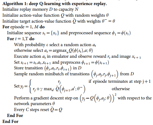
It’s time for another blog post apparently! Just as last time, I have decided to fill it with science! This time I will talk mostly about the “Deep Q Network” and the “Stochastic Gradient Descent” algorithm. These are all fairly advanced topics, but I hope to be able to present them in a manner which makes it as comprehensible as possible. Of course, I will provide an update to my project as well.
The machine learning part of my project is going very well, and is indeed working as expected. I have several variations of neural network based Q-learning including the Deep Q Network discussed below. In the end, we have replicated most features of the DQN except for the introductory “convolutional layers”. All these layers do, is convert the image of the screen into some representation that is possible for the computer to understand. Depending on the final solution of how we will incorporate the existing simulation, these layers may be put back in.
Our Monte Carlo methods right now are limited to the Stochastic Gradient Descent algorithm and some random sampling during the training phase of the Deep Q Network, as we’ve had some problems with our Monte Carlo Tree Search. This is the Monte Carlo method mentioned in the last post for navigating towards a goal.
It does however look like we have found a way to make it work. However, some implementation details are still required. Where we have before tried to make the tree search work on the scale of individual agents, we have now moved to a larger scale, which means we don’t have the problems we had before with the need of communicating between agents.
Deep Q Network
This network was first introduced in [1] published in the journal Nature, where they managed to play a wide variety of Atari games without having to change a single thing. The Deep Q Network was the first to enable the combination of (deep) neural networks and reinforcement learning in a manner which allows it to be used on the size of problems we work on today. The main new feature added is called “experience replay” and is inspired by a real neurobiological process in our brain. [1]
Compared to the dynamic programming problem of Q-learning, we do “neuro-dynamic programming”, i.e. we replace the function from the dynamic programming problem with a neural network.
In the following video, based on an open source implementation of the Deep Q-Network, we see that in the beginning the agent has no idea what’s going on. However, as time progresses, it not only learns how to control itself, it learns that the best strategy is to create a passage to the back playing area! At the bottom of the page, you can also find links to Deep Minds videos of their implementation.
Basics of Q learning
In the previous post we talked about Markov Decision Processes. Q-learning is really just a specific way of solving MDP’s. It involves a Q-function which assigns a numerical value, the “reward”, for taking a certain action in a state . By keeping track of tuples of information of the form , i.e the state, action taken and reward, we can construct a so called (action) policy (function).
A policy is a rule which tells you that in a certain state you take some action. We are usually interested in the optimal policy which gives us the best course of action. A simple solution, but not very applicable in real world situations, is explicitly storing a table specifying which action to take. In the case of a tabular approach, we simply update the table whenever we receive a better reward than the one we already have for the state. In the case of using neural networks, we use the stochastic gradient descent algorithm discussed below, together with the reward, to guide our policy function towards the optimal policy.
An important thing to mention here is that it is important that we don’t always follow the optimal policy, as this would lead to us not obtaining new information about our Q-function. Therefore, every now and then, we take some random action instead of the one given by the optimal policy. A smart thing to do is to do this almost all the time in the beginning, but reduce it over time. We can perhaps see the analogy to growing up. Children often do things we, as adults, know not to do, this way they learn; by exploring the state space and seeing if they are rewarded or punished.
Experience Replay
During learning, episodes of sensory input and output are stored and later randomly sampled, over and over again to combine previous and new experiences. An episode contains information about which action was taken in a state, and what reward this gave. This technique is also done by the brain’s hippocampus, where recent experiences are being reactivated and processed during rest periods, like sleeping. [1]
Stochastic Gradient Descent
Let’s, for a moment, skip the stochastic part and concentrate on the gradient descent. Imagine you are on a hill and want to get down as quickly as possible, i.e. take the shortest path, having no access to a map or any information about where you might be or the surroundings. Probably, your best bet is to always go in the direction of the steepest descent.
In the case of machine learning, we are in a bit more abstract world, and would like not to get to the ground, but find the (mathematical) function¹ that most closely resembles our data. One way of doing so is minimising the so called norm, which is the “straight forward” generalisation of Pythagoras Theorem, , from points in the plane to distance between functions. How this works can be seen, I think, quite easily from the gif below. Simply let and where x and y are the length of the catheti along the x- and y-axes, respectively. Then just bend your mind for a while!
Imagine being somewhere on this graph. You want to get down as fast as possible, so always head in the direction of the steepest descent. There is a risk of hitting a local minimum (white dot). However, this can easily be overcome by having a look around.
The Taylor series approximation for the exponential function.
This gives us a a direction to go towards! One problem in the case of very high dimensional functions is that this can be very time consuming. Therefore, we often use Stochastic Gradient Descent (SGD) instead, which updates only one, or a few, dimensions at a time. This is done randomly, hence stochastic in the name.
How on earth does this relate to the image of the neural net I showed last time, you may ask? Well, this is where the magic that is neural nets comes in. As far as I can see on the internet, no one has explained this in a easy to understand fashion; in partiuclar it would require a very long explanation on exactly what the networks do. You can try to visualise some connection between the dimension of the function and the neurons (the circles in last weeks picture).
¹ – These functions might not be as simple as most people are used too. For a starter, in school, we meet functions in 2 dimensions and of the form . The functions I’m talking about will often have tens of millions of dimensions.
Well, that’s it. The actual algorithm is presented below, and will not be explained. I refer to the original authors’ paper.
Deep Q-learning algorithm. This version deals with processing images, hence the mention of images. Not intended to be understood by the vast majority, but included for completeness for those who can.
Image is from the cover of Nature, issue 518, Cover illustration: Max Cant /Google DeepMind
Further Reading
I will recommend the following papers, for anyone with an interest in understanding the mathematical details. Theory of Deep learning: part I, part II and part III.
For any other aspects, your favourite implementation of PageRank should be able to help you.
Some authorative textbooks include Reinforcement Learning, Sutton; Deep Learning Book, Goodfellow et.al; General Machine Learning books include the books by Murphy; Bishop; and Tibshirani & Hastie, in increasing order of mathematical sophistication.
In my last post, I explained what El Niño events were about. In general, El Niño events are part of a bigger oscillation pattern in the climate of Earth called ENSO (El Niño-Southern Oscillation) that changes patterns in temperature and precipitations worlwide.
Being able to predict what their real consequences are around the globe is not easy, it takes a lot of time to evaluate if a certain anomaly in the weather in other regions is due to mere chance or if, on the contrary, El Niño events plays an important role on them.
Just to give an example, it is believed that, during El Niño years the summer monsoon in India is very weak and that the country is going to suffer from drought that year. Nevertheless, more deep studies show that, although El Niño years tend to be drier than average, the strongest El Niño of the century (1997-1998) produced a monsoon season with above-average rainfall. So, with these kind of figures, how to distinguish between causality and coincidence?
Comparison between the Oceanic Niño Index and the Indian monsoon rainfall from 1950 to 2012. Source: https://www.climate.gov/news-features/blogs/enso/enso-and-indian-monsoon%E2%80%A6-not-straightforward-you%E2%80%99d-think
What I have been doing all these weeks in Dublin (apart from getting plenty of rainfall myself) is try to figure out how these El Niño events have truly made an impact in other parts of the world.
The Pacific Ocean
The first question to answer is how it changes rainfall patterns in the Pacific Ocean (since ENSO originates there, it will obviously change something there) and that can be easily shown in the figure below.
Rainfall during December of several years regarding different states of the ENSO climate oscillation
We see that, during normal conditions, weather tends to be drier near the Pacific islands. During the cold phase of ENSO (La Niña phase), this pattern amplifies and the Pacific Ocean suffers from a dry month in December. However, during 1997 (the strongest El Niño year of the last century), this pattern changes drastically, implying a severe drought near Indonesia and nearby island and causing heavy rainfall in the Pacific ocean and Peru.
Correlation between floods in Florida and ENSO events. Source: https://www.weather.gov/tae/enso
The United States
But ENSO events also changes rainfall in the United States, where it can have either bad or good consequences. It is believed that there exists a correlation between rainfall in Florida and El Niño, which causes an increase in the amount of floods. Although, once again, it is difficult to say whether it is only a coincidence. On the other hand, California, which is a general dry place suffering from drought every once in a while, tends to have more rainfall during El Niño events which is good news for everyone living there.
Many more places to discover
Of course, apart from the places mentioned in this post (India, Pacific ocean, Florida and California), many more places can be affected by El Niño events and some correlation may not be as straightforward as others. Scientists should be careful about making statements when it comes to ENSO and, once discovered something, it is important to keep in mind that climate is one of the most unpredictable things the Earth has.
So, if you want to discover which other places are affected by ENSO events and how big this correlation is, do not miss my next post with more news about it. And in the meantime, I will leave you with an animation on how an El Niño event takes place. In the video below you will see how the temperature of the ocean rises in the equatorial Pacific Ocean at the end of 2015, which was one of the strongest ENSO events ever recorded.


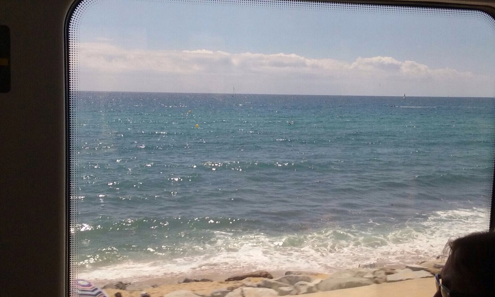


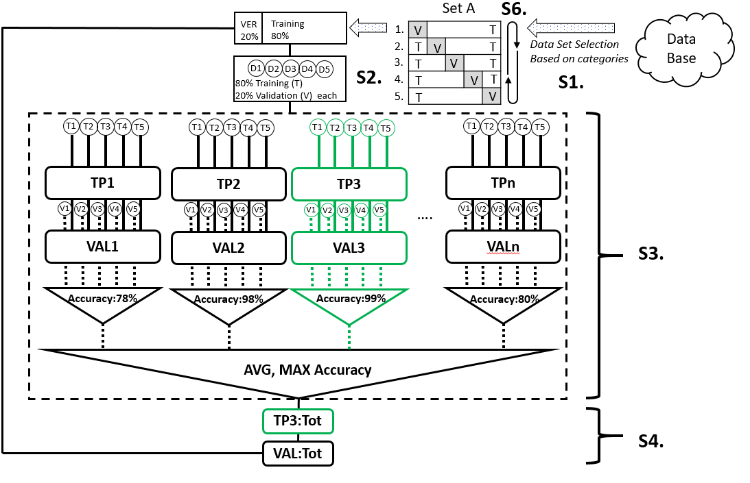
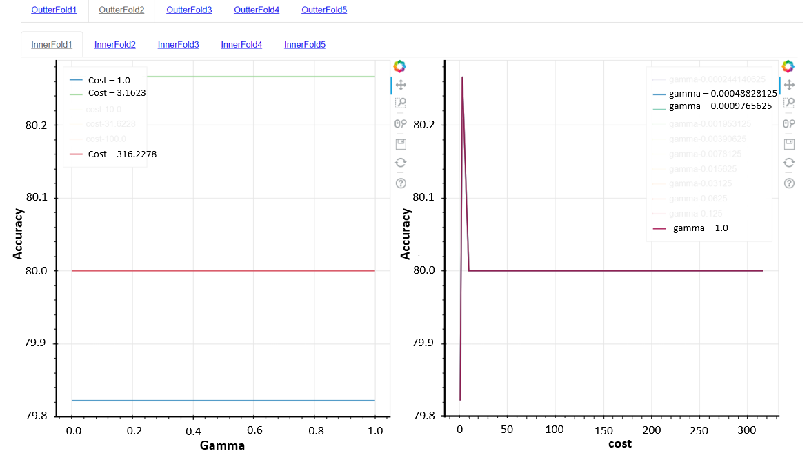


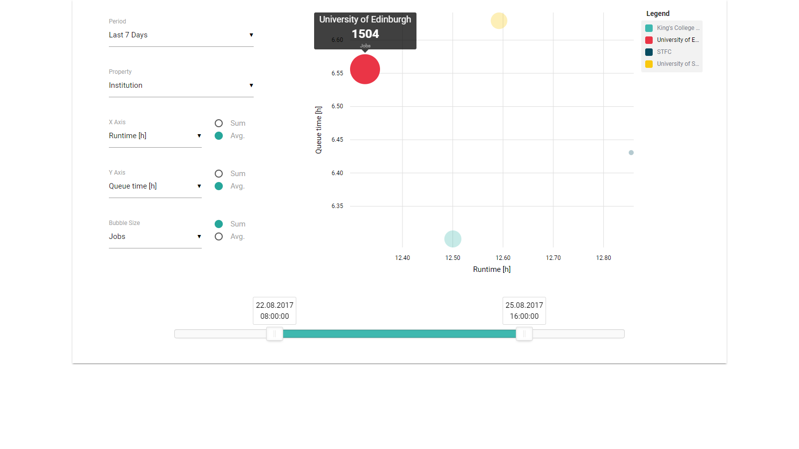


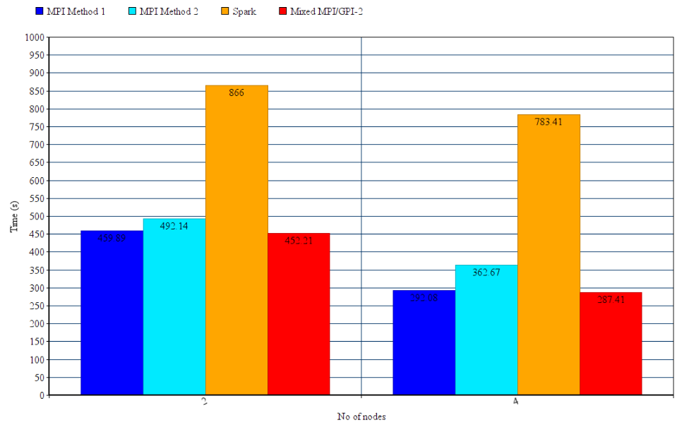

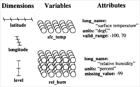
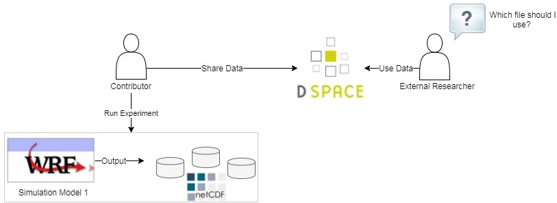
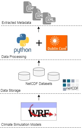
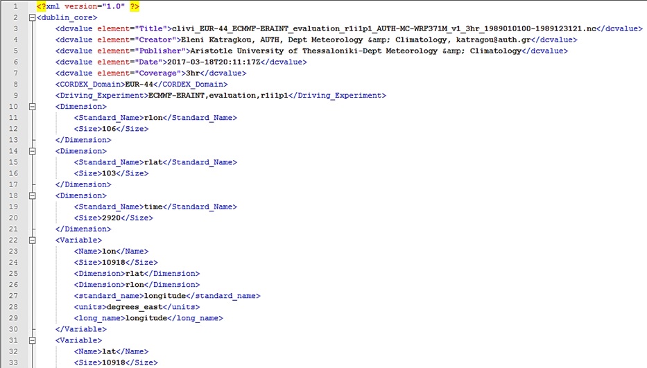


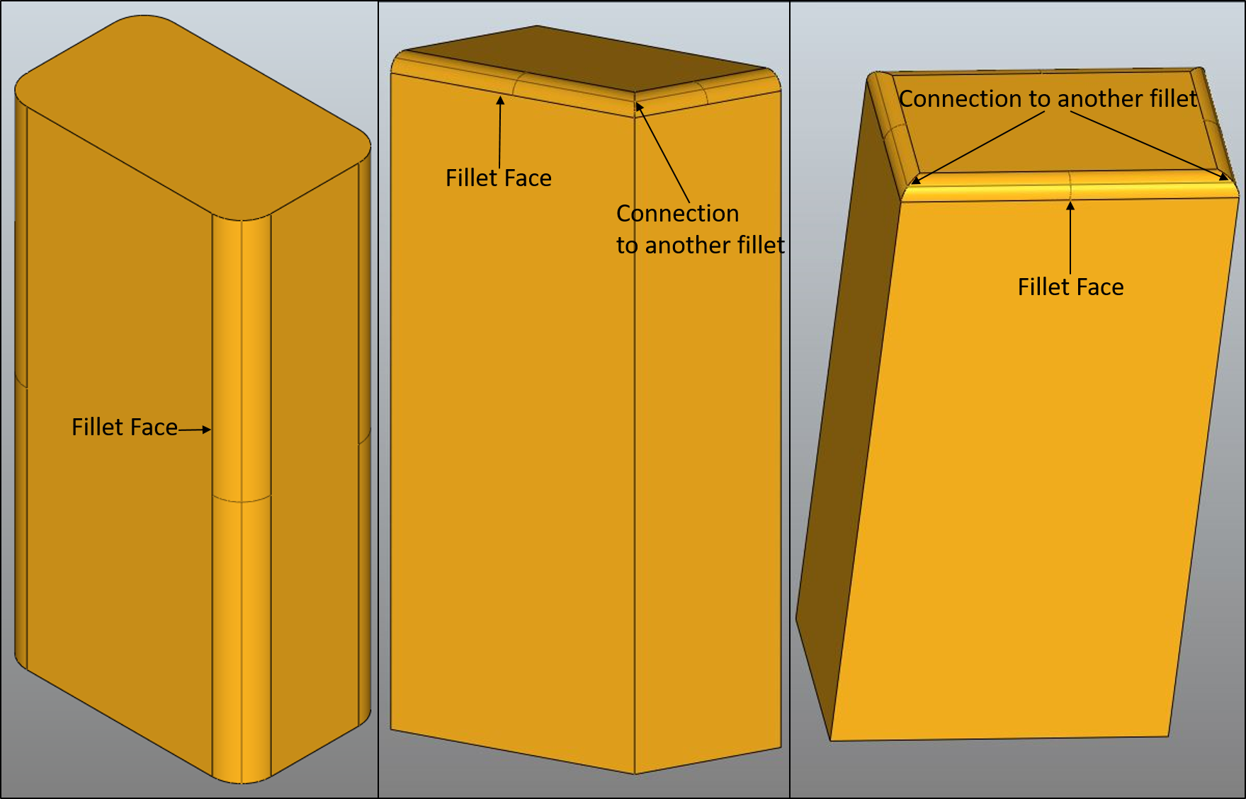


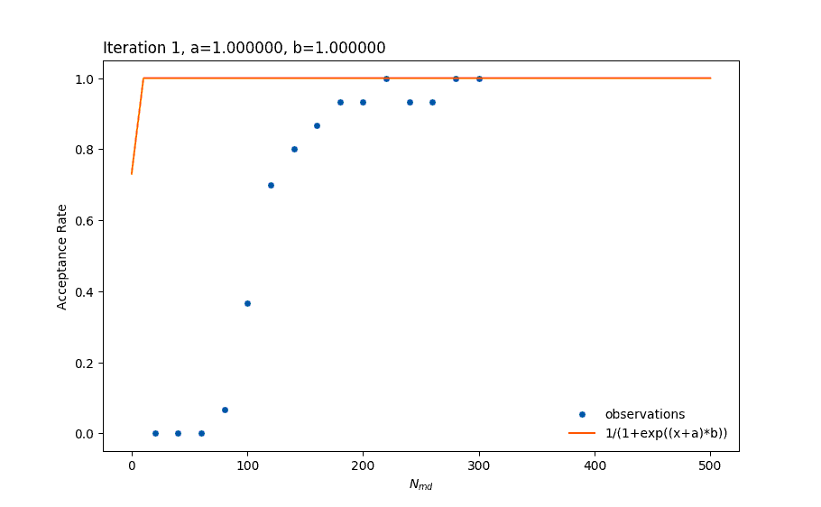
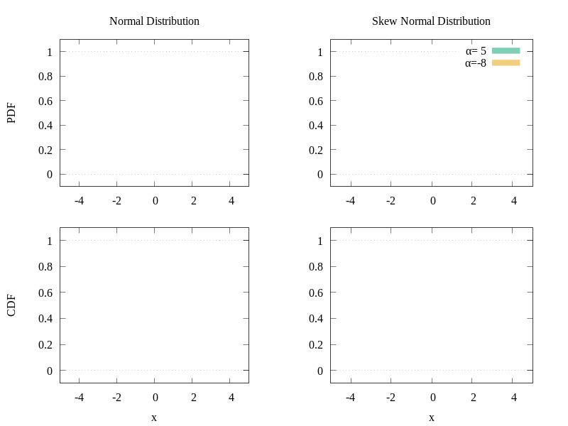
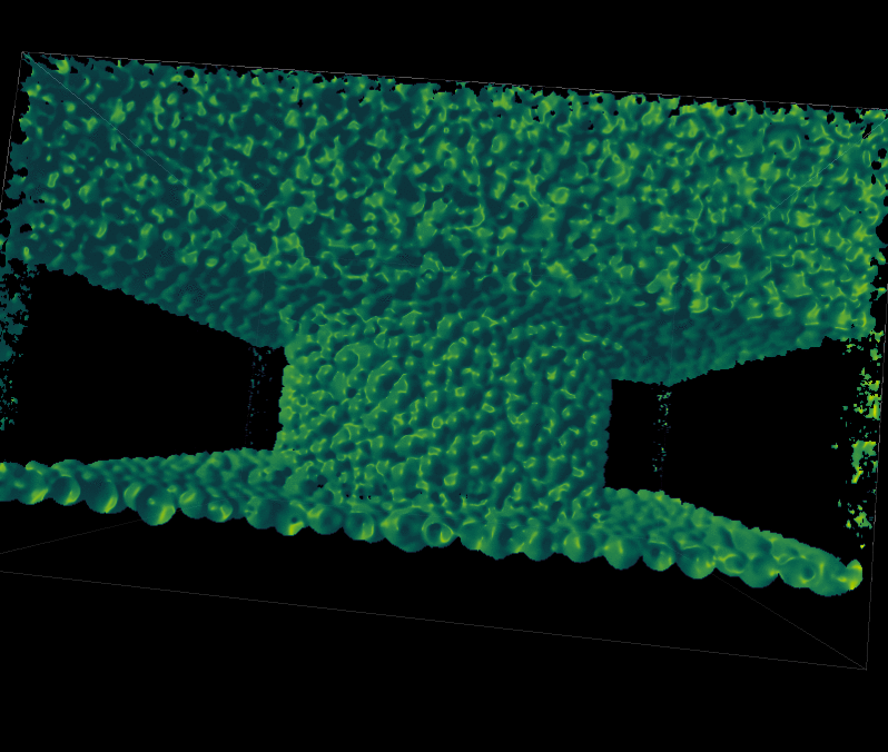
 vectors). Let
  be a 1-D image. The circulant matrix created from this image
 ") contains all possible translations of the image along its dimension:
contains all possible translations of the image along its dimension: = \begin{bmatrix} x_{1} & x_{2} & x_{3} & \dots & x_{n} \\ x_{n} & x_{1} & x_{2} & \dots & x_{n-1} \\ x_{n-1} & x_{n} & x_{1} & \dots & x_{n-2} \\ \vdots & \vdots & \vdots & \ddots & \vdots \\ x_{2} & x_{3} & x_{4} & \dots & x_{1} \end{bmatrix}")
") to nearly linear
to nearly linear ") , bounded by the DFT. The
, bounded by the DFT. The ^{-1} X^T y")
 = w^T z") that minimizes the square error over samples (which are the rows of the matrix X in the 1D example) and their regression targets
that minimizes the square error over samples (which are the rows of the matrix X in the 1D example) and their regression targets  . This means finding the parameters
  .
.") . This means moving the problem to a different set of variables (the dual space) where the optimization problem is still linear. This usually also means on the downside that evaluating
. This means moving the problem to a different set of variables (the dual space) where the optimization problem is still linear. This usually also means on the downside that evaluating 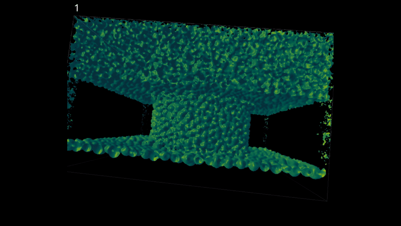
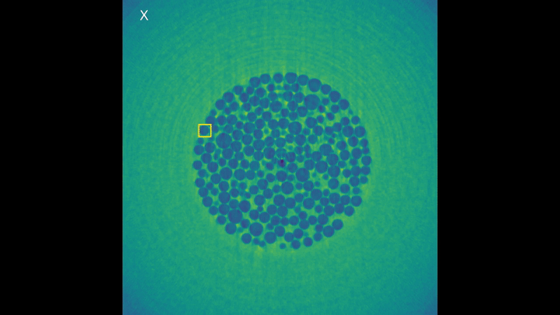


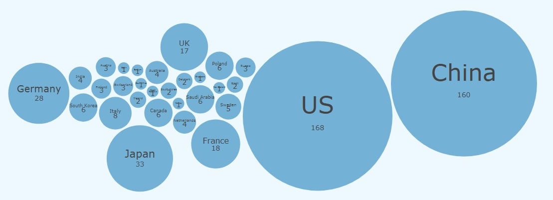
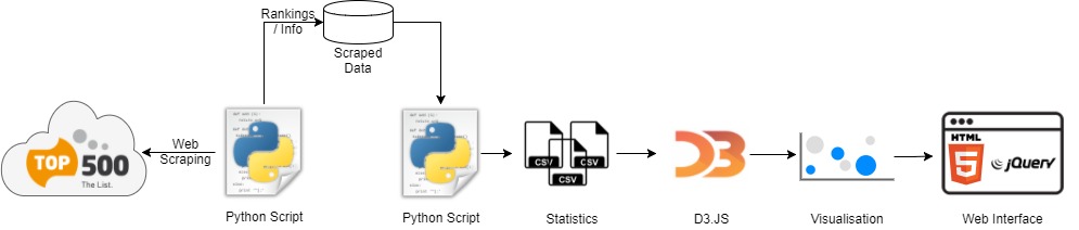
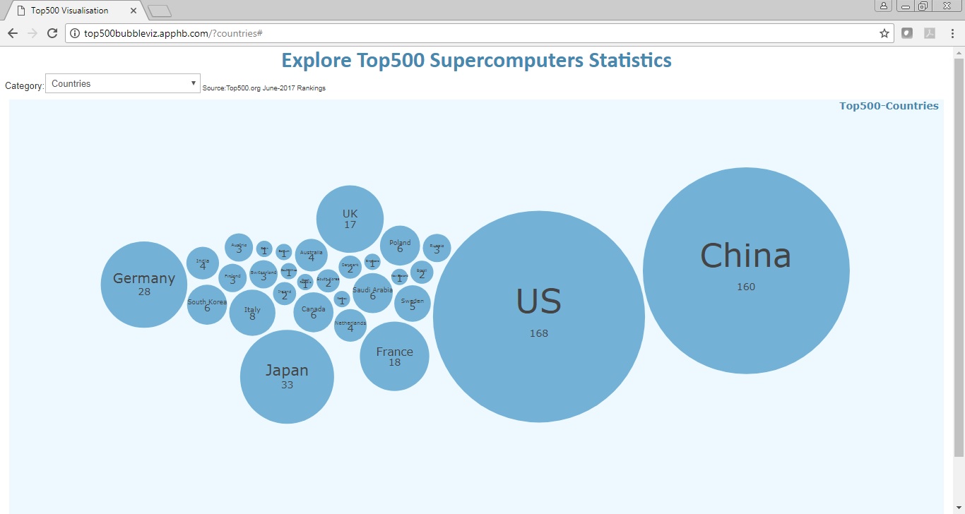
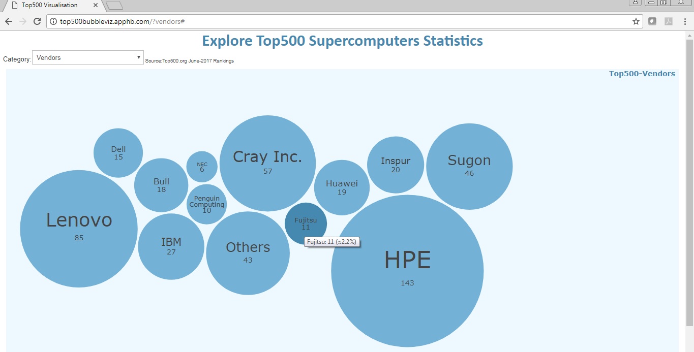
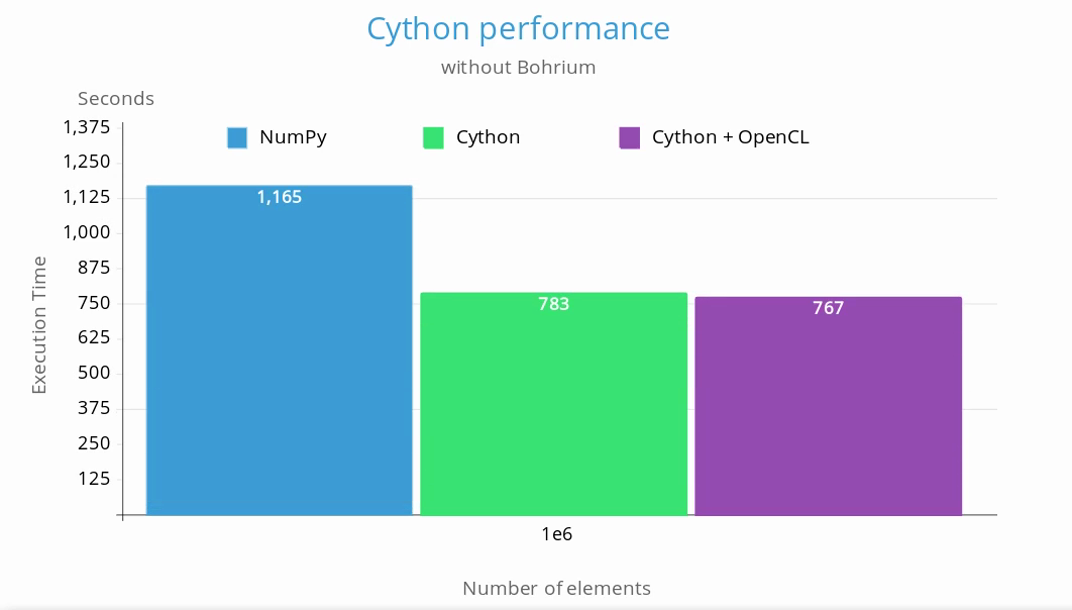
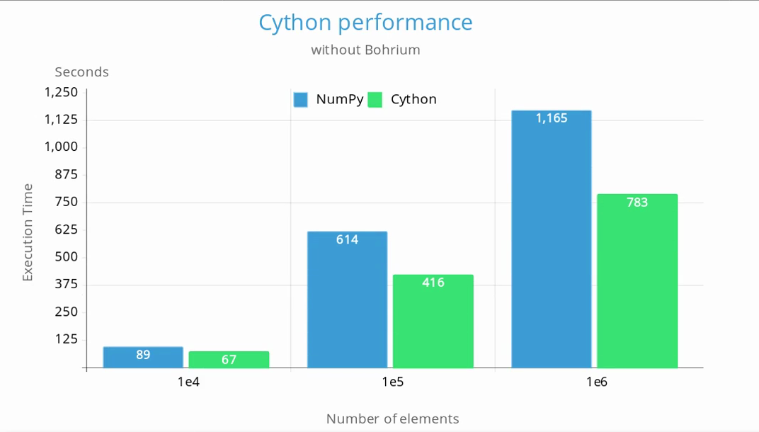

 Last but not least, as my whole coding journey through the libraries of NumPy, Scikit-learn, Pandas, Matplotlib and many more comes to and end, I am grateful for the amazing learning experience PRACE’s Summer of HPC proved to be. I would also like to add that it was accompanied by many cups of the finest Scottish tea, shortbread treats and exciting weekend trips around Edinburgh.


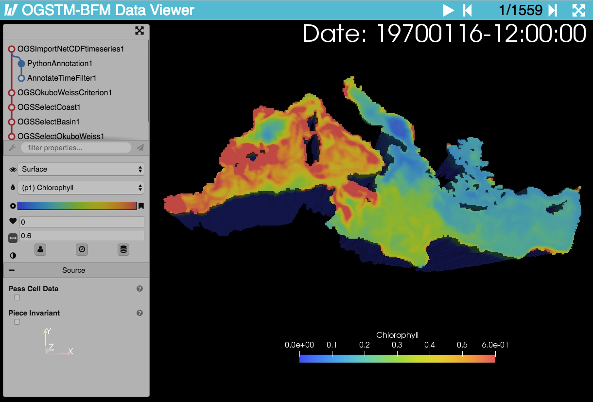
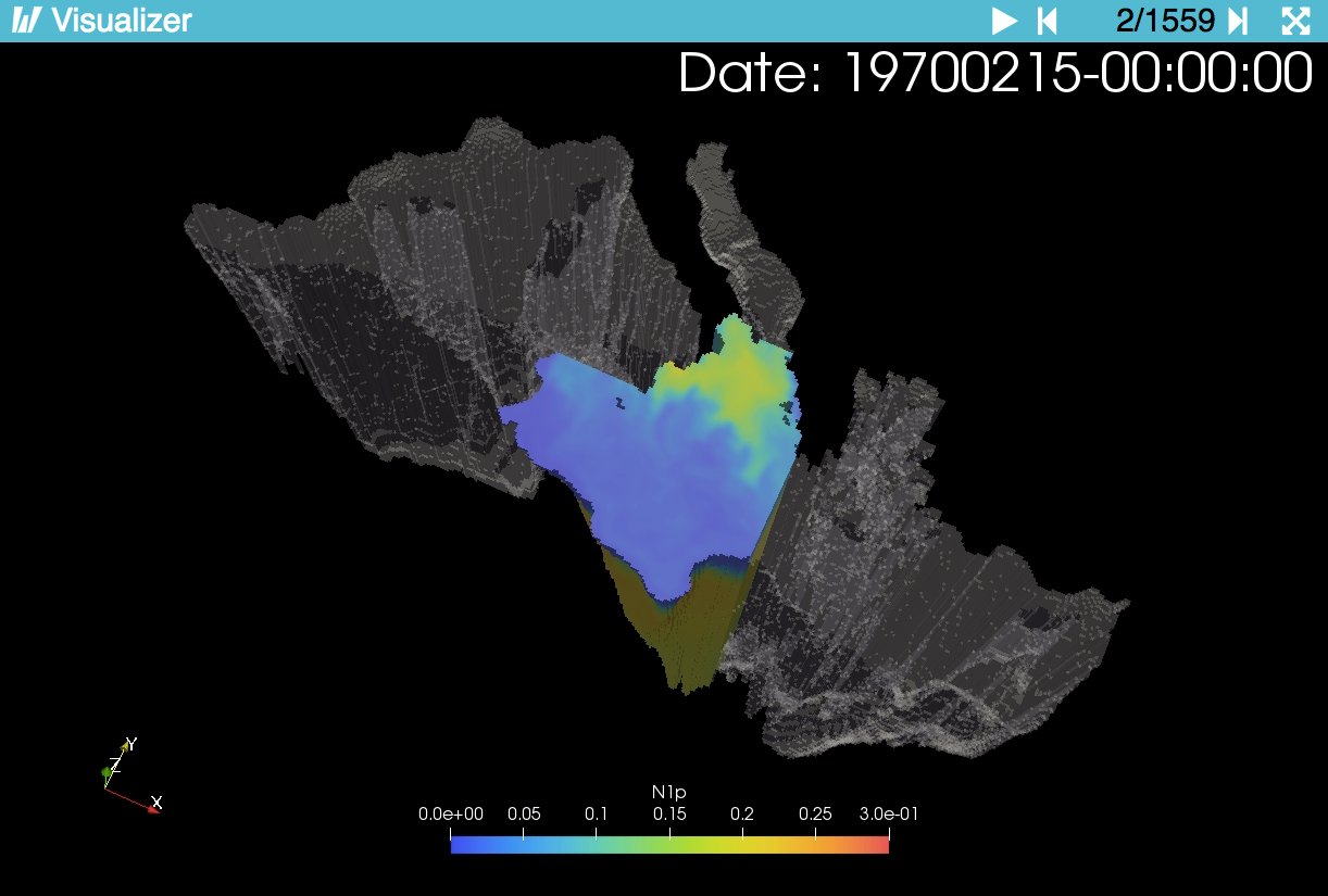


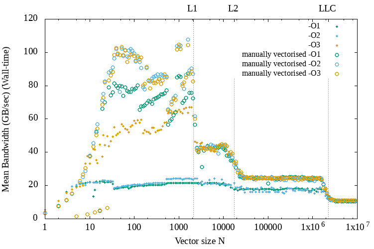
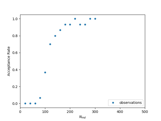
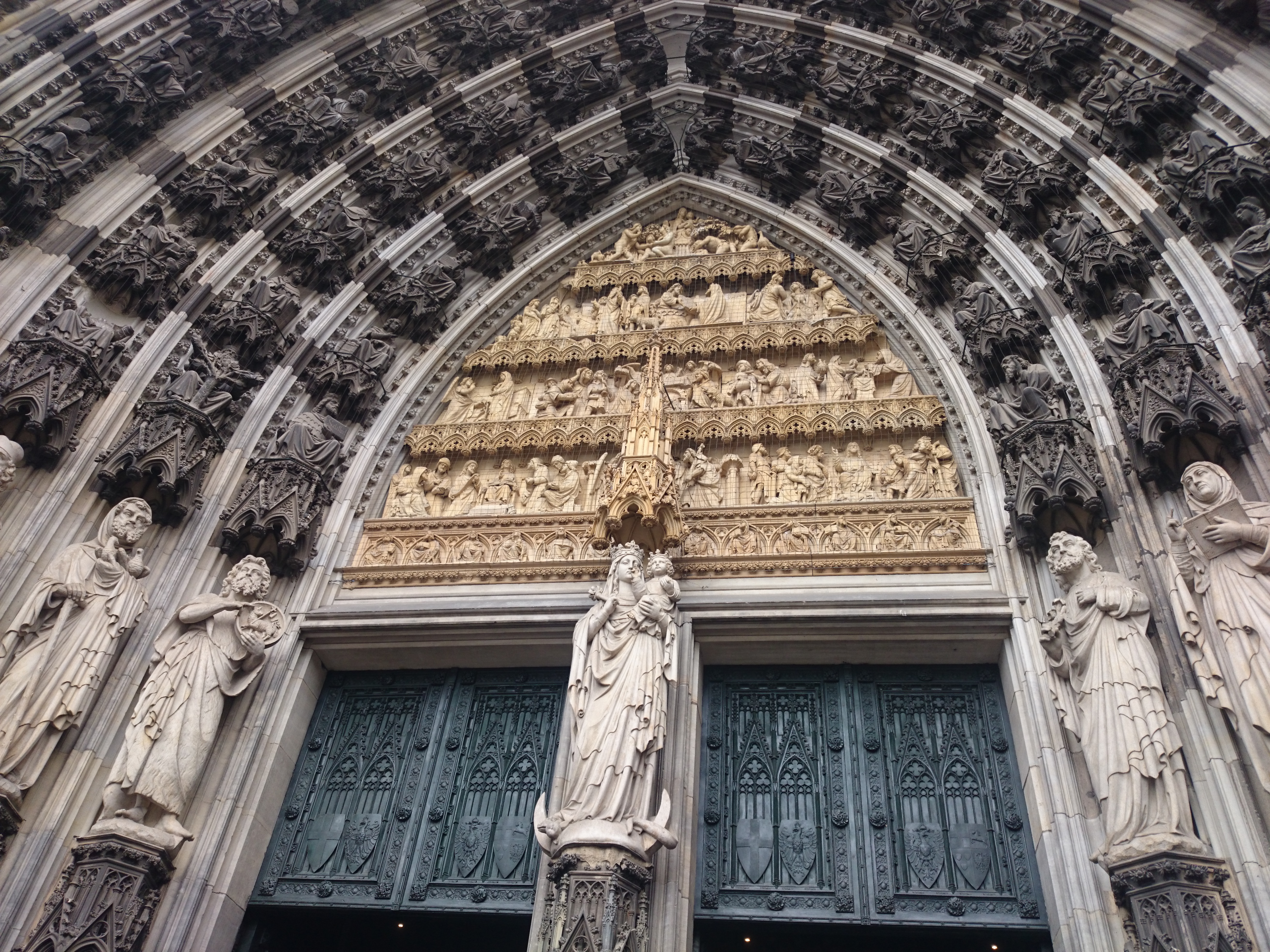

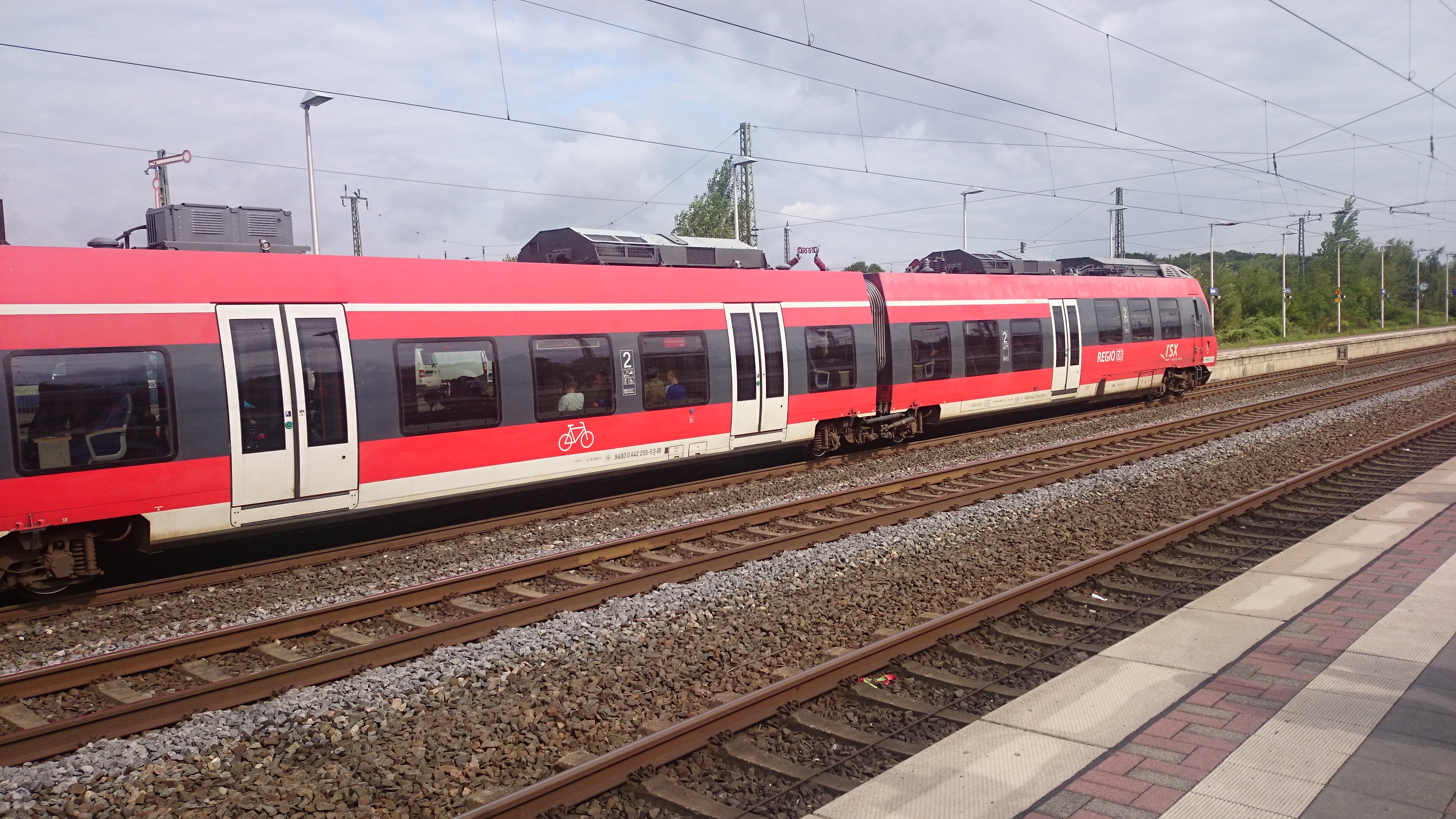


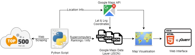
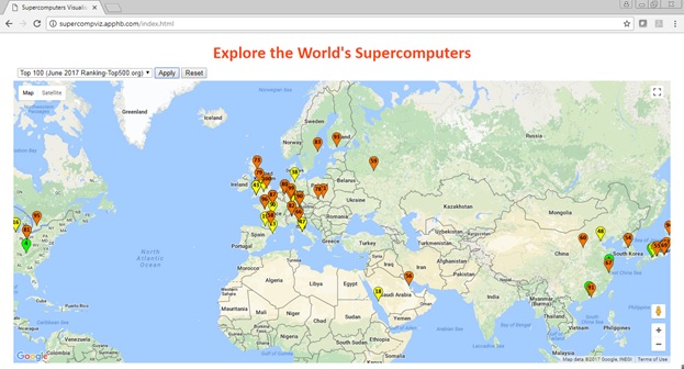
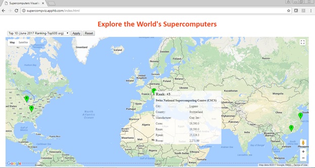

 in a state
  . By keeping track of
  , i.e the state, action taken and reward, we can construct a so called (action) policy (function).
 norm, which is the “straight forward” generalisation of Pythagoras Theorem,
  , from points in the plane to distance between functions. How this works can be seen, I think, quite easily from the gif below. Simply let
  and
and  where x and y are the length of the catheti along the x- and y-axes, respectively. Then just bend your mind for a while!

") . The functions I’m talking about will often have tens of millions of dimensions.
. The functions I’m talking about will often have tens of millions of dimensions.