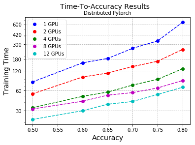
As I explained in previous posts, I’m following a transfer learning approach to training the model that I will use to detect action units on faces. This means that I’m going to be taking an existing network, removing a few layers and adding new custom ones on top that will serve as a classifier. This speeds up training considerably as you don’t have to build a feature extractor from scratch. However, not fully understanding how a network behaves can make choosing the hyperparameters for the training a hit-or-miss process. This post intends to walk you through my exploring journey in the hyperparameter realm as I explain how and why different training parameters gave me different results, and how I achieved the sweet spot that gave me the model I deployed to the final solution.

Me by the NVIDIA DGX-2. The GPU cluster in which I ran the training

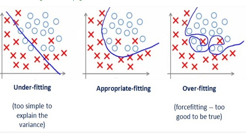
The main problem that I faced throughout the entirety of the training process was overfitting. Usually, when a deep learning model is trained on a dataset, that dataset is first partitioned into two: the training split and the validation split. As their names imply, the training split is used to train the model and the validation split is used to test or validate the performance of that model. The reason why we save a portion of the data for validation is that we want to make sure that the model has learnt a general interpretation of the data, instead of memorizing the samples. Memorization happens because a training session involves a model being fed the training data over and over again. So even if we’re seeing an increase of accuracy in the predictions that our model makes on the training set, we don’t know if this is because the model learnt the underlying pattern that we want it to learn, because the model memorized the individual images or because the model is basing its inference on a bias that we weren’t even aware of. This is why cross-checking how the model is doing using a partition of the dataset that the model hasn’t seen yet is so important

Overfitting, visual example. Taken from https://medium.com/greyatom/what-is-underfitting-and-overfitting-in-machine-learning-and-how-to-deal-with-it-6803a989c76

Phew, okay. So I chose a set of hyperparameters that I eyeballed to be a good starting point. These hyperparameters that I’m talking about are the learning rate –how fast the model adjusts its weights as an attempt to improve accuracy, the batch size –the number of images that I’m feeding the model at a time, data augmentations –I will go into more detail below, and the topology of the classifier. The data augmentation and the topology of the classifier are not usually included as hyperparameters, but I am for the sake of simplicity.

To begin with, I started freezing the base layers of the network so only the classifier on top would train (as the base layers were already trained to detect image features). I started with a few dense layers (layers of fully connected neurons, in a way like a matrix multiplication) of a size of around 100 each. However, this wasn’t enough. The network was having big trouble generalizing as the accuracy wasn’t improving much. I thought that despite having a set of hopefully useful features extracted by the base layers, the classifier wasn’t complex enough. I then decided to increase the size of these layers.
Larger dense layers started giving better results –it’s worth noticing that increasing the size of the classifier increases the training and the inference time. However, when I reached a size of around 1000 per layer, the training wouldn’t converge anymore. By this, I mean that I would leave the training running for quite a few of epochs (iterations over the entire dataset), but no apparent improvement in the accuracy was shown.
This got me wondering that there might be another hyperparameter that I had to tune in order to continue the learning. After a lot of unsuccessful trials which got to the point of slight desperation, I finally struck gold. It turned out, the learning rate was too large so the loss function kept jumping around skipping the minima over and over again. I imagine something similar to this was happening to me:

Low vs high learning rate, visual representation. Taken from http://www.bdhammel.com/learning-rates/

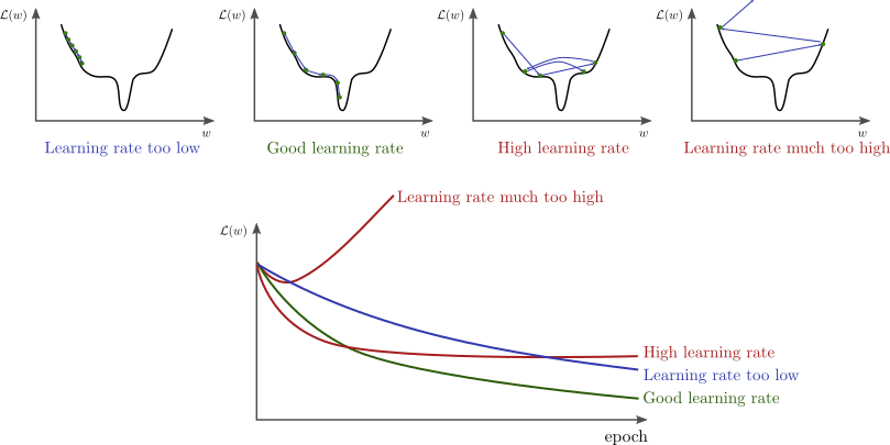
I want to note that I am using Adam optimizer so when I say learning rate I actually mean the initial learning rate, as Adam adjusts the learning rate for each weight based on an initial parameter. Anyways, once the learning rate was adjusted I started playing with the batch size, ending up with 16 as the optimal size.
However, up to this point overfitting kept being my #1 enemy. The model was able to deliver an almost perfect accuracy on the training set, but after a few epochs, this improvement wouldn’t be reflected on the validation partition.

I started researching how to reduce overfitting, and after trying a bunch of different ideas I found one that dramatically reduced it: introducing dropout layers between the dense layers of the classifier.
These dropout layers are filters that ignore a random fraction of the neurons during the training process. This adds noise to the training process and prevents the network from relying on very localized patterns and instead forces it to rely on different features every time, making the inference more robust.

Loss over epochs for a training run of my model. Dropout layers decreased the gap between validation and training loss dramatically.

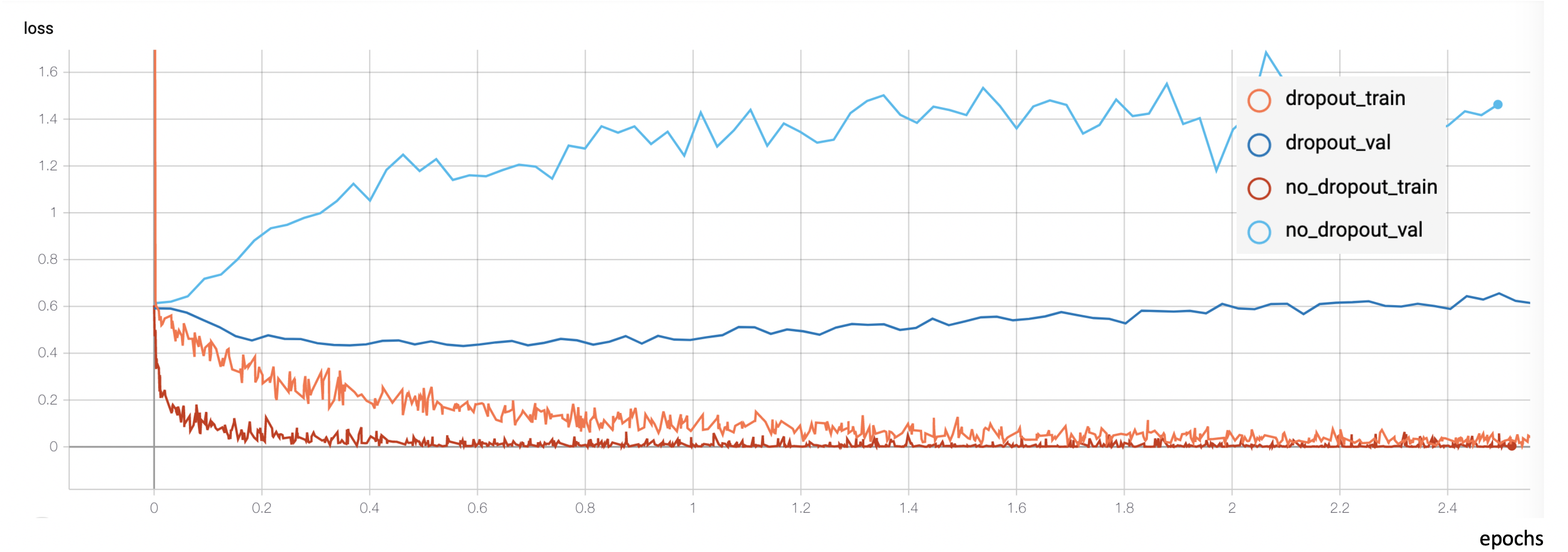
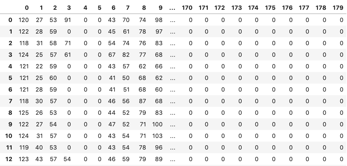
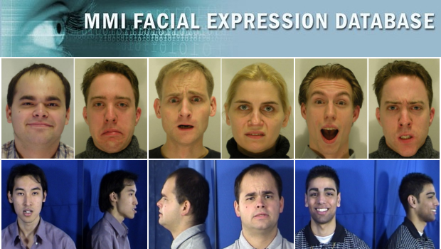
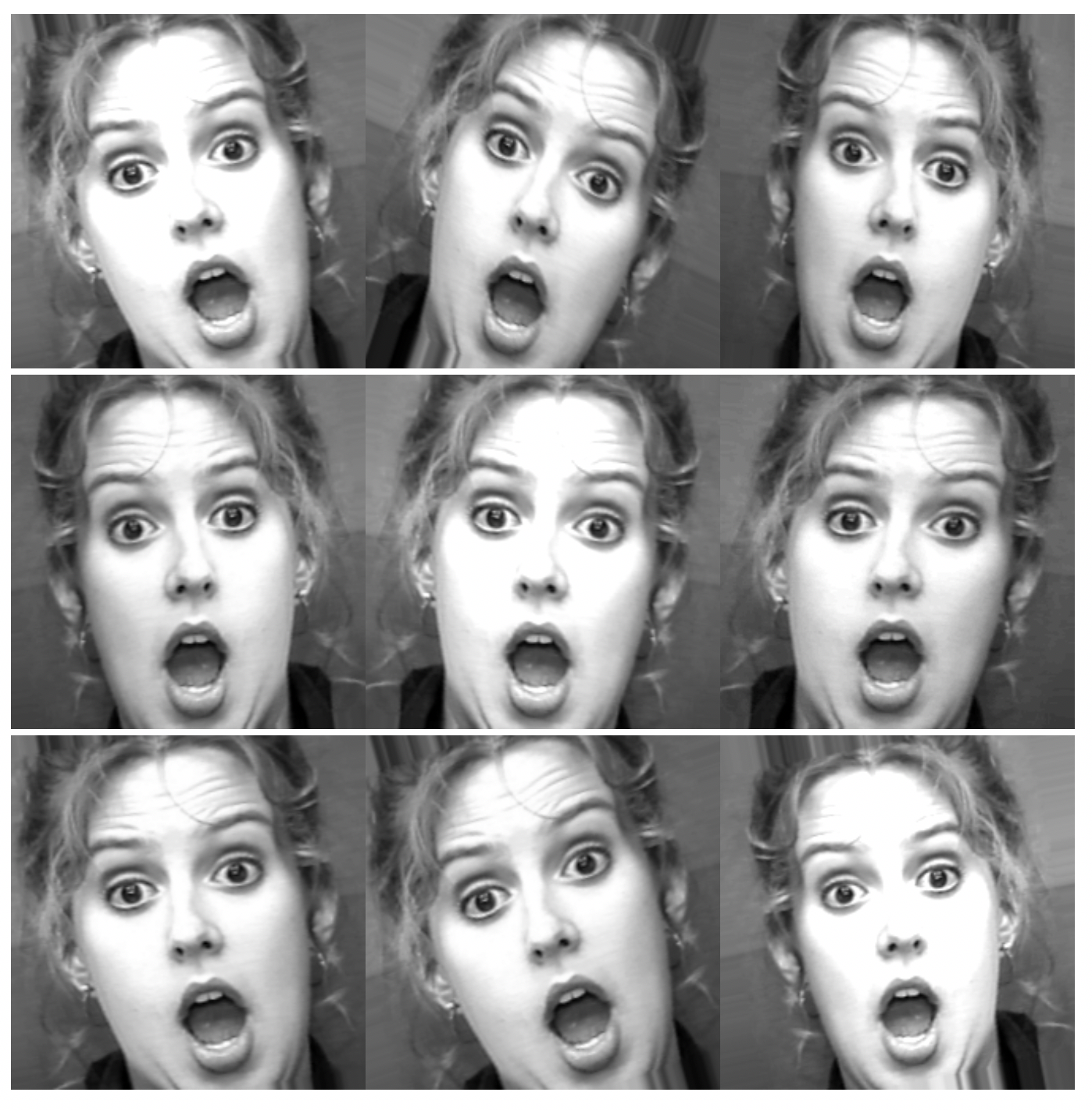
I ended up using a dropout layer before and after every dense one, each dropout layer dropping from 20 to 50 % of the input units. However, this wasn’t enough. The model was still overfitting after a few epochs. The last thing I tried which happened to also be very successful was further data preprocessing and augmentation. Let me explain. The original dataset I was working with consisted of 300K images. These images corresponded to frames of footage showcasing people undergo spontaneous emotional changes. However, due to the unbalanced nature of the dataset, I had to cap the most common classes so that every class would be equally represented. This reduced the dataset to about 200K images. But the network was still overfitting a lot, and what was especially weird about it was that the overfit happened before the model had seen all the images even once. A model cannot memorize data that hasn’t seen yet so something stinky was going on. After inspecting the images that the model was being fed I finally understood: contiguous frames in the videos were very similar to each other. So I was basically feeding the model the same image over and over again in each epoch. I ended up removing contiguous frames so only 1 frame out of every 5 was kept. This shrunk the dataset to 40K (quite a dramatic decrease, considering it originally was 300K).
This already gave me much better results but the last thing I tried was data augmentation: adding random modifications to each image every time they were fed to the model. These modifications consisted of random rotations, brightness shifts, shearings, zooms… Which in a way mimicked a larger dataset without repeated images.

Image augmentations from one image (zooms, rotations, shears and change in brightness) Original image taken from Cohn-Kanade dataset ©Jeffrey Cohn

To sum up, this process –which I really simplified for the sake of storytelling– led me to a model able to predict action units with a precision of .72 and a recall of .68 (evaluated on a balanced validation set). However, this is not the end of it. Emotions still need to be inferred from these action units. And this is not exactly a trivial process. So stick around for the next and final blog post next week explaining how I did this and how I deployed this pipeline to an application able to infer emotions in real-time!

Python programming language which its main philosophy is ‘code readability’ has entered our lives in 1991. After the Python developer Van Rossum has decided to pursue his career on Google, Google has became the tower of strength of Python. Then Python’s popularity has begun to increase linearly. One common question arises in mind of most people, how Python has become popular although its slow ?  If you can’t believe or don’t want to believe, you should examine at the numerical data.

Reference: http://pypl.github.io/PYPL.html 

I have got caught up in this popularity trend and I chose a project where I could use the Python programming language when applying to the Summer of HPC program. What would you say about speed when you compare C and Python programming language? Of course, everyone will call it C. Actually I’m not trying to solve a known result of problem. I’m working on how much speed we can improve by doing code optimization in python. That’s when I met Numpy more closely.

in my dream python with numpy
in reality

NumPy (Numerical Python) is a mathematical library that allows us to perform scientific calculations quickly (many people confuse it with a module or framework but it’s a library).  Numpy arrays form the basis of Numpy. Numpy arrays are similar to python lists, but are more useful in terms of speed and functionality than python lists. Also, unlike python lists, Numpy arrays must be homogeneous,  all elements in the array must be of the same data type.

You know that you can write an algorithm in more than one way in a programming language. So I has written this problem in three different ways:

  • version 1 – Using the Numpy library
  • version 2 – Numpy not using the library
  • version 3 – Using the Numpy library and never using for loop

I have mentioned the CFD problem in my previous post. We have done many experiments by changing the parameters of this problem. There were 3 different parameters that could affect the speed of the algorithm. You can see the values :

  1. Scale factors of 1, 4, 16, 32 and 128
  2. For each scale factor, two cases: without Reynolds number and with Reynolds number
  3. For each case, run with error checking

How many runs do I need for all these cases?

5 (scale factor) * 2 (Reynold number) * 2 (Check error) * 4 (repeat) =
80 run ! (for each code)

I can say that there are big differences between speed performances. I will share the results in my next blog post.


Let’s imagine you have a working code and now you are producing some results. What do you feel? You are very happy, of course, but you feel the urge to improve your code. It’s always a good idea to parallelize the code, and in the meantime you can think about the visualization, how to impress your colleagues and friends.

Parallelization

In my previous blog post I wrote about the already existing MPI parallelization of the code. Briefly, we have to solve the eigenvalue-equation of the Fock-matrix that has huge dimensions, but the matrix is -fortunately- block diagonal. The blocks are labelled with a k index, and each block is diagonalized by a different process. According to the original project plan, my task would have been the further development of the parallelization to make the code even faster. What have I done instead? I extended a code with a subroutine that performs a complicated computation for a lot of grid points. Yes, electron density computation made the program running longer. Well, it’s time for parallelization.

We get several electronic orbitals for each k value, and the electron density is computed for each orbital. I decided to implement the MPI parallelization of the electron density computation the same way as it was done for the Fock matrix diagonalization. We use the master-slave system: If we have N processes, the main program is carried out by the Master process (rank=0) that calls the Slave processes (rank=1,2,…,N-1) at the parallel regions and collects the data from the Slaves at the end.

Each process does the computation for a different k value. We distribute the work using a counter variable that is 0 at the beginning. A process does the upcoming k value if its rank is equal to the actual counter value. If a process accepts a k value, it increases the counter value with 1, or updates it to 0 if it was N-1. This way, process 0 does k=1, proc. 1 does k=2, proc. N-1 does k=N, then proc 0 does k=N+1, proc. 1 does k=N+2, and so on. The whole algorithm can be described something like this:

Master: Hey Slaves, wake up! We are computing electron density!
Slaves: Slaves are ready, Master, and waiting for instructions.
Master: Turn on your radios, I am broadcasting the data and variables.
Slaves: Broadcasted information received, entering k-loop.
From now, the Master and the Slaves do the same:
Everybody: Is my rank equal to the counter? If yes, I do the the actual k and update the counter; if not, then I will just wait.
At the end of the k-loop:
Slaves: Master, we finished the work. Slaves say goodbye and exit.
Master: Thank you Slaves, Master also leaves electron density computation.

The first implementation of parallelization

There is a problem with the current parallelization: you cannot utilize more processors than the number of k values. It is very effective for large nanotubes with lots of k values, but you cannot use the potentials of the supercomputer for small systems.

Next idea: Let’s put the parallelization in the inner loop, the loop over the orbitals with the same k. In this case we distribute the individual orbitals among the processes. If we have M orbitals in each block, the first M processes start working on the k=1 orbitals, the next process gets the first orbital for k=2. This way we can distribute the work more evenly and utilize more processors.

The second implementation

I tested the parallelization on a nanotube model that has 32 different k values. The speedup as a function of the number of the processors is shown in the figure below. The blue points stop at 32, because we cannot use more processors than the number of k values. The speedup is a linear function of the processor until about 64, but after that the speedup does not grow that much with the number of processors.

Test of the parallelization

Visualization

Motto: 1 figure = 1 000 words = 1 000 000 data points

Before I started this project I thought that the visualization part will be the easiest one, but I was really wrong. It can be very difficult to produce an image that captures the essence of the scientific result and pretty as well. (I have even seen a Facebook page dedicated to particularly ugly plots. I cannot find it now, but it’s better that way.) I do not have a lot of experience with visualization, as it was only lab reports for me. For lab report all we had to do was to make a scatter plot, fit a function to the points, explain the outliers and -most importantly- have proper axes labels with physical quantities in italic and with proper units. The result? A correct, but boring plot and the best mark for the lab report.

Now I am trying to make figures that can show the results and capture the attention, too. If you have a good idea, any advice is greatly welcomed.

The first test system of the was the benzene molecule, and I computed the electron density only in the plane of the molecule. I plotted the results with Wolfram Mathematica using ListPlot3D and ListDensityPlot.

Electron density of benzene orbital using ListPlot3D in Mathematica
The same benzene orbital but plotted with ListDensityPlot

But electron density is a function is space! How can I plot the four-dimensional data? The answer is simple, let’s make cuts along the x-z plane, and make a plot for each cut. Here you can find 1231 cuts for the R=(6,0) nanotube. I apologize if you really tried to click on the “link”, it was a bad joke. I do not expect you to reconstruct the 3D data from plane cuts, because there are better ways of visualization.

What we can plot is the electron density isosurface, a surface where the electron density is equal to a given value. Quantum chemical program packages can make such plots if we give them the input in the proper format. I have x-y-z coordinate values and the data, and I convert this to Gaussian cube file format, then I use the Visual Molecular Dynamics program to make the isosurface plots. Here you can see some examples for the R=(6,0) nanotube.

This is all for now, I hope I could tell you something interesting. I will come back with the final blog post next week.

Hello dear passengers, the new topic about my project is equality!

I believe the topics in SoHPC should be comprehensible for everyone, so I decided to make a game to explain how HPC and Deep Learning works with a game.

” Everything should be made as simple as possible, but not simpler.”

Albert Einstein

While designing the game, the aim was giving the idea as simple as possible for every age and gender.

There are two modes of the game:

-Training Mode: You can train the deep neural network by sliding the images into the Deep Learning Module.
-Inference Mode: The trained deep neural network will try to guess the images that you slide.

Also, there is a button where the magic happens!
HPC Button: You can “Speed Up” the training and inference process by increasing the “HPC Workers”.

Don’t be shy! Just try the game, it is fun:

You can access the game with the full resolution by clicking here or you can download the PC version here. I made the game with Unity.

The training and inference of deep learning is a heavy computational process. While extracting information from images (they are just numbers in computers’ eyes), many matrix operations (like adding, multiplication and padding) happening. The process is long, however, the magic of HPC helps.

You can feel the powerful touch of HPC in the game with the button.

Very big thanks to my friend Çağdaş for helping me with his expertise in this project.

-Behind the idea-

Besides working and learning new academic things commonly in the beautiful nature of STFC Hartree Centre,

SoHPC event gave me a great opportunity to meet awesome people and visit fantastic places.

After one inspirational month in this event, I started to think about what we do and feel should be shared with everyone as simple as possible.

The photos in the game:

In loving memory of my best friends, the bird “Tekir”, and the dog “Kuzu Kulak”.

Hello World!

Since my last blog post quite some time has passed, and wherein a lot of progress was made on my project! After a very warm welcome by my supervisors and the other colleagues working at ICHEC I immediately started out setting up what would keep me occupied for the next couple of weeks, the Neural Compute Stick by Intel Movidius.

The Intel Movidius Neural Compute Stick

This stick was developed specifically for computer vision applications on the edge, with dedicated visual processing units at its disposal to inference tasks on deep neural networks. This last sentence was loaded with quite a lot of terminology, so I’ll go ahead and try to unentangle this a bit.

So, what does inference mean in this context? Once a deep neural network was trained on powerful hardware for hours or sometime days, it needs to be deployed somewhere in a production environment to run the task it was trained for. These can be for example computer vision applications, which can encompass detecting pedestrians or other objects in images or also classifying objects in detected images such as different road signs. Simply put, inference using a trained model at hand refers to the task of making use of the model and getting predictions depending on the inputs def into the model. This can happen on a server in a data center, an on-premise computer or an edge device. Now the crux with the latter is, that applications such as computer vision tend to have quite a high computational load on hardware, whereas edge devices tend to be lightweight and battery powered platforms.  It is of course possible to circumvent this problem by streaming the data that an edge device captures to a data center and process it there. But the next issue that the term “edge device” already implies is, that these computing platforms are situated in quite inaccessible regions, like on an oil rig in the ocean or attached to a satellite in outer space. Transmitting data is in these cases costly and comes with a lot of latency, rendering real time decision making nearly impossible. Especially if this data encompasses images, which as a rule of thumb tend to be large. That’s where hardware accelerators like the Neural Compute Stick bring in a lot of value. Instead of sending images or video to some server for further analysis, the processing of data can happen on the device itself and only the result i.e. pure text is sent for storage or statistical and visualization purposes to some remote location. Such an approach brings numerous benefits, but most importantly alleviates latency and communication bandwidth related concerns.

Example of running inference on the Neural Compute Stick. On the picture a combination of object detection and classification is to be seen.

Now what is this magical Neural Compute Stick all about?  

The Intel Movidius Neural Compute Stick is a tiny fan device that can be used to deploy Artificial Neural Networks on the Edge. It is powered by an Intel Movidius Vision Processing Unit, which comes equipped with 12 so called “SHAVE” (Streaming Hybrid Architecture Vector Engine) processors. These can be thought of as a set of scalable independent accelerators, each with their own local memory, which allows for a high level of paralleled processing of input data.

Complementing this stick is the so called Open Visual Inferencing and Neural Network Optimization (OpenVino) toolkit, a software development kit which enables the development and deployment of applications on the Neural Compute Stick. This toolkit basically abstracts away the hardware that an application will run on and acts as an “mediator”.

Other than working on my project I already got a first taste of how it is living in Ireland and I find it nothing short of amazing! The weather has been very gentle, bringing way more sunshine than I expected, given all the clichés about Irish weather! Living centrally during my stay here also brings about the advantage, that exploring the city is fairly easy and the workplace is just a short walk away!

Fortunately such rainy weather was rather a rare sight in the first couple of weeks!

After this short introduction I will outline in my next blog the workflow and setup of the Neural Compute Stick and show demonstrate an example application, so stay tuned for more!

Bird pun, check. Now let’s move on to the next installation of Allison’s Summer of HPC blog!

A quick recap: my project is all about improving the accessibility of meteorological radar data for ornithologists at the University of Amsterdam. These data provide new insight into the migratory trends of different flocks, and the reason for changes to migration patterns.  See the below posts for more info on my project and the SoHPC journey so far.

When I say ‘radar data’, I’m guessing that the first image that comes to your mind is a big ol’ circle with different blobs of blue and green on a retro screen in a submarine or airplane or some other militaristic vehicle. Maybe the screen is beeping and updating with every sweep, and the shapes are changing as the torpedo/alien starship is coming closer and closer to Air Force One (#hollywood). Am I right? 

The important thing to recognise about this mental image is that: this may be the typical imagery associated with radar, but the data certainly isn’t readily accessible in this format. It’s all just numbers and figures with no discernible patterns. If I gave you a table (or worse still, a 1D array) of meteorological data like the below and told you to find the cloud, how do you think you would fare? 

Horrible, ugly, useless

We need visualization to be able to make any use of this data! We need to turn this boring information into a visual that our brains can actually understand. Now what if I gave you this? 

Wonderful, beautiful, useful

That’s more like it. Here we can clearly see the radar data represented in a way that is interpretable. Add in a time dimension (like in the gif at the top of this post) and Bob’s your uncle.

There’s a bit more complexity to visualizing radar data than you might first imagine. Image data is typically stored in 3D (height, width, and colour if a colour image), or 2D arrays (height and width if black and white). This is basically a matrix, or ‘gridded’ data, and it’s pretty easy to wrap your head around. Polar data, however, is not stored in this format. Instead of having x and y axes (width and height), a polar dataset basically collects data along different azimuths and radial distances. This data combines to form a circle with 360 data points at each range.

Azimuth: the horizontal angle or direction of a compass bearing.  Ie. if you stand in a circle and do a twirl you’ll cover 360 azimuths.

Radial distance: the distance (in any metric) from measurement point to the fixed origin, being the radar.

The polar data structure can make it quite complicated to visualize this data. Most visualization tools require pixels to be stored in a tabular format, ie. all the horizontal pixels are stored in rows, and all the vertical pixels stored in columns. If you try to shove in polar data and tell the tool to start at the middle and go out in graduated circles: fail. 

A crucial step in the data transformation pipeline that I am building is, therefore, ‘gridding’ the data. Conceptually, not too challenging: plotting out the circular data that we do have, and then filling in to the corners with null values. In practice, this was a lengthy process involving many documentation rabbit-holes.

def polar_to_grid(polar_array):
     # lots of code
     # more code

      return gridded_data

Et voila, we have a grid! The datapoint that was at the top left corner in the table above (ie. at azimuth 0 and radius 0) now becomes the datapoint at the very centre of our new grid. 

Image result for mind explode emoji
Easier?

With gridded data, things become much “easier”. Now we just have to generate longitude and latitude arrays that accurately reflect the geographical position of each datapoint, with consideration of the altitude of the radar, the elevation of the scan, and the curvature of the globe.

With a little help from some brilliant tools and libraries like Geoviews, Wradlib, Holoviews, Spark and Bokeh, we can create an interactive visualization tool that allows researchers to quickly access and visualize their data. They can stop wasting time on data structures, programming and stack trace errors, and focus on what’s more important for them: ornithology.

Hi dear readers!

Today, as promised, I will present and explain my challenge called oneGBSortChallenge! Then, complements about Radix Sort will be given, in particular how to deal with negative and real numbers but also with other kinds of data types. Lastly, I will explain what I have done so far and expose some performance results about the Radix Sort I have implemented.

If you have not read my previous blog post, Read this if you want your computer to run your applications faster [Difficulty: Easy], I suggest to read it first because this one is the continuation. It will take you only a few minutes and it is interesting!

Now, let’s talk about the challenge!

#oneGBSortChallenge

What is it?

Beat my time record on sorting 1GB of data using MPI and C++. There are Amazon gift cards to win and it is also a good opportunity to practice or discover HPC and MPI. Everything is guided and made simple to allow also beginners to take part. So no hesitation!

How to take part

Go to the challenge’s git and follow the very simple and short instructions. Everything is detailed there.

If you read my blog posts, you should have some hints on how to defeat me…

Back to Radix Sort

If you have paid attention in the previous blog post, when we have presented the Radix Sort, all examples were with positive integers (unsigned integers). What if we want to sort a list containing reals or both positive and negative numbers? Let’s see an example with signed integers.

Sort signed integers

Usually, to implement the Radix Sort, the base 256 is used and one digit corresponds to one byte. The reasons for that have been explained in my previous post. As soon as we work with the binary representation of numbers for the Radix Sort, whatever the base, we encounter the upcoming issue to sort signed integers.

What is the issue?

For the example, in order to make it faster and simple, we will treat the integers in base 16 and we want to sort int8_t numbers (signed integers stored on one byte). In base 16, one digit corresponds to 4 bits. Indeed, if you take 4 consecutive bits (half a byte), the value you will end up with is between 0 and 15 inclusive (between 0 and F within base 16 notation). Base 16 is named hexadecimal or hex often.

One byte is composed of 8 bits, so there are two base 16 digits in one byte. Thus, the Radix Sort d parameter we have seen in the previous post equals 2 here because all the integers we want to sort have two digits in the chosen base. Besides, we will use the Bucket Sort in the example but notice that we have the same issue and the solutions are the same with the Counting Sort. The Bucket Sort is just more handy to illustrate. Below is the list we want to sort.

A list of signed integers we want to sort using the Radix Sort to demonstrate the issue with signed integers.
Figure 1. A list of signed integers we want to sort using the Radix Sort to demonstrate the issue with signed integers.
Source: Jordy Ajanohoun

The first row is our list in base 10, the last row is the same list but represented in binary signed 2’s complement (like they are really represented and stored in a computer). The middle row is the corresponding base 16 representation. According to the Radix Sort algorithm we have seen in the previous post, we have to first sort the elements based on the last digit (Least Significant Digit). Then the result will be again sorted by the second digit which is the last in this case.

First Bucket Sort round of the Radix Sort on a signed integer list (list of int8_t integers).
Figure 2. First Bucket Sort round of the Radix Sort on a signed integer list (list of int8_t integers). The list is sorted according to the base 16 Least Significant Digit of the numbers. The considered base to run the Radix Sort algorithm here is the base 16. The empty buckets are not represented.
Source: Jordy Ajanohoun

The empty buckets are not represented here to save space. This example also allows revising how the Bucket Sort works. As d equals 2, we still have one iteration to do with the next digit (the Most Significant Digit here).

Second and last Bucket Sort round of the Radix Sort on a signed integer list (list of int8_t integers).
Figure 3. Second and last Bucket Sort round of the Radix Sort on a signed integer list (list of int8_t integers). The list is sorted according to the base 16 Most Significant Digit of the numbers. The considered base to run the Radix Sort algorithm here is the base 16. The empty buckets are not represented. The result is wrong, the final list is not sorted.
Source: Jordy Ajanohoun

Now the algorithm is finished and our list is not sorted. So, let’s understand why with unsigned integers it works fine but not with signed integers. The MSB (Most Significant Bit) of unsigned integers, not to be confused with the MSD, is entirely part of the number, helps to code the value of the integer, unlike signed integers where it is used to store the sign. And this makes the difference. If we pay attention, in the final list above, we have the positive integers first and then the negative ones and, whatever the length of the list, we always will have this partition. This is due to the value of the MSB because 0 is used as MSB for positives and 1 for negatives. As we always treat each digit as an unsigned integer, the MSD value of negative integers will always be greater than those of positive ones because of the MSB. Thus, in the final iteration, when we sort according to the MSD, positive integers will always come before the negatives as the value of their MSD is lower. The very good point is that if we look only at the positive section of the list, it is sorted and the same with the negative section. So, the only thing we have to do is to find a way to swap these two parts and we will end up with the desired sorted list. There are several ways to achieve this.

How to fix it?

We could for example loop through the final list and find at which index the negative section begins and then proceed to multiple swaps. However, this solution is not suitable because it requires at least one more loop through the entire list and, as a consequence, increases the complexity of the sort.

A more clever and suitable solution is to sort the list still with the Radix Sort but, according to another key. Until now, we have sorted the numbers according to their bitwise representation, which is perfectly correct and fine for unsigned integers but not for the signed. Plus, the main inconvenient of the Radix Sort is that it can sort only data having a bitwise representation according to how it proceed. Thus, to sort signed integers, we have to find a suitable binary representation of signed integers such that the Radix Sort, executed using that representation as key to sort, ends up with the correct sorted list. Looks maybe complex but actually, it is fairly simple. If we take the bitwise representation of the numbers, invert their MSB and use the output as a key to sort, our problem is solved. The reason is straightforward, we have seen just above, it is because the MSB of negative integers equals 1 and those of positives equals 0 that there is this partition at the end. By inverting the value of this bit, we invert the final placement of the positive and negative sections in the list. Let’s go back to our example to illustrate.

A list of signed integers we want to sort according to their key and using the Radix Sort.
Figure 4. A list of signed integers we want to sort according to their key and using the Radix Sort. These keys fix the problem we encounter when we want to sort a list of signed integers in the same way that a list of unsigned integers with the Radix Sort.
Source: Jordy Ajanohoun

We still want to sort the same list, the numbers are unchanged and we can read them in the first row. The last row contains the keys as explained and the middle row contains the keys within base 16 representation. As the LSD of the numbers have not changed, the result of the first Bucket Sort will be the same as previously (Figure 2). Thus, we can take this result (Figure 2) to continue the Radix Sort with the second and last Bucket Sort.

Second and last Bucket Sort round of the Radix Sort on a signed integer list (list of int8_t integers) using correct keys.
Figure 5. Second and last Bucket Sort round of the Radix Sort on a signed integer list (list of int8_t integers) using correct keys. The list is sorted according to the base 16 Most Significant Digit of the keys. The considered base to run the Radix Sort algorithm here is the base 16. The empty buckets are not represented. The final list is well-sorted.
Source: Jordy Ajanohoun

This time the list is sorted. In practice, there are several ways to invert the MSB of a signed integer and it can also depend on the programming language. Unfortunately, we are not going to go further into details with this aspect today because otherwise, the post would be too long. However, the issue has been highlighted and a solution has been provided.

There are other possibilities to face the problem. I have presented this one because it is the first I have found, succeeded to implement and for me, the simplest. Plus, this solution doesn’t need an additional loop through the list because we can extract the keys when needed during the Bucket Sort (or Counting Sort) via a function dedicated to that. In that way, no need to store them neither. We can extract or get the key of a given signed integer in a negligible constant time so, we are not increasing the complexity.

Careful! If we use this process to sort also unsigned integers, it doesn’t work. By doing that with unsigned integers, we are losing information about the value of the numbers because the MSB is not a sign bit anymore. The keys with unsigned integers have to be their binary representation without any transformation. In other words, the numbers themselves.

Ok, now we know how to sort signed and unsigned integers, but what about reals and other kind of data types?

Sort reals and other data types

Explain in detail how to sort float and double using the Radix Sort would be too much for the purpose here. That is not really complex but requires knowledge about floating-point representation, which is not so straightforward. It is a bit more complex and tricky than with integers but the idea remains the same concerning the Radix Sort. Still a question of dealing and playing around with binary representations.

Sort other data types like dates or hours or whatever, is simple with comparison-based sorting algorithms. We can implement a predicate which takes two instances of our data type and returns if or not the first one is greater than the second. Then we provide this predicate as entry to the sort function accompanied by the list to sort and it is done. But, we can’t generalize that to non-comparison based sorts because, by definition, they don’t compare the elements between themselves. Besides, as said, the Radix Sort needs a binary representation to sort. This is why the Radix Sort has a limited scope, this constraint can be embarrassing. Dates and hours, for example, don’t have a native binary representation, they are not native data types in computers. Often, we use strings or two to three integers to represent and store them. So, to sort them using the Radix Sort, the rule is the following. We have to find a suitable binary representation of our data type such that the Radix Sort, executed using that representation as key to sort, ends up with the desired sorted list. By binary representation here, we have to understand integers, strings or reals because they are the native data types and they have a native binary representation. Finally, in that case, instead of providing a predicate to the sort, we can provide a function allowing to get the binary representation of an instance of the data type. This function is often called a functor or a callback.

If you want more details about sorting float, double, other data types and the Radix Sort in general, I recommend this YouTube video C++Now 2017: M. Skarupke “Sorting in less than O(n log n): Generalizing and optimizing radix sort”.

What I have done until now

I have started first to play around and implement some serial versions of the Radix Sort to be familiar with the algorithm and its variants. The goal was not to implement an optimize serial Radix Sort ready-to-use because we are not going to reinvent the wheel. Indeed, there already are some very good libraries with that, like the boost library and its spreadsort function. I will use one of them when needed. I remind that my project is to implement a reusable C++ library with a clean interface that uses Radix Sort to sort a distributed (or not) array using MPI (if distributed). So, when the array is not distributed I can use, for example, the boost’s spreadsort. My project focuses on distributed arrays using MPI and, so far, I have a great parallel version able to sort all integer types. It is my third parallel version, I have started with a simple version and then optimized it little by little until this third version. My current version also allows the users to provide a function returning a bitwise representation of their data to sort other data types than the native ones. Since for now it can sort only integers, the bitwise representation should be in the form of an integer, but this already offers flexibility and a huge range of possibilities. Besides, I have also profiled my versions and compared them to the std::sort with more than 2 000 nodes using the ICHEC Kay cluster. We will talk about that in the next post!

See you soon!

Many hands make light work (or maybe just Lumos if you’re a wizard). How about many processors?

Howdy, Friends!

Form Gfycat.com

I hope you are all doing great and that you are enjoying your summer (Or any season… Future applicants of SoHPC20 triggered… )

I am getting the best of my time/internship here in Bratislava. I am learning a lot about programming, Machine Learning, HPC, and even about myself! In parallel with that (seems like HPC is a lifestyle now), I am really enjoying my free time here visiting Bratislava and other cities around!

I can hear you saying “Learning about programming? And herself? What is she talking about? Well, humor me and you’ll understand!

Programming

Well, this is something I wasn’t expecting to be this important, but it is actually an important feature!
I have not programmed a lot in C lately and got more used to Object Oriented languages like C++ and Python. I found myself here programming in C an algorithm that my brain was designing only in an “object oriented” way.

So I had to adapt to the C language constraints while implementing my regression tree. This took some time and I had some delays, so I am not on time regarding what you saw here but the steps are the same and I am trying to catch up. Hopefully my final product will meet the expected requirements…

Machine Learning

So, as I told you in my last post (Come ooon, you’re telling me that you can’t remember the blog post you read 3 weeks ago? Shame… on me, for not posting for this long!)…

Excuse: I was really focused on my code’s bugs……..

…I implemented a decision tree. The idea of this algorithm is to find a feature (a criteria) that will help us “predict” the variable we study. As an example we can create our own (super cool but tiny) dataset as follows:

IndependentPartsLinesRepeatedLoopsDependencyParallelizable
1101
1010
0110
0100
1111
1001
1011

This is a (totally inaccurate and random) dataset that has 4 variables (columns). IndependetParts reflects whether the program has some blocs that are independent from each other. LinesRepeated means that there are some parts that it has to compute/do many times (a for loop on the same line for example). LoopsDependency tells us if the segments that are encapsulated in a loop depend on the result calculated in a previous iteration or not. Finally, Parallelizable states if we can parallelize our code or not.
1 always means yes. 0 means no.
Each lines represents one program. It means that we have 8 different programs here.

If we want to predict the fourth one (Parallelizable), our decision tree will have to consider each feature (column) and see which one helps us more to distinguish if a code can be parallelised or not. Then we select it and split the codes according to that variable.

Easy, right? But it’s not done yet!
If we stop here, we could have something that can help us, but this will never be accurate because you wouldn’t know (and neither your algorithm) what to do in this case, if you choose the LoopsDependency, for example:

IndependentPartsLinesRepeatedLoopsDependencyParallelizable
1111
1001

Do you know how it can predict if it’s parallelizable or not? Because I don’t…

And this is why we have to consider all the variables that can help us (but not ALL the variables each time, some of them could be useless) reduce this uncertainty, or the errors that can occur.

BAM! You have a tree now! (Because you are splitting every time the “Branches” -will call them nodes-. The first one will be the root and the last ones that have no “children” will be called the leaves.

By the way, if I want to predict a quantitative variable, like in the table above, our decision tree will be called regression tree. If it predicts a categorical (qualitative) variable, it is called a classification tree! See below.

FavoriteColorLovesHPCReadsMyPostsCool
Red718.2
Blue317.8
Red503.1
Yellow606
Razzmatazz10110

This is a (very serious?) dataset considering people’s favorite color, their love/interest in HPC and whether they read my blog posts or not to evaluate how cool they are. (Since you are reading this post, I give you 10!)

For the record, Razzmatazz is a real color. 89% red, 14.5% green and 42% blue. I can only imagine cool people knowing this kind of color names, I had to give a 10 here!

So since we are predicting this continuous variable (Cool), it is a regression tree! But don’t worry, if you are not used to this, you can still read the sections below since we won’t solicit this. But basically, you can see here what we are doing (only with one one stopping condition, there are others and this is simplifying -on purpose- a lot the code!):

A functional portion of the algorithm that considers only the size of the Nodes to stop the recursion and the tree building. Created on Lucidchart.com

Note: If you are really into Machine Learning and would like to know more about the algorithms, check out the tutorials of this great teacher. Now if you want to know more about my C implementation, I would be very happy to talk about it with you and write a detailed post about it! Just contact me!

More Machine Learning

With this in mind, we can now go further and see what is a Gradient boosting decision tree.

So, to make it easy-peasy, just consider it as a repetition of what we were doing before (building trees) for a fixed number of times (usually 100). But this is done in a serial (dependent) way from the others. It means that, in order to build the tree No. i we have to consider the result (especially the errors) of the (i-1)th tree.

This is very useful to have more accurate predictions.

HPC

I know, I just said that gradient boosting implies a serial repetition of decision trees and that each step depends on the previous one, so parallelising is complicated here… but we actually won’t parallelise this part! What we will parallelise are those loops and independent parts of the decision trees!

There are lots of ways to parallelise the decision tree building part.
Since the algorithm finds the best value that can split the observations with a minimum error rate (the threshold in the algorithm you saw above), we could parallelise this part!
Another option would be the parallelisation of the node building parts. This would give something like this:

An example of how the Node building part could be parallelized. This one is done only on Google Docs.

So the next step is to compare these different parallel versions and see if we can mix some to get better results!

I’m now very excited to see how all of this goes and which version will be better!

More HPC

Haha! You thought it was done! Well, no. But this part is not about the project, but still about HPC! (Not only)

Few weeks ago, we visited a museum that is located here in the Slovak Academy of Science, few meters away from the Computing Center. And guess what? It’s all about computers! I had such a gooood time there! The guide was so passionate about what he was talking about, and we saw some great things there. I’ll show you two things. You have to come here to see the others!

This is a highly parallel (old) computer! The first (if I correctly remember -I mean what the guide said, not the 1958 era-) computer in Czechoslovakia. It’s an Analog computer, they used to solve some differential equations (raise your hands if this gives you some gooseflesh) by changing and connecting different plugs. © SAS
This may look like a random old computer, but did you know that Alexey Pajitnov invented Tetris on a similar machine? Cool, huh? © SAS
Sorry for the quality of this one, but I think it’s too cool to skip it! This shows what you need to store 256 Gb of data, which can be stored now in a small MicroSD Card. Just incredible! © SAS

And now I’ll just say goodbye! I’ll do my best to post soon another post. As usual, if you have any suggestion or question, just send me a message on LinkedIn (on my bio).

Welcome, all! I have been working on an Industrial electricity consumption prediction project. I have received this data from a Slovene company which sells electricity to its customers. The dataset is a 15 mins Electricity Consumption data spanning one year for 85 end-users. The company wants to build a forecasting system in order to make better spending forecasts from the consumer’s consumption history, thereby making it more accurate to know how much electricity should be bought for the selected time interval, which will ultimately make it more profitable. I am developing a system for profiling consumers and develop algorithms for predicting consumption, which will enable smart ordering and planning of energy consumption and thus great savings.

Exploratory Data Analysis

After the identification of data and their sources; I am investigating the influential external factors for the consumption of end-user electricity. The focus is on the calendar and the weather. For this, the consumption data is fused with data about influential external factors (both on 15 minutes scale) and I have firstly performed exploratory analysis trying to understand how the selected factors influence the energy consumption. I have downloaded the weather data from the Environmental Agency of the Republic of Slovenia (ARSO) website. The holidays in Slovenia information is obtained from the Time & Date Slovenia weblink. Then, I have derived the long holidays i.e. suppose Thursday is a holiday then it is highly likely that most of the people take Friday also as leave day, thus making it a long holiday. A similar case is for Tuesday. This holiday data and the derived information are then used to get insights from the clusters which are formed using unsupervised learning. Using this I have performed statistical analysis for every consumer.

The consumption varies with temperature. More electricity is required for at very low temperature & at very high temperatures.
The consumption varies with temperature; more electricity is required at very low & very high temperatures. The curve is smoothed using the Loess method.
The correlation of various weather factors with Electricity Consumption.

The correlation of various weather factors with consumption.

Though, there are many consumers who don’t exhibit similar temperature vs consumption behavior.

The consumption varies with day & time (every 15 mins, hence a total of 96 data points in a day).

Unsupervised Learning

I have performed cluster analysis to generate clusters of days with similar kind of electricity consumption using k-means clustering and hierarchical clustering with custom distance metrics. I have found the optimal number of clusters for every consumer and estimated the variance within and among the clusters. I have also calculated how much variance is reduced before and after the clustering.

This dendrogram shows various clusters for one customer.

Using this cluster information I have tried to find the relation among various factors like day of the week and the holidays. For now, I have developed a small process which takes a date for which consumption has to be predicted, then I find the cluster to which it belongs, and then the average of the cluster for that time is the predicted consumption. And then I calculate how much is the error percentage in the actual and predicted consumption.

What’s Next?

Till now, my analysis was for 85 consumers with 1-year data each. I don’t have direct contact with the company, I have requested SoHPC to request the company to provide data for more years using which I can do a prediction of future year consumption based on their past year’s consumption. After I receive more data, I will be splitting it into training and testing part, perform time series analysis and modeling, and evaluate the results.

Other Updates

I have developed algorithms for data analysis and predicting electricity in the R environment. I have used NoSQL MongoDB to store the dataset. The system is scalable in terms of a large amount of data. Some of the algorithms have been adapted to big databases for parallel processing on multiple nodes. I am working on adapting the rest of the code. I will be writing separate blog posts on these to provide some basic understanding. So, stay tuned!

Hello my dear reader, Sorry about the Clickbait. I know a bad joke won’t save my blog, anyway in this blog I’m going to talk about my first week, instead of telling what have happened at the California Fire Department.

Unfortunately, I could not attend the training week in Bologna due to bureaucratic processes (I did not get a visa). Don’t worry if one day you qualify for this program and you can’t participate because of country agreements! There will be many possibilities for you to work remotely! And don’t give up, sooner or later you can get a visa 🙂 

Edinburgh

What is ARCHER ?

In the first week, I joined Archer Summer School. Archer is the latest UK National Supercomputing Service located in Edinburgh. Archer Summer School is a free program for anyone interested in course content. Here are  the link that training program; https://www.archer.ac.uk/training/ . Archer has about 5000 nodes and 118 000 cores ( like 30 000 quad core laptops connected together) .

Archer
ARCHER (Advanced Research Computing High End Resource)

I had the opportunity to attend “Introduction to HPC” and “Message-passing programming with MPI” courses. Exercises on the courses were very time-consuming and each participant’s questions were answered separately. The courses were different from the ordinary course by being based on practice instead of listening so those courses were ideal for my project. I have to admit that I have learnt a lot.


What is CFD ?

Let’s talk about my project. My project includes a CFD simulation. The application of this simulation in different programming languages will be written. Even more than one version of a programming language will be used. I hope you know that there are more than one ways to create an algorithm. Let’s take a look at what CFD is.

A Example of Computational Fluid Dynamics
CFD Simulation of a Motorcycle

Computational fluid dynamics is a branch of fluid mechanics that uses numerical analysis and algorithms to solve flow patterns and thermal conditions of fluid. Computational Fluid Dynamics is one of the key analysis method used in engineering applications. By using cfd, you can solve complex problems that involves fluid-liquid, liquid-solid, or liquid-gas interactions. Cfd Analysis has great potential to save time. It is therefore inexpensive and quick to obtain information compared to traditional tests.

To see the included subjects and case studies ; https://www.cfd-online.com/ When you click the “solve” button in Ansys or Autodesk cfd, the fans will sound as if they were fighting in the computer case. To speed things up first, it requires a very good processor and at least (today’s conditions) 16 gb ram. It is therefore one of the uses of HPC.  

In the project, I will simulate the flow patterns of a fluid that goes through from an empty square box. The box have a single inlet and a single outlet that does not in the same axis with the inlet.

I will write different versions in Python programming language of the existing C code. Then I will compare their performance on different computers.

Simulation of flow depending on the number of iterations


Stand by for amazing results…


The cost of drug discovery

Last May I had the opportunity to attend VivaTech, an innovation fair, which takes place in Paris. There, Vasant Narasimhan, Novartis CEO, shared some thoughts about the present and future of pharma and biotech companies. During his talk, he insisted on the need of using computational tools in drug discovery. That is so because, according to Vasant numbers, the cost of drug development is now way above US$ 1 billion, thus the extremely high cost of producing new drugs is an urgent problem that needs to be tackled. Indeed, there are even studies that estimate this cost in more than US$ 2.8 billion, but with the use of computational chemistry the time and cost of the drug development process can be significantly reduced.

Vasant at his talk at VivaTech

Drug discovery phases

Drug discovery has several phases. For simplicity, we may summarize them into four: discovery of an active compound, called “lead”; optimization of the lead, in which candidates are synthesized and characterized in preclinical studies to test safety and efficacy in animals; clinical trials to test for drug safety and efficacy in humans; and drug launching. The second phase, “lead optimization” may account for almost 25% of the total cost of all four phases, according to a study from 2010. Lead optimization includes optimizing drug metabolism, pharmacokinetic properties, bioavailability, toxicity, and of course efficacy. Drug efficacy is directly dependent on the binding affinity of the candidate drug onto the pharmaceutical target, which is commonly a protein. Optimizing the binding affinity, i.e. the strength of interaction of the candidate drug onto the protein of interest is the step we would like to optimize this summer.

Free Energy Perturbations

For pursuing this goal we are working at the Biomedical Research Foundation Academy of Athens on Free Energy Perturbation (FEP) simulations. FEP simulations determine the relative binding affinity of two drug candidates to discovery which one of the two binds more strongly onto the protein of interest. In the last post, we explained how with FEP simulations, we can compare the binding of two ligands to their target protein and determine which one is favored. As it was explained, this results from calculating a physicochemical property called “free energy of binding”, which directly relates to the binding affinity of the ligand-protein interaction. The difference in the free energy (ΔG) of binding of the two ligands is computed from Zwanzig’s equation, which takes into account the difference between the Hamiltonians – the potential and kinetic energies- of the two molecules in solution environment and in the environment of the protein. Using a thermodynamic cycle what we calculate is the difference in the free energy of binding (ΔΔG = ΔGΑ – ΔGΒ) between ligand A bound to the protein and ligand A solution (ΔGΑ) and ligand B bound to the protein and ligand B solution (ΔGB).

FEP computations are computationally expensive so they need to be carried out at High Performance systems, such as ARIS, the supercomputer administered by GRNET. The last simulation I ran on ARIS took around 14 hours and the usage of 80 computing nodes, each one with 20 cores of 2.8GHz each, to complete. That simulation was just comparing the lead molecule A with  lead molecule B in which we had just substituted one hydrogen atom by a hydroxyl group (OH). The result was that lead molecule B had a negative free energy of binding compared to lead molecule A. Thus, we conclude that lead molecule B with the hydroxyl group is favored for binding to the protein of interest

Lead compound (left) vs mutated molecule (right). Spot the one difference!

In addition to high computational needs, FEP simulations still need to be validated as a tool for drug development. This is key and the goal of our project. We are comparing FEP simulation results using different force fields and software tools with the results obtained in experiments. In particular, I am using GROMACS software, and GAFF2 force field. At the end of the day, we will be able to tell how well FEP predicts the experimental results. If the correlation between calculated and experimental results  is high, in the future FEP may save time and resources in the lead optimization process of drug discovery.

To compare FEP simulation results with lab experiments, we have decided to use a series of Arp2/3 inhibitors. Arp2/3, means “Actin-related protein 2/3” and it is a very important protein in our cells. It is part of the machinery that makes the cell move. However, in some scenarios we want to slow it down, since it is relevant in tumor motility. And that is what CK666 does. It inhibits Arp23 by binding to it. A collaborator group has obtained experimental results for the binding of CK666 and different analogs, which we will compare to our simulated results.

Arp23 structure. Source: generated by the author using the PDB file available at rcsb.org/structure/1k8k

Goodbye

As it may have been clear from the above paragraphs, the whole project is a huge challenge for a biomedical engineer like me. Since I am not a chemist, I have to indulge in chemical principles. And since I am not a computer scientist, I have to learn to operate new software plus a supercomputer! Luckily, I am working with great colleagues who have been helping me enormously. And of course, as Jack Torrance may say, all work and no play makes Jack a dull boy, so after-work dinners and walks with friends are also a great source of help 😉

Here I am at Filopappus Hill with a beautiful view of Acropolis.

In my last post, I gave a quick overview of the challenges involved in benchmarking deep learning algorithms and hardware as well as my plans to make a tool for this task to be used on UniLu’s Iris Cluster.The main development since then is that I now have a version of this tool up and running. What it does is let the user import a model and dataset and supply a config file with details of the training before it automatically distributes everything it across the hardware specified, trains it for a while, and collects data on how quick and efficient the training may or may not have been. There’s also a script to sort parse the config file and produce a suitable SLURM batch script to run everything for when you’re feeling lazy. 

As mentioned in the last post, there’s a lot of tweaking that can be done to parallelise the training process efficiently but, after a bit of experimentation and reading up on best practice, it looks like I have found default settings which work as well as can be expected. The general consensus on the subject is well summed up in this article but the short explanation is to keep the batch size per core fixed and adjust other parameters to compensate. Currently the frameworks supported are Tensorflow distributed with Horovod, Keras (distributed either with Horovod or the built in, single node multi-gpu-model functions) and Pytorch. While this is by no means a complete list of all the deep learning frameworks out there, it’s enough for me to step back and see how well they work before adding more. 

Now that I seem to have working code, the natural thing to do with it is to run some experiments for a sample problem. The problem in question is image classification. More specifically training a neural network to distinguish between the different categories of image in the CIFAR-10 dataset. This is a standard collection of 32×32 pixel images (some of which can be seen in the featured image for this post), featuring 10 categories of object, including dogs, ships, and airplanes.

Diagram of Resnet Architecture

The neural network being used for these experiments is Resnet, a standard algorithm for this type of problem. The specific version being used has 44 layers and over 600,000 trainable parameters. While this sounds like a lot, training a network of this scale would be considered a medium sized task in deep learning. This is helpful because it means my experiments take a few minutes rather than hours or days to run but it should be noted that many state-of-the-art algorithms are a lot more complex.

The Results are in

This is the section where I include a large number of graphs which came from the results of the experiments described in the previous paragraph. The first one, above, shows the average throughput (number of images processed per second during training) from when the model was fitted over 40 epochs (sweeps through the entire dataset) on varying numbers of GPUs. Metrics of this type are often used by chip manufacturers and organisations who build ML software to explain why their product is worth using.

The main trend which can be seen in this graph is that Tensorflow/Horovod and Pytorch both scale quite a bit better than Keras. This may not be unexpected given that Keras is the most high-level Framework considered and may have some hidden overheads slowing everything down. There’s also the fact that when using the built in Keras multi GPU functionality, only the training is split over multiple GPUs and not any of the other potentially time-consuming steps like loading and processing training data.

While looking at throughput is a very nice, mathematical way to work see how fast your setup is running, a metric which is more likely to help you decide what setup you should actually use is the time it takes for your model to reach a certain accuracy (which in this case is the proportion of images in the test set it guesses correctly). This is shown above for a range of accuracies for the two frameworks with the highest throughput. One trend which is visible in both cases is once 4 or more GPUs are used, the benefits of adding more start to look a bit limited. Note that Tensorflow seemed to actively slow down and didn’t reach the 80% mark in its 40-epoch run once 12 GPUs were used. This is likely due to the fact that the tweaks to make the code scale better, described in the first paragraph, have the effect of increasing the batch size (number of training examples processed at the same time) to the point where it becomes too large to train effectively. It also appears that the curves for Horovod aren’t quite as smooth as those for Pytorch. This might take a bit longer to explain than would be reasonable for one post but the short answer is that Horovod cuts some corners when handling weights for something called Batch Normalisation and this causes the accuracy to bounce around a bit early in a run.

In the last of the graphs for this post, the speedup (1/walltime when using one GPU) is shown for both the throughput and time to reach 75% accuracy for the two best frameworks. In each case, these seem to reinforce the evidence seen so far that Pytorch scales better than the other frameworks considered. As can be seen, as far as throughput is concerned, both frameworks scale well for a small number of GPUs with discrepancies creeping in once more than 4 are used. However, it’s quite clear from looking at the difference in time to reach 75% that the changes to the training process needed to get decent scalability can slow down training and add to the inefficiencies caused by splitting the work over too many processors.

What comes next?

So now I have these initial results, the main question is what I do in the next three weeks I have left to make this project more interesting or useful. The first item on the agenda is to test the most promising Frameworks (currently Torch and Horovod) on larger problems to see how my current results scale. More comprehensive CPU only experiments could also be worthwhile.

Beyond running more experiments, the main priority, is adding support for a few more frameworks to the code. The standard built in method for distributed training in Tensorflow is currently in the pipeline. This could be interesting given that its perceived flaws served as Uber’s motivation for creating Horovod in the first place. Apache’s MXNet could also be making an appearance in future results, time permitting. Another important job from my last three weeks is to make this code a bit more general so it can benchmark a wider variety of tasks in a user-friendly manner. Currently everything is fairly modular but it may not be easy to use in tasks that are radically different from the one described above, so there’s still a bit more to be done to reduce the work needed for other users to use it once I leave.

Quantum chromodynamics (QCD)

QCD theory is a quantum field theory that describes the strong interaction between quarks and gluons. Quarks are the subatomic particles composing the well known neutrons and protons and they occur in six flavours up, down, strange, charm, top and bottom. The proton for example is a composition of three quarks, 2 up quarks and 1 down quark.

If the story ended here then we would be talking about quantum flavourdynamics. Due to the very small mass of the quarks they should have been constantly moving with speeds close that of light, so how are they bound together? At this point the strong force is introduced which is called strong because it is indeed strong so that it can hold the quarks bounded together and it is the strongest of all four of the fundamental forces. Carrier of this strong force is the gluon and analogous to electric charge, in QCD there is the colour charge. Also instead of having positive and negative charge there are three colours representing it red, green and blue (though colour has nothing to do with the real colours). But again this not entirely true… because there are “more” colours the anti-colours and each gluon carries two colours and that will be anti-red and blue or anti-blue and green etc..

In order to make calculations at the subatomic level there are two options perturbative and non-perturbative methods. Lattice QCD is a non-perturbative method for solving QCD problems, but why we use non-pertubative methods? The reason lies with the highly non-linear nature of strong force and the large coupling constant at low energies which makes it impossible for an analytical or perturbative solution to be found.

Julich

Julich is a very beautiful place with tons of places to visit while spending your days here. Even though the night life is not that great, if you are the nature type of person and you like to take the bike and move around then here is where you should be, i will let the pictures talk for me.

Last weekend I finally went to Prague! Which was about time because I’m living in the Czech Republic. Apart from being one of the cheapest European capitals I’ve been to there are so many beautiful things to do, like visiting the astonishing castle or going on a relaxing walk along Charles bridge. It also happened to be Pride week during my stay, where everyone was remarkably friendly. Walking by the parade was a great way to tour around the city at a time where it was fuller of life than ever.

But let’s dive into the topic of this blog: the quest for databases and the data preprocessing adventure. I’ll take it right where I left it: Action Units (those encoders of muscle group movements that I explained in the last post) are a relatively common topic of study. A lot of institutions have attempted to come up with solid datasets in which professional encoders annotate the present action units frame by frame in videos.
The facial expression datasets out there are pretty much split into two big categories: the ones in which subjects, usually actors, reenact combinations of action units at the command of an investigator, and the ones in which subjects are shown different stimuli in hopes that they produce facial expressions that include the action units that want to be studied.
As I explained in the last post, the goal of my project is to be able to understand facial expressions in normal conversations. The way I was going to do this was through understanding the action units present in a face and then inferring the expression and thus the emotion from them. Consequently, it was ideal for me to use the datasets in which facial expressions were elicited through stimuli, as these expressions were closer to the ones that would show in real conversations. This kind of dataset resembles my target problem the most, so it theoretically will help my model perform the best in real-life situations.

Flash forward to the point in time that I got access to a few terabytes of spontaneously elicited facial expression datasets (which required quite a lot of bureaucracy as most of these datasets are not publicly accessible). But yeah, now it’s the time to preprocess that data in a way that is consistent across the different datasets. The goal: to end up with a unified, robust collection of facial expressions with their annotated action units.

The first step in the preprocessing of this data was to crop out the faces from the video frames –as the models I’m going to be doing transfer learning from are trained on cropped faces, and don’t include the face detection part of the problem in them. An interesting anecdote here, In order to crop the faces from pictures I found Python OpenCV’s Haar Cascade face detector to be the best option (considering recall, accuracy and speed). However, I noticed that after preprocessing the whole dataset, a bunch of cropped faces were missing. And these faces were all from a small subset of the subjects. This got me wondering until I visually inspected the images and found that all these subjects had one thing in common: they were not caucasian. Sadly, this kind of bias is very common between modern algorithms as they are usually developed and tested on predominantly caucasian datasets. Anyhow, I ended up finding an alternative –more racially inclusive – version of the default algorithm, again provided by OpenCV.

Another issue I faced was the unification of the action unit encodings across the different datasets. Labelling the active action units is not a trivial job like it can be labelling the brand of a car model or the presence of a face in a picture. Sometimes facial expressions can be very complex and action units can interfere with each other. Besides, it takes professional annotators to label these perfectly.
I used four main datasets: BP4D-Spontaneous (a high-resolution spontaneous 3D and 2D dynamic facial expression database), from which I only used the 2D data, DISFA (the Denver Intensity of Spontaneous Facial Action Database), the Cohn-Kanade AU-Coded Expression Database and the MMI facial expression dataset.
BP4D was by far the dataset. In order to get rid of the individual differences of the AU annotations across the datasets, I decided to bundle similar AUs together. I bundled those that described a similar muscle movement and weren’t use to determine the presence of dramatically different emotions.

Samples for the MMI facial expression database taken from https://mmifacedb.eu/

Finally, another big issue I faced during the preprocessing of the dataset was the unbalanced nature of it. As these datasets contained spontaneous emotions, the frequency at which each action units was present was extremely variant. Action units related to common expressions like those involved in smiling or frowning were much more popular than those related to disgust or fear -as these emotions were more rarely elicited. One could argue that this distribution is likely to match the distribution of the AUs present on a real conversation, making common action units be detected with very high accuracy and rare AUs at a low one a good thing. However, this is a very undesirable behaviour, as in social interactions the uncommon facial expressions are more crucial to be understood as they encode a behaviour that is out of the norm, and so it’s more important to be aware of.

One of the balancings tried to train model

To mitigate this issue, I followed a bunch of different approaches. The first one that I tried, and the most trivial was removing instances of the most popular classes. But to be honest, this is not as trivial as it seems when the problem at hand is a multi-label problem (in which each image can have multiple labels). The issue is that when we remove an image that contains a very popular label, we are also removing other labels that might not be as popular. I used some heuristics and greedy algorithms to find an optimal set of images to be removed to reduce the popular label frequencies while preserving the unpopular ones. Something along the lines of removing the images with the highest ratio of popular to unpopular labels.
I will go in further detail about the unbalance in the next post as I explain how this affects the training process and the accuracy of the model overall.

In summary, data preprocessing can be a very long process, especially when the amounts of data to be handled are big. However, if the problems faced are tackled little by little, it’s worth spending the time because you can’t train a quality network without quality data to start with. So stick around for the next post detailing how I used the data I just preprocessed to train the neural network: how I explored the different hyperparameters, the different network topologies, the metrics I used and how they affected the performance of the module.

In contrast to my last post, where I tried to explain the concept behind the technology, in this one I try to describe a bit how a typical day in my research looks like, and what kind of results I want to achieve. And, to justify the headline, I will also describe our plan to publish a paper about my work here at EPCC!

Programming is sometimes like crossing mountains: You think that you managed to reach the top, but then you realise that it was only the lowest peak. (For those people who don’t know what a segmentation fault (SIGSEGV) is: It is just a bad error related to memory problems which is often difficult to fix)

Theory…

I was very excited, when my mentors told me that they aim to publish a small paper (to be honest, it is more like an extended abstract) about my work here at EPCC for a conference called “Alternatives To MPI+X” this November. And this is indeed a good match, since I’m working with GASNet which is in fact an alternative to MPI. The only problem with this was (and still is) the deadline: It was only 10 days in the future. But pressure is alway motivation, so I agreed without hesitation. Our plan for the paper is pretty simple:

  • An Introduction where we describe our technologies (especially GASNet)
  • Comparison of MPI and GASNet in two basic mikro-benchmarks which measure the most important properties of the network:
    • Latency (what time does the network need to react on e.g. a send-instruction, usually given in µs)
    • Bandwidth (how many data can be transferred in a certain time, usually given in GB/s)
  • Comparison of MPI and GASNet in two different applications:
    • Stencil-benchmark (a very regular benchmark, where one process just exchanges data with their neighbour processes)
    • Graph500-benchmark (an irregular benchmark, where data are exchanged unpredictable between processes

Especially the both applications in the third bullet point should be the core of the paper: They represent two different extreme cases of parallel applications, so the reader gets an idea if this could be a choice for his application. Another possible learning could be, that GASNet is in general not as good as MPI, regardless the field of application. In any case we want to present an as general as possible overview over GASNet and its capabilities.

The good news was that most of these things I did for my project anyway, or they are at least useful for it, since they would provide better understanding of the technology. I thought these things won’t be a problem, and the time would be enough to do all this work.

… and reality

Things are never as easy as one may think. Most of the time it is like this: You write your code, you run it, and it doesn’t work (no big surprise). Then you try to understand what the problem is, you solve it and you have learnt a new thing. For example, after I have re-written the Stencil-benchmark with the GASNet-framework, it produced wrong results sometimes. This “sometimes” is the real problem: Without precisely knowing at which conditions your program fails, it is nearly impossible to fix the issue. In the case mentioned above, I found out after a while that if the message-data exceeds a certain size, they are overwriting each other on their destination. From this I learnt that I misunderstood the way in which GASNet sends long messages, and now I know it! It is always a great feeling to solve such problems.

But not all problems are as educational as described above. Especially in programming and software development you also often have issues which arise from bad documentation or API design. Sometimes you solve them by just randomly changing things in your code, and in the end it is not very satisfying (especially if you’re pressed for time and you haven’t really learnt something).

In this way I’m trying to get all required benchmarks working by the deadline (in the moment of writing there are 3 days left!). This is a hard job, but despite from some unpleasent moments it’s fun and I’m confident that I will make it! Even though there is much distraction in Edinburgh these days… It’s Fringe!

Meanwhile outside the office

Yes, it’s Fringe! It is really a huge festival, and there are so many people on the streets now! And so many events (The official event book has more than 300 pages!). In the main streets each 5-10 meters there’s the next guy who advertises his show and tries to hand you a flyer. (I think it is a huge waste of paper, the bins are full of them!).

And there is really a show for everybody! There are plays, musicals, comedy shows and many more cultural events. I’m more into the concerts, and this weekend for example I was at a classical concert with my fellow student Caelen. And we also got visited by another participant of Summer of HPC! Emre came for one night from his site near Liverpool to us. With him we had a great afternoon and evening!

Ebru, Emre and me in the main area of Fringe at Edinburgh (old town)

So, as I mentioned in my previous post, my next task was to set up a virtual machine with KVM, the Linux hypervisor, and libvirt, a virtualization API, and add an encrypted disk to it. This I achieved yesterday with the LUKS encryption mechanism supported by libvirt.

But enough with throwing around ominous acronyms, what I did was fairly simple. As I said, KVM is a Linux hypervisor, which basically means it supervises the virtual machines you have running on your Linux system. To create or edit a VM, you can use libvirt, an API that registers components (like disks or networks) with KVM and also creates virtual machines according to settings provided by the user and hands them over to KVM. Basically, it acts as a bridge between KVM and the user. To tell libvirt what you want, it is easiest to write an XML-file as a sort of “recipe” for the new virtual component. For example, if you were to create a new virtual disk, it could look like this:


        luksvol.img
        500
        
                /guest_images/luksvol.img


With this XML-file, you tell libvirt that your new virtual disk shall be named luksvol.img and have a capacity of 500MB. In your host system, it is located at /guest_images/luksvol.img. The field encryption is what is most important for my project: It says to use encryption format LUKS and specifies the properties of the encryption.

LUKS is short for Linux Unified Key Setup: it was invented to standardize hard disk encryption in Linux. As you might know, there is a lot of encryption algorithms and before LUKS, every algorithm hat their own tool with their own commands and you needed a different tool to take care of your key management. Just like when you have different e-mail-addresses with different e-mail providers, and on one web portal the logout button is on the right, on the other one on the left. LUKS is the Mozilla Thunderbird for encryption of hard disks. It lets you select the disks you want to encrypt, and specify the encryption algorithm it should use to do so. It takes care of the key management and regardless of the algorithm you are using, the commands to encrypt a hard disk are always the same.

But what does key management mean? To encrypt a message (and a hard disk is nothing more than a potentially very long message), you need a (master) key. If you are not sure how that would work, have a look at the Vernam cipher. But as I’m sure you are all aware, you should change your passwords frequently. If you do so with this key, the whole message would have to be encrypted all over again, which would take considerably long for a long message. This is why LUKS makes you define a user key which then in turn encrypts the master key generated by the system. The master key is used to encrypt the hard disk. When you change the user key, only the master key has to be re-encrypted, but the hard disk stays the same. This is called a two-level key hierarchy.

LUKS also takes a few measurements for increased security. While I don’t want to go into detail here, all those measurements follow the same principle: Make the attacker’s life hard. There is no practical way to set the unbreakable password, but there are many ways to slow down the password’s calculation on the attacker’s side, so LUKS makes sure an attacker has to go through many CPU-intensive operations to find the right password. That doesn’t make breaking the encryption impossible, but unlikely.

That’s it for now, next up is some benchmarking on this setup. I’m very excited for that since it is something I have never done!

We are approaching to the fancy parts of my project named “Hybrid Monte Carlo/Deep Learning Methods for Matrix Computation on Advanced Architectures”.

After World War 2, the story started with “a simple question” from a great scientist named Stanislaw Ulam.

In his convalescence days, he entertained himself by playing solitaire games.
While playing, the question “ What are the chances that a solitaire laid out with 52 cards will come out successfully?” appeared in his mind.
This question started an interest in determining the probability of winning and calculating the outcome of each event in the game. With this interest, he explained the rest with his words:

When he shared his ideas with John von Neumann who is also a great scientist, they decided to name the method after the gambling spot in Monaco, “Monte Carlo”. The first formulation of Monte Carlo computation for an electronic computing machine was outlined by Neumann to solve neutron diffusion and multiplication problems.

Since then, Monte Carlo Method helps to simulate the experiments with the outcome. The magic behind the Monte Carlo Method is repeating the experiment with random sampling. As long as you repeat the experiments, the results will be better.
Nowadays, Monte Carlo is an important and handful method for finance, physics, and even Quantum Mechanics.
Consequently, Monte Carlo Method became one of the most important factors for the birth of High-Performance Computing.

Let’s start with the classic example: Estimating Pi with Monte Carlo

Imagine you are playing dart with this funny board:

Figure 1: The Board.
[Adapted from the reference: nicoguaro, CC BY 3.0, via Wikimedia Commons]

Imagine the darts are only allowed to hit inside of the square with 1cm² area, and the darts that hit inside the quarter circle with π/4 cm² are counted. If of the number of darts that hit inside the quarter circle divided by the total count of darts (n) thrown, and multiplied by 4, pi can be estimated.

Figure 2: Simulation of Darts and Estimation of Pi.
[Reference: nicoguaro, CC BY 3.0, via Wikimedia Commons]

However, you need to throw too many darts to have a good estimation,
and nobody likes to wait for the calculations.
That’s why High-Performance Computing is also important.

Did you like the Monte Carlo Method and HPC?
If you are interested with High-Performance Computing, why don’t you look at the PRACE Tutorials.

to be continued…

Let’s catch up with what my tasks have consisted in this far, one month into the SoHPC.

Since my very first day at STFC-Hartree, I was introduced to the DL_Meso simulation package, particularly to the Dissipative Particle Dynamics library, or DPD.

https://www.scd.stfc.ac.uk/Pages/DL_MESO.aspx

Briefly, this code allows simulating the physics of the mesoscale. Let’s assume that we are trying to perform an experiment with one or more fluid phases: a classical example could be a mixture of oil and water.

Representation of a two-phase mixture, for example mixed water and oil.

By mesoscale I mean the range of size between molecules (micro-scale) and droplets (macro-scale). The DL-Meso DPD code deploys a finite number of particles, or beads, whose dynamic will be simulated; as result, we will obtain information on our experiment accordingly to the size of our beads and to the simulation volume considered.

Clearly, as the number of beads increases, we have to move to more powerful computers. Moreover, the code can benefit from the usage of GP-GPU accelerators (General-Purpose computing on Graphics Processing Units) by means of CUDA C, therefore its possibilities are enormous in terms of running configurations.

The main task I am facing during the SoHPC ( https://summerofhpc.prace-ri.eu/author/davideg/) is to understand how the DL-Meso DPD code scales, or, in simpler words, how the time required to provide an experimental result is affected by the number of exploited resources.

Strong scaling experiment, where the simulation size is kept constant while the number of resources is increased. In blue the experimental results, in orange the ideal scaling.
Ideal speed-up happens if, for doubled resources, we obtain half the execution time.

As you can see from the picture above, which represents the first obtained results, the difference between ideal speed-up and my data is of some importance. From this, we understand that the problem is not that simple, as many factors influence the performance of our code: above all Input/Output, number of simulated beads.

In conclusion, the exploration of the capabilities of the DL-Meso Code is keeping me busy during the SoHPC; furthermore, as I gain more confidence with the software and the supercomputer (We are talking about Piz Daint, the greatest supercomputer in Europe, which allows me to use up to 5704 CPU-GPU nodes: https://www.cscs.ch/computers/piz-daint/. Some caution is mandatory, especially when launching jobs with 2000 of them!), some extensions will be performed, in order to increase the possible scaling experiments or verify new features.

After completing the training, my final project has now begun!

DAY 37/60

After the initial week of training in Italy and the month of training in Greece, my final project has begun! I am so grateful for this in-depth training period as it taught me an array of knowledge ranging from molecular dynamics simulations to the in depth biology and chemistry that explains some of the science governing them. As a theoretical physicist, this has been very new territory for me. However, it has shown me that my skills acquired from physics have been transferrable. In addition, for the past couple of years I have been intrigued by biophysics and this internship has been inspiring and has assured me that introducing biophysics modules into my master’s degree next year would be of great benefit to me. If they are anything like this internship, then I know I will find them extremely engaging.

This image is of me in the lab whilst working on visualising the K-Ras protein using a visual molecular dynamics simulation, VMD.

As a recap from earlier on in the internship, a Nanoscale Molecular Dynamics (or as some call it, Not Another Molecular Dynamics program), (NAMD) tutorial was completed, after writing a report on the inter- and intramolecular bonds in proteins and protein-ligand complexes. Last week, the work I had done for these tasks were reviewed and after meetings with my mentor, helpful updates were included, allowing my work and my understanding of the science to develop further. I also completed another two tutorials that aided my understanding of the process behind drug design and the biochemistry that governs the interactions and bonds in proteins. For example, this included studying haemoglobin, a protein in red blood cells. The protein data bank (pdb) file, which is needed in order to visualise the structure in VMD ,a visual molecular dynamics program, was downloaded from the RCSB (Research Collaboration for Structural Bioinformatics) website. This protein is shown below. A range of other proteins I investigated are also shown in the following images. Some of the images represent the same protein but are displayed using different drawing modes. These different ways to view the same structure have shown to be very useful throughout my project as depending on the reasoning for looking at the protein, the most suitable drawing type to use can be determined. For example, if the general structure of the protein is to be examined, the ‘NewCartoon’ drawing method is helpful. On the other hand, to see the individual bonds, the ‘licorice’ drawing method may be the most appropriate.

This figure shows the pdb file of haemoglobin (obtained from the RCSB website) visualised in VMD.

My favourite parts of this intership so far have been visualising the proteins and the final simulations at the end of each step in the process. I find the capabilities of these molecular dynamic simulations and supercomputers so incredibly fascinating and I feel so lucky to be able to learn about how to utilise them. I am so excited to see what the future brings, as I hope to one day join the scientists working to use these simulations, and others like it, to reduce animal testing. I am so pleased to be working on a project that is teaching me essential knowledge required for this field of study.

After finishing these tutorials, I completed a Glide and a SiteMap tutorial- the latter of which I will expand on now. The location that a potential drug could bind to a protein is usually known if its structure is known. However, in some cases, the binding site of a protein is unknown, making it hard to know the types of drugs that could bind to it. Therefore, computational studies can be used to help find these potential sites without much prior knowledge of the protein structure. Initially, a couple of regions on the protein’s surface, called ‘sites’, are identified as potentially promising. These are located using a grid of points called ‘site points’. Various further stages entail which all help ensure the best chance of successfully finding a good binding site. This information is provided to Maestro in order to visualise the process. (Source: SiteMap User Manual, Schrodinger Press, 2009)

The very first task of my final project was to write a document explaining the functional domains, the mechanism of action and how the mutation affects both of these for the K-Ras4b protein. I found this task so beneficial to clarify both my understandings and mis-understandings of these processes and ensured that I was clear about the properties of this protein. The NAMD tutorial, completed previously, was almost like a trial run for me. The tutorial focussed on the protein ‘lysozyme’ and took me through multiple steps such as minimisation, heating and equilibration. After learning about these processes, along with the other tutorials, I am now ready to start my final and main project. I will be performing similar minimisation, heating and equilibration steps (just to name a few) on K-RAS4b proteins (one of which is shown below) which include both the wild type (referring to the unmutated state) and the G12D mutated protein, meaning that the amino acid in position 12 has mutated from a glycine to become an aspartic acid. I will then use SiteMap and Normal mode analysis to do binding site identification in order to determine whether any cavities exist on the proteins in question.

This is a visualisation of a K-Ras protein using VMD. Source: RCSB
This clip shows a K-Ras wild type protein bound with GDP. It is visualised using VMD.

Still to come… As the final few weeks approach, there may just be a few more tasks to complete (as well as the project itself) however they may be the most crucial of all! There will be one more blog post by me in two weeks time which will summarise my project, give some more details about how it was carried out and finally, a summary of the results obtained- I promise to make sure it includes plenty of really interesting videos of the simulations and photos to accompany them! I am also in the process of creating a 5-minute video to explain my project from beginning to end and also a final report that will be submitted to PRACE. Moreover, I will be delivering a 20 minute presentation and then showing my video to my colleagues at BRFAA which will finish off my internship completely. I hope you can follow me on the remainder of my journey! I would also love to hear if you have done any similar projects this summer or if you have an interest in something in the same area of study! I’d love to hear about all of your thoughts in the comments below!

Data lake is a storage of large quantities of data that has little to no structure. It combines data from different sources that were originally not intended to be a part of a bigger monitoring infrastructure.

In the case of supercomputers data lake is a combination of different monitoring systems/services that were each originally intended to only provide information (diagnostic) of a single computer component (such as CPU temp and frequency, storage health, network status …). In order to provide meaningful insights (with machine learning for instance) the data first has to be structured and (as much as possible) unified. Because data collection (and storage) was originally not done with the intention of data mining there are some difficulties that have to be taken into consideration:

  • Different sampling frequencies/unaligned timestamps. Different monitoring services (or even different sensors) have different sampling frequencies or/and unaligned starts of sampling.
  • Different services available on different subsections. At CINECA there are three mayor supercomputer systems: MARCONI, GALILEO and DAVIDE. They all have different hardware architectures and consequently different monitoring solutions. Even on a single supercomputer systems there can be multiple partitions with different hardware architectures (MARCONI for instance has skylake and knights landing partitions which have sensors with different characteristics).
  • Missing data. Even on single partition of a supercomputer system (or a single node) not all reporting services are available all the time.

There are many possible approaches when handling loosely structured data. The main approaches and necessary considerations include:

  • Different sampling frequencies are usually mitigated by time aggregation. The tradeoff in time aggregation is between data granularity and missing values. Time aggregates over longer time periods usually have fewer missing features (attributes) but also use information about temporal development of the system. In any case the minimal period over which data is aggregated is governed by the attribute(s) with the lowest sampling frequencies.
  • With different monitoring services the tradeoff is between the building a single model (for the whole system) and building a separate model for each node/partition. When preparing the data for a more general model there can be a lot of missing values. Inputting these values introduces additional noise to the dataset which harms the effectiveness of the model trained on such data. On the other hand a single node (partition) on its own might not have enough data to construct a usable model.
  • With missing data the tradeoff is between removing the feature with a lot of missing values, removing the timestamp (or sequence) with a lot of missing features or imputing missing values. Removing timestamp or features reduces the size of the dataset wile imputing the values introduces noise. The best balance between these two strategies is thus to impute values if there are only a few missing values and remove the features (or sequences) otherwise.

The end of all data preparation steps is to create a training set that will:                                                                                

  • Be as big as possible (removed as few data points as possible)
  • Contain the most of the original information
  • Contain as little noise as possible.

In the next blog post I will delve deeper into particular features of described data set (data set about supercomputer monitoring services).

Follow by Email